
Creating your own web browser might seem like an impossible or even unwise endeavor, especially if you’re primarily a front-end developer unfamiliar with native programming languages such as C++. However, a few years ago, I challenged myself to do exactly that. The result is a sophisticated project that has significantly transformed how I work and how others can benefit from a more tailored browsing experience.
The Inspiration Behind My Project
In 2015, I made a pivotal switch from using Photoshop to Sketch for my design work. The switch was seamless because I quickly adapted to Sketch’s artboard system, which allowed me to place multiple artboards side by side in any configuration. This setup enabled me to generate a comprehensive overview of all responsive variants of a design simultaneously, greatly enhancing my workflow. I could see how different layouts interacted and adjusted in real-time, streamlining the process of creating responsive designs.
However, when I returned to implementing these designs within a traditional browser, I encountered a frustrating limitation: I was restricted to viewing a single viewport at a time. Resizing the browser or switching through responsive tools proved slow and cumbersome. Comparing multiple responsive states side by side was practically impossible, and the experience felt far inferior to the flexibility Sketch provided.
Around this same period, I was experimenting with Electron, a framework that allows developers to build desktop applications using web technologies. I decided to leverage Electron to prototype a tool that could display the same website across multiple viewports simultaneously, mirroring my Sketch layout. After a few nights of coding, I had a working prototype that was surprisingly effective:
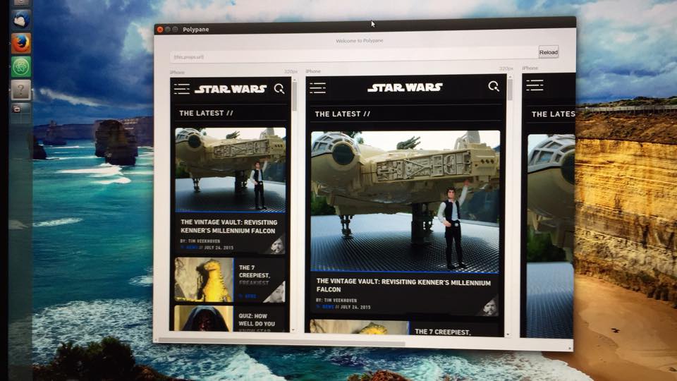
This initial version allowed me to input a URL, and it would render the site across various screen sizes side-by-side. While limited, it demonstrated the potential of such a tool—showing me how a multi-view browser could drastically improve my workflow.
Electron proved to be an excellent choice. It enabled me to utilize my existing web development skills to create a functional desktop browser built on a current version of Chromium and its developer tools. This meant I could test websites across different web technologies without worrying about compatibility issues—since Chromium’s engine would handle the rendering. Plus, I could continue using familiar developer tools, making debugging and development more efficient.
Using this prototype in my daily work as a front-end developer quickly proved its worth. I found that I could implement designs much faster because I no longer needed to manually resize my browser or switch tools to view different responsive states. Instead, I could focus entirely on the website itself, which saved me hours each week—an enormous productivity boost.
As I used the prototype, I identified missing features and began adding enhancements. Simple but essential browser functionalities such as navigation buttons (forward and back), page titles, and the ability to add and resize multiple screens became part of the tool. I also integrated a feature to capture screenshots of all screens simultaneously—ideal for sharing with clients or team members.
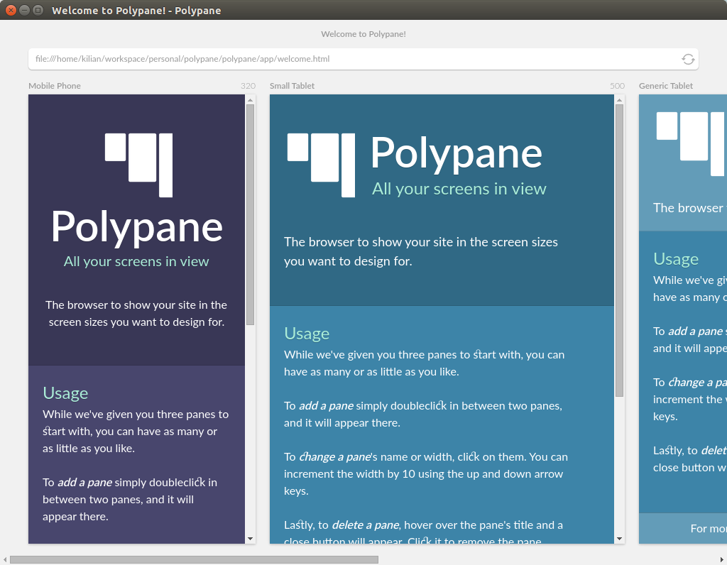
Encouraged by positive feedback, I started sharing my browser with other developers. Their input led to the development of new features like zooming in and out of screens, supporting popular device sizes, and synchronizing interactions like scrolling and hover states across all viewports. This multi-screen synchronization made testing and debugging even more intuitive.
The Evolution of My Browser
With each new feature, I questioned why mainstream browsers didn’t offer similar capabilities. Major browsers like Chrome and Firefox are primarily built for general users, not developers. While their developer tools are excellent, the rest of their interfaces often overlook the needs of front-end professionals. Most users don’t require or use advanced debugging features, and in many cases, developers are a tiny subset of a browser’s overall audience.
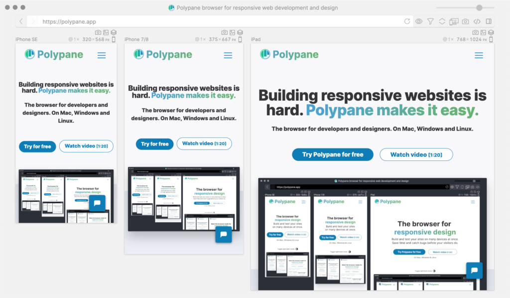
This realization inspired me to redesign the browser interface to cater specifically to front-end development workflows. I envisioned a tool that consolidates essential features into an accessible, integrated environment. Since early last year, I’ve been working full-time on this project, implementing ideas and features based on user feedback. The result includes functionalities like full-page screenshots, live reloading, and device emulation—all integrated directly into the browser.
Unlocking Browser Potential for Developers
Web browsers hold an immense amount of information about websites—data that can be invaluable during development. For example, understanding the various responsive sizes used in CSS can help optimize styles, reducing complexity and improving maintainability. However, this information is often hidden or buried within developer tools.
By integrating features such as real-time layout debugging, accessibility testing, and device simulation directly into the browser, developers can streamline their workflows. For instance, accessibility checks—like verifying ALT texts, heading structures, and contrast ratios—are critical but often overlooked. Modern browsers like Firefox have started to introduce these features, but they tend to be tucked away in developer panels, making them less accessible to those unfamiliar with their locations.
Furthermore, a comprehensive browser should provide insights into cookies, local storage, and HTTP connections—data that can reveal issues like unnecessary redirects or slowdowns. Every 302 redirect, for example, adds milliseconds to page load times, and tracking these can significantly improve site performance.
The potential for a more intelligent, developer-focused browser is enormous, and I plan to continue expanding its capabilities throughout 2020 and beyond. This ongoing development aims to bridge the gap between browser functionality and developer needs, making the tool an indispensable part of front-end workflows.
Is Building Your Own Browser a Good Idea?
After completing this project, I can confidently say that while it’s a challenging undertaking, it has been incredibly rewarding. Building a dedicated browser tailored to specific workflows can seem daunting, but the benefits—like saving hours each week and gaining deeper insights into your sites—are well worth the effort.
The landscape of front-end development has become increasingly complex, with new tools and techniques emerging constantly. Sometimes, it’s easy to feel overwhelmed by the rapid pace of change or to chase after every new trend without considering how it can improve your existing workflow. A custom browser that supports your specific needs can help you navigate this complexity more efficiently.
If you’re interested in improving your website’s layout and design, understanding how typography affects readability, or learning how to craft effective design briefs, resources like a detailed typography guide and tips for writing clear design briefs are invaluable. These tools can help streamline your process and ensure your projects are both functional and visually appealing.
Ultimately, whether you’re a developer seeking to optimize your workflow or a designer aiming for better site performance, investing time in customizing your tools can lead to significant productivity gains and better results. Building your own browser might seem unconventional, but the benefits can make it a worthwhile pursuit.
