Understanding the distinctions between design systems and style guides is crucial for effective digital product development. These two frameworks are closely related and often used interchangeably, but they serve different purposes and levels of complexity. Properly leveraging each can streamline workflows, ensure consistency, and foster a unified brand presence across teams and projects.
A Parent-Child Relationship
Both design systems and style guides serve as repositories of guidelines, principles, and visual standards that aid in creating cohesive interfaces and designs within an organization. They enable UX designers and developers to work with a shared language, making collaboration more efficient and reducing inconsistencies that can arise when teams operate in silos.
The key difference lies in their scope and depth. A design system functions as the overarching “parent” framework, encompassing various smaller components and documentation. Style guides, pattern libraries, and component libraries are considered the “children”—the specific elements that collectively contribute to the larger system. Think of the design system as an ecosystem that organizes and standardizes design resources across all facets of a product or brand.
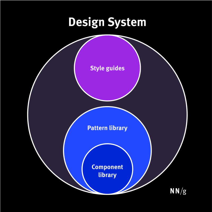
Design systems can include style guides, pattern libraries, and component libraries.
Design Systems
A design system is a comprehensive, living collection of standards, principles, and reusable components designed to manage and scale design efforts efficiently. It encapsulates everything from visual styles to interaction patterns, creating a unified language for product teams.
The primary goal of a design system is to maintain visual and functional consistency across a product or suite of products. By establishing a repository of reusable elements, it minimizes duplicated efforts, accelerates development, and ensures brand coherence. Without such a system, large organizations risk internal inconsistencies, redundant work, and fragmented user experiences.
Furthermore, design systems foster a shared understanding among cross-disciplinary teams—including designers, developers, and stakeholders—by providing a common set of standards. For example, multiple teams working on different features within a company can draw from the same component library, ensuring that UI elements like buttons, forms, and navigation menus look and behave uniformly.
Repository: Housing a Design System
A repository—often a dedicated website or shared platform—is used to store and distribute the components and documentation of a design system. For instance, Google’s Material Design repository consolidates all parts of its design framework.
Typically, a repository contains:
- Style guides: Documentation that details visual, content, and branding standards. These guides ensure consistency in tone, language, and visual identity.
- Component libraries: Collections of reusable UI elements such as buttons, input fields, and icons, complete with detailed specifications, states, and implementation code.
- Pattern libraries: Collections of design patterns, like page headers or modal windows, assembled from components to serve common UI scenarios.
- Additional resources: Design files (e.g., in Figma), logos, fonts, and icons that aid both designers and developers in maintaining uniformity.
The boundaries between style guides, component libraries, and pattern libraries can sometimes blur, as organizations might use different terminology or combine these elements in various ways.
Maintaining Design Systems
Effective management of a design system requires ongoing oversight. Dedicated teams or individuals—depending on the company’s size and maturity—are responsible for updating, refining, and communicating the standards. Larger companies often have specialized teams overseeing the entire system, while smaller organizations might assign this responsibility to a senior designer or engineer.
Style Guides
A style guide is a focused document that provides precise instructions and visual references for implementing specific aspects of a design or content strategy. It guides teams on how to create consistent content, branding, or UI components, serving as a reference point for maintaining coherence.
Style guides tend to focus on one of three key areas:
Content Style Guides
These guides establish standards for written content. They specify tone, voice, grammar rules, punctuation, and formatting, ensuring consistency in messaging across all platforms. For example, a company may define whether to use British or American English, preferred terminology, or specific headline styles.
Brand Style Guides
These documents outline the visual identity of a brand, including color palettes, typography, logo usage, imagery, and iconography. They ensure that all visual representations adhere to the brand’s identity, fostering recognition and trust.
Front-End (Visual) Style Guides
Sometimes called visual or interaction standards, front-end style guides compile all UI elements—such as layout grids, color schemes, type styles, and components—in a modular format. They often include code snippets for developers, facilitating implementation and ensuring that the product’s interface aligns with design principles.
While similar to pattern or component libraries, front-end style guides focus more on defining overarching design rules rather than providing ready-to-use components.
Maintaining Style Guides
The upkeep of style guides depends on their focus area. Content style guides are typically managed by content strategists, while brand guides are maintained by branding or marketing teams. Front-end guides often involve collaboration between UX designers and developers to keep standards current, especially as products evolve.
Conclusion
Design systems encompass a broad array of resources—components, patterns, styles, and principles—that facilitate scalable, efficient, and consistent design and development processes. They serve as an operational backbone, enabling teams to deliver high-quality products rapidly while maintaining a unified user experience.
Style guides, on the other hand, are more narrowly focused documents that specify how to implement particular content, branding, or UI elements. They are essential tools within the larger design system framework, ensuring that specific aspects of a product adhere to established standards.
Implementing a well-structured design system, complemented by detailed style guides, empowers organizations to produce cohesive, accessible, and user-friendly digital experiences. For those interested in optimizing their approach, learning about responsive web design and building a career in freelance web design can provide valuable insights into best practices and industry standards. Additionally, gaining expertise in the key phases of responsive design and the crucial steps in web development can further refine your skills for creating seamless digital products.