Creating an intuitive and efficient user interface that combines video content with supplementary web elements presents unique challenges. The goal is to craft a design that is both visually appealing and functionally effective, ensuring users can navigate seamlessly without frustration. Achieving this requires careful consideration of layout choices, responsive behaviors, and interactive features that work harmoniously across different devices and screen sizes.
In this discussion, we explore essential lessons learned from practical experience, focusing on layout strategies, media responsiveness, and interactive coupling that enhance user engagement and performance. These insights are vital for developers aiming to optimize their web projects, especially when integrating multimedia with detailed content.
Vertical Versus Horizontal Scrolling: Which Enhances User Experience?
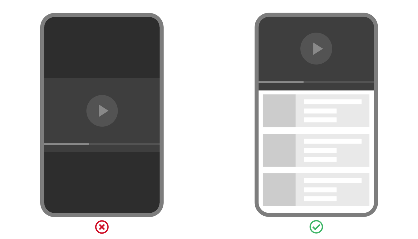
A fundamental decision in UI design is how to present product lists or related content alongside videos. The initial instinct may lean toward horizontal scrolling, inspired by interfaces like carousels or media-rich galleries, which can display multiple items simultaneously and align with the video timeline.
However, practical testing reveals that vertical scrolling remains the most familiar and natural navigation method for users. Most users instinctively scroll vertically on webpages, even when scrollbars are hidden, because it aligns with their expectations and ingrained habits. Horizontal flicking, while potentially useful in contexts like the Netflix interface, often introduces usability issues, especially on devices like smartphones where finger gestures favor vertical movement.
For instance, when designing a site similar to The Beautube, which showcases product details alongside videos, opting for vertical scrolling ensures a smoother experience. While horizontal scrolling might seem attractive for integrating related content, it often hampers long-term engagement and accessibility. For scenarios requiring minimal user interaction, such as short carousels or category navigation, horizontal scrolling can still be appropriate, but it should not replace the primary content flow.
Favoring Single-Dimension Lists for Clarity and Speed
When displaying lists of items, limiting the layout to a single dimension — typically a single vertical column — enhances readability and speeds up user scanning. Multi-column arrangements, although they increase information density, can lead to visual clutter and confusion, forcing users to shift their gaze back and forth and making it harder to maintain context.
A single-column approach ensures that each product image, title, or description is given clear space, enabling users to quickly parse the information. This method is especially effective when screen width is limited, such as on mobile devices or narrow sidebars. However, if the available space is wide enough, designers should be cautious to prevent lines of text from becoming too long, which can negatively impact readability.
Keeping Video Content Persistent with Sticky Positioning
In multimedia-rich interfaces, maintaining the visibility of the video player during scrolling enhances user control and reference. Using CSS’s position: sticky property allows the video to stay anchored within the viewport, sticking to the top or bottom edge as users scroll through related content. This technique ensures users can always compare or react to the video without repeatedly navigating back to it.
For example, applying sticky positioning to the video component ensures that, regardless of how far a user scrolls through product details or supplementary content, the media remains accessible. This approach is particularly beneficial in tutorials or demonstrations where cross-referencing between the video and content is frequent.
Responsive Design with Media Queries: Leveraging Orientation and Aspect-Ratio
Responsive design isn’t solely about adjusting widths; understanding device orientation and aspect ratios is critical. Media queries that incorporate orientation and aspect-ratio features enable layouts to adapt intelligently based on how the device is held or its screen shape.
For instance, a video embedded in an iframe with a fixed 16:9 aspect ratio can be made responsive with CSS tricks, ensuring it scales appropriately across devices. When rotating a device from portrait to landscape, layouts can transition from a single column to a multi-column grid, making better use of available space and improving user experience.
Preventing Unwanted Fullscreen Mode on Mobile Devices
On iOS devices, embedded YouTube videos often automatically switch to full-screen mode, disrupting the intended layout. To circumvent this, developers should enable inline playback by setting the playsinline parameter. This small but vital adjustment allows videos to play within the page layout, preserving the overall design integrity and user flow.
Implementing Two-Way Interaction Between Video and Web Content
Integrating video with web content offers opportunities for dynamic, synchronized experiences. Using the YouTube Player API, developers can create two-way communication where actions in the video influence webpage elements, and vice versa.
For example, each timestamp in a list can be clickable, seeking the video to a specific point, while the video can highlight corresponding list items based on playback progress. This bidirectional coupling enhances engagement and provides a cohesive experience for users, especially in tutorials or educational content.
The Lazy Auto-Scroll: Minimizing Distraction and Maintaining Context
Auto-scrolling to keep the active list item in view improves navigation without overwhelming the user. The lazy auto-scroll principle involves only adjusting the list position when necessary — for instance, when the active item moves outside the current viewport — and doing so with minimal movement.
This approach reduces unnecessary scrolling, preventing distraction and preserving the user’s mental map of the content. When combined with the concept that auto-scrolling should only occur at specific moments, such as when the video reaches a new timestamp, it creates a smooth and user-friendly interaction model.
Practical Application: Refining the User Interface
Applying these principles results in a cohesive, accessible, and engaging multimedia interface. Thoughtful layout choices, responsive behaviors, and intelligent interactions ensure users can focus on content without friction or confusion. Continual testing and refinement based on these lessons can lead to a final product that not only looks professional but also performs optimally across all devices.
For further insights into optimizing your web design for performance and user experience, consider exploring resources such as web design’s influence on site speed and how strategic layout choices can boost your SEO. Understanding the critical role of website responsiveness can further refine your approach, while learning what constitutes professional web design provides a foundation for excellence.