Implementing toast notifications effectively can significantly enhance user experience by providing timely, non-intrusive feedback. This comprehensive guide explores the fundamental aspects of toast components, including their anatomy, design variants, appropriate use cases, and how to distinguish them from other UI elements like dialogs and banners.
What is a toast component?
Toasts are brief, transient messages designed to communicate information to users without disrupting their workflow. Their primary purpose is to deliver quick updates or acknowledgments that automatically dismiss after a short duration, ensuring minimal interruption.
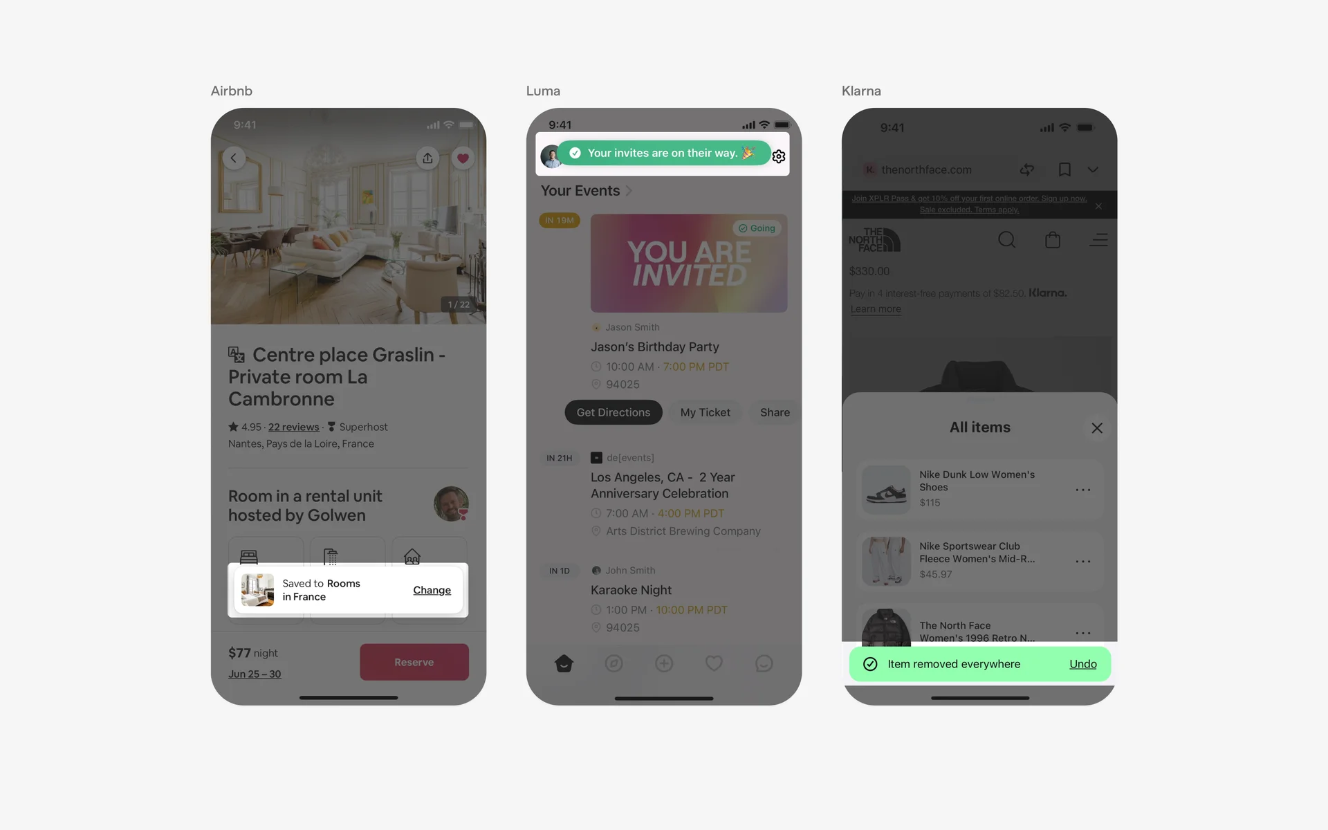
Visualize a toast as a piece of toast popping out of a toaster—appearing briefly and then fading away seamlessly. These components are commonly employed in scenarios such as confirming actions or alerting users to errors. Typical design patterns utilizing toasts include acknowledgment messages and error notifications.
| When to use toasts? | |
|—|—|
| Low-priority messages | Ideal for notifications that do not require immediate user action or acknowledgment. | |
| Optional user actions | Suitable for messages prompting optional interactions, such as undo options. | |
| Self-dismissing messages | Best for notifications that should disappear automatically after a brief period. | |
| When not to use toasts? | |
|—|—|
| High-priority notifications | Use alternative UI elements like modals or banners for critical alerts. | |
| Urgent actions requiring immediate response | For messages that demand user attention, dialogs are more appropriate. | |
| Persistent messages | When information must remain visible until explicitly dismissed, choose other components. | |
What is the anatomy of a toast component?
A typical toast comprises several key elements that contribute to its clarity and usability:
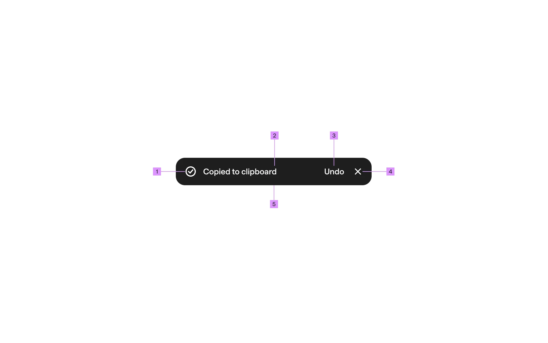
- Content Text: The core message conveyed to the user.
- Iconography (Optional): Visual cues indicating success, error, or information.
- Action Buttons: Optional interactive elements like “Undo” or “Retry.”
- Placement: Consistent positioning on the screen ensures visibility without obstructing primary content.
What are the design variants of a toast?
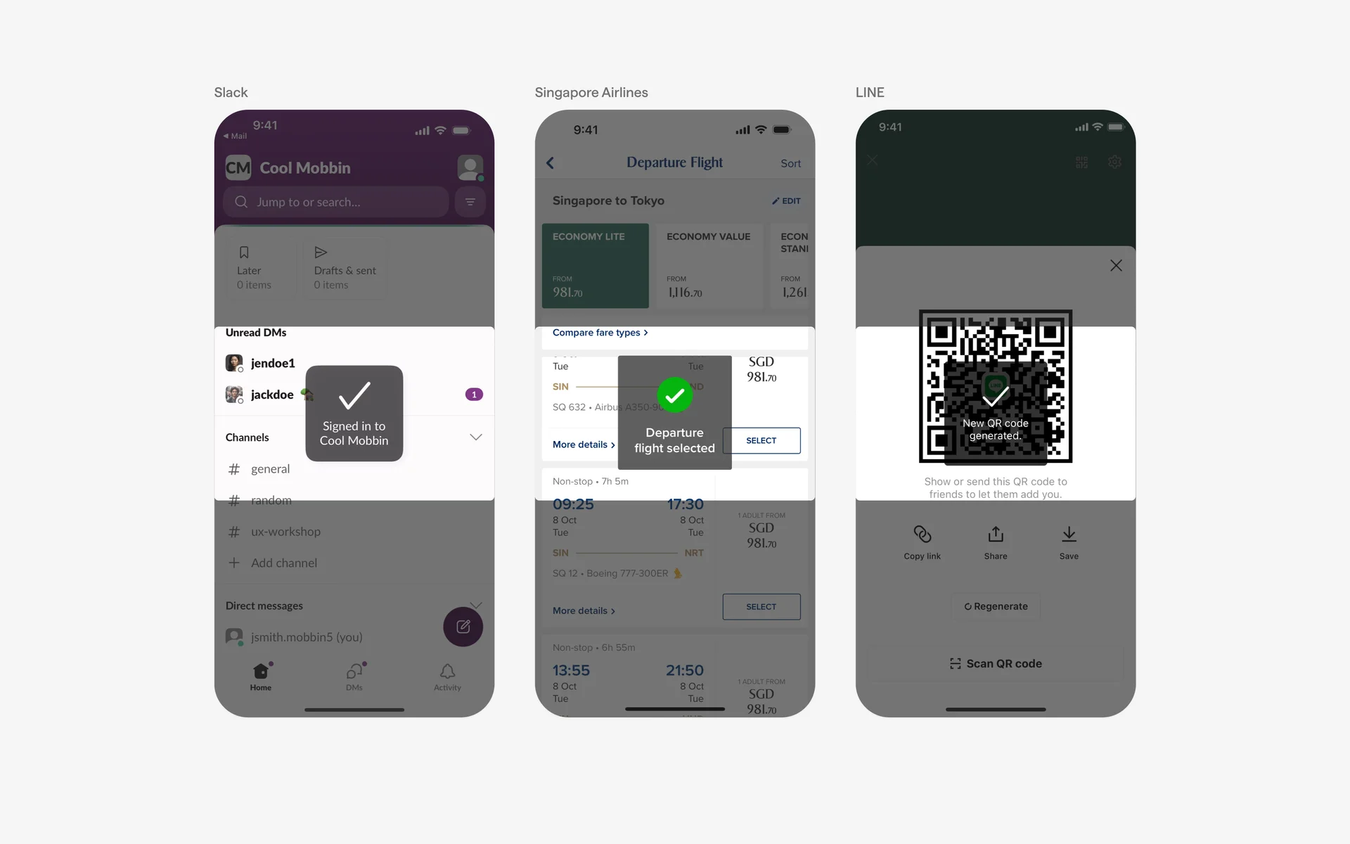
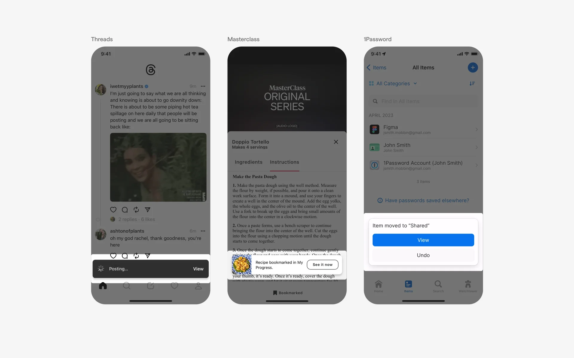
Analysis of over 2,500 real-world toast UI components from Mobbin reveals diverse design variants categorized mainly by placement, form, and action elements.
Placement
Mobile toasts typically appear in three positions along the Y-axis:
- Top-Aligned Toasts: Positioned above the main content, providing early visibility.
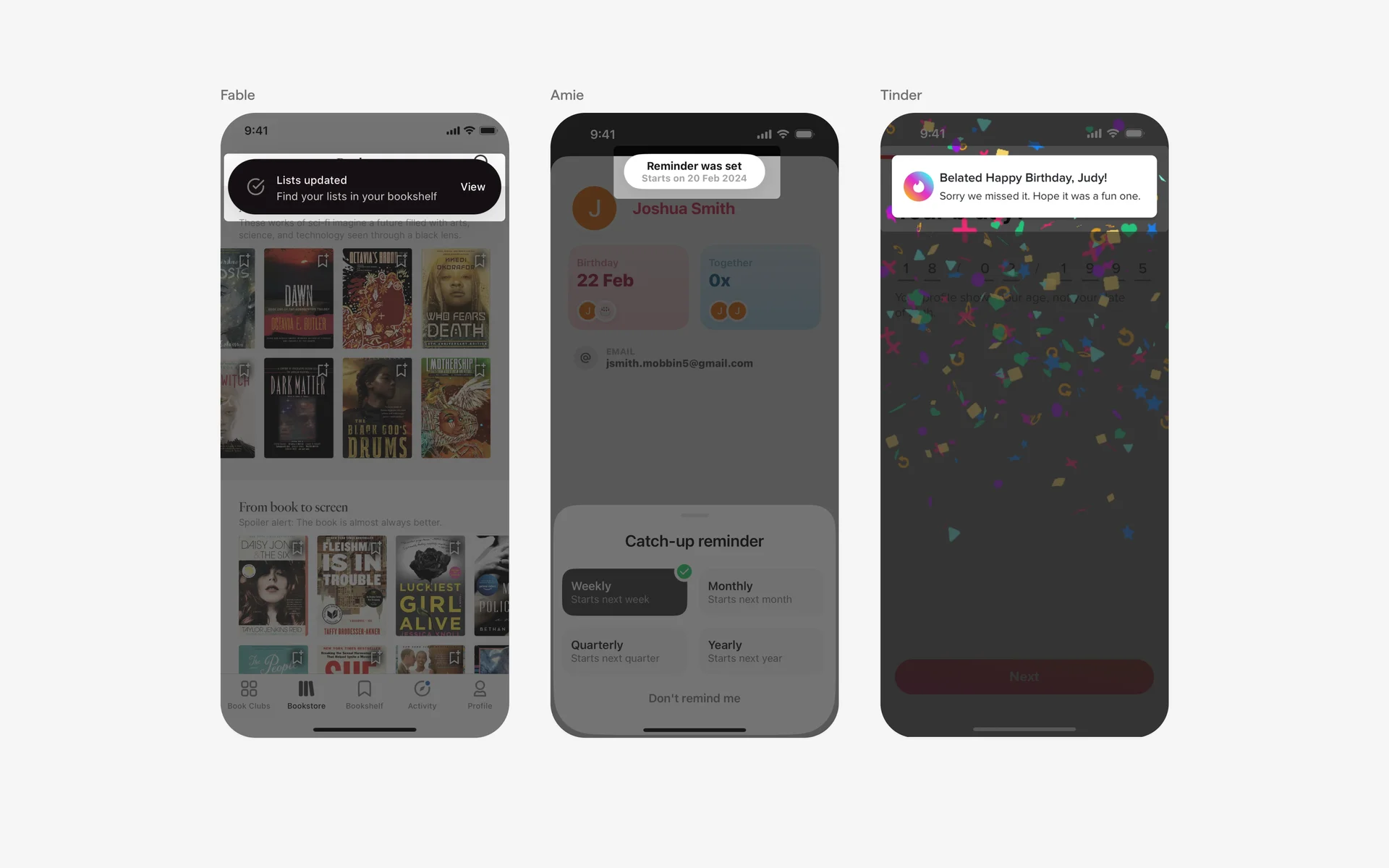
- Center-Aligned Toasts: Centered on the screen for balanced visibility.
- Bottom-Aligned Toasts: Located at the bottom for easy thumb access on mobile devices.
In web applications, designers can leverage horizontal alignment (left, center, right) to optimize layout based on the available screen space.
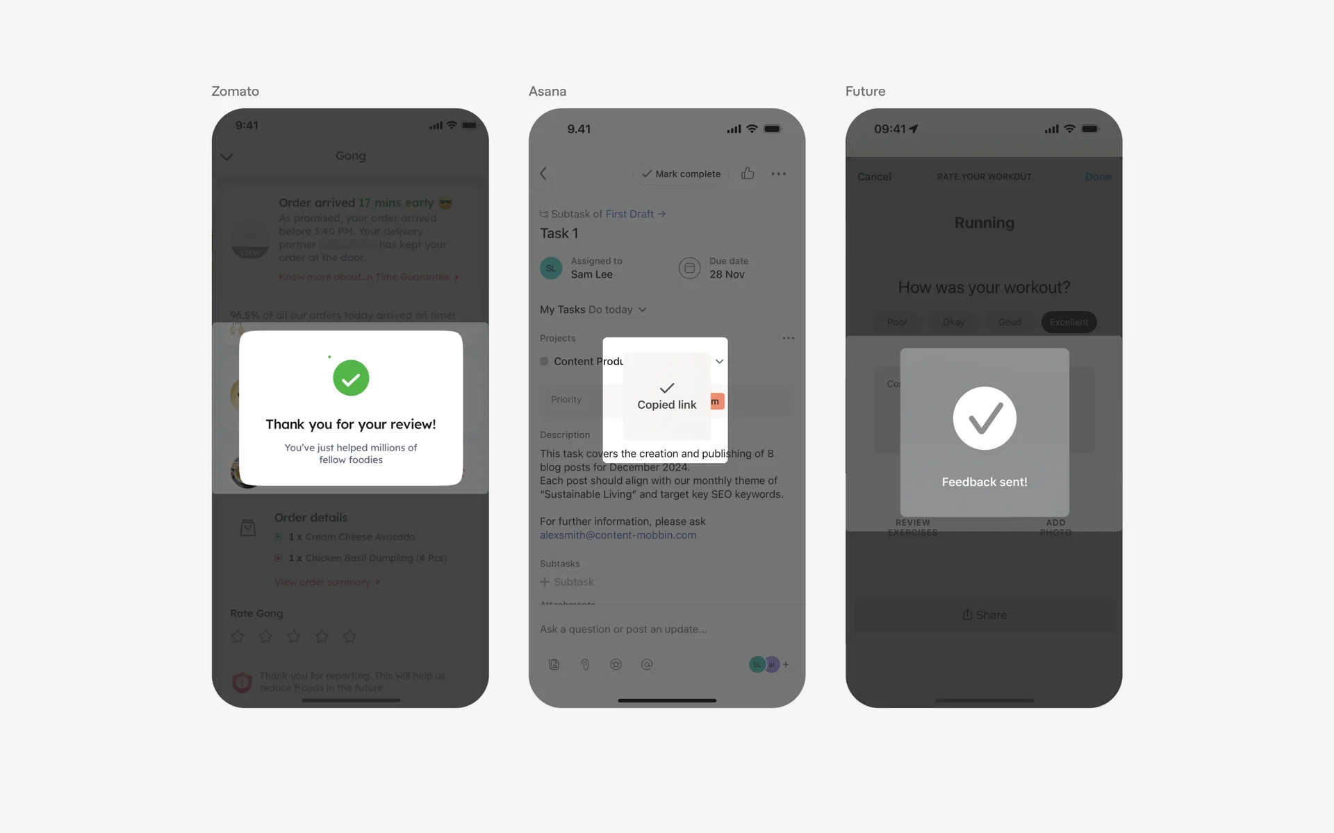
Form
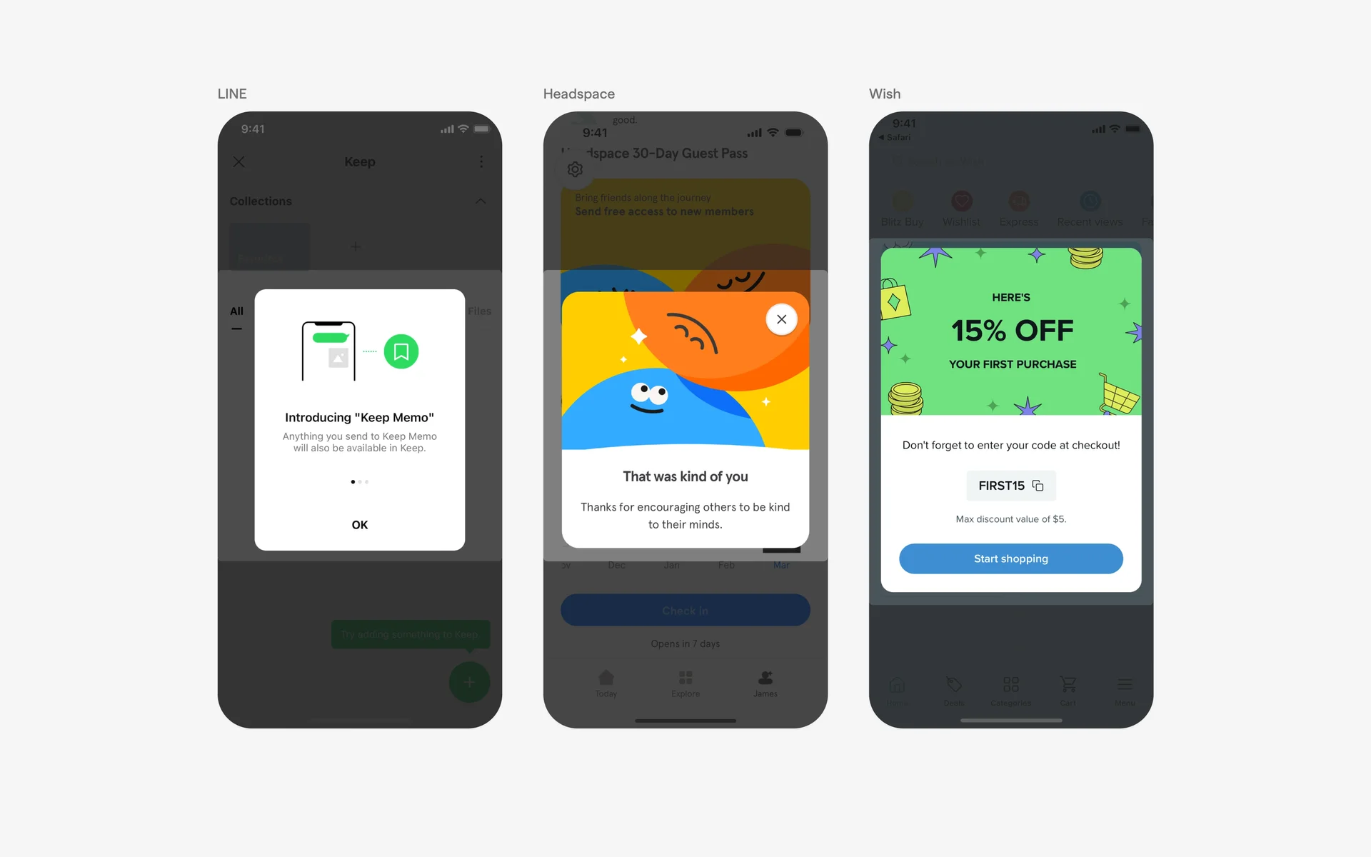
Toasts can adopt various structural forms aligned with a brand’s design system, primarily categorized as:
- Bar Style: Slim, strip-like notifications suitable for minimal space.
- Full-Bleed Style: Toasts that span the entire width of the screen, providing ample space for content and actions.
- Bar Style with Rounded Corners: Variations include different border radiuses for aesthetic preferences.
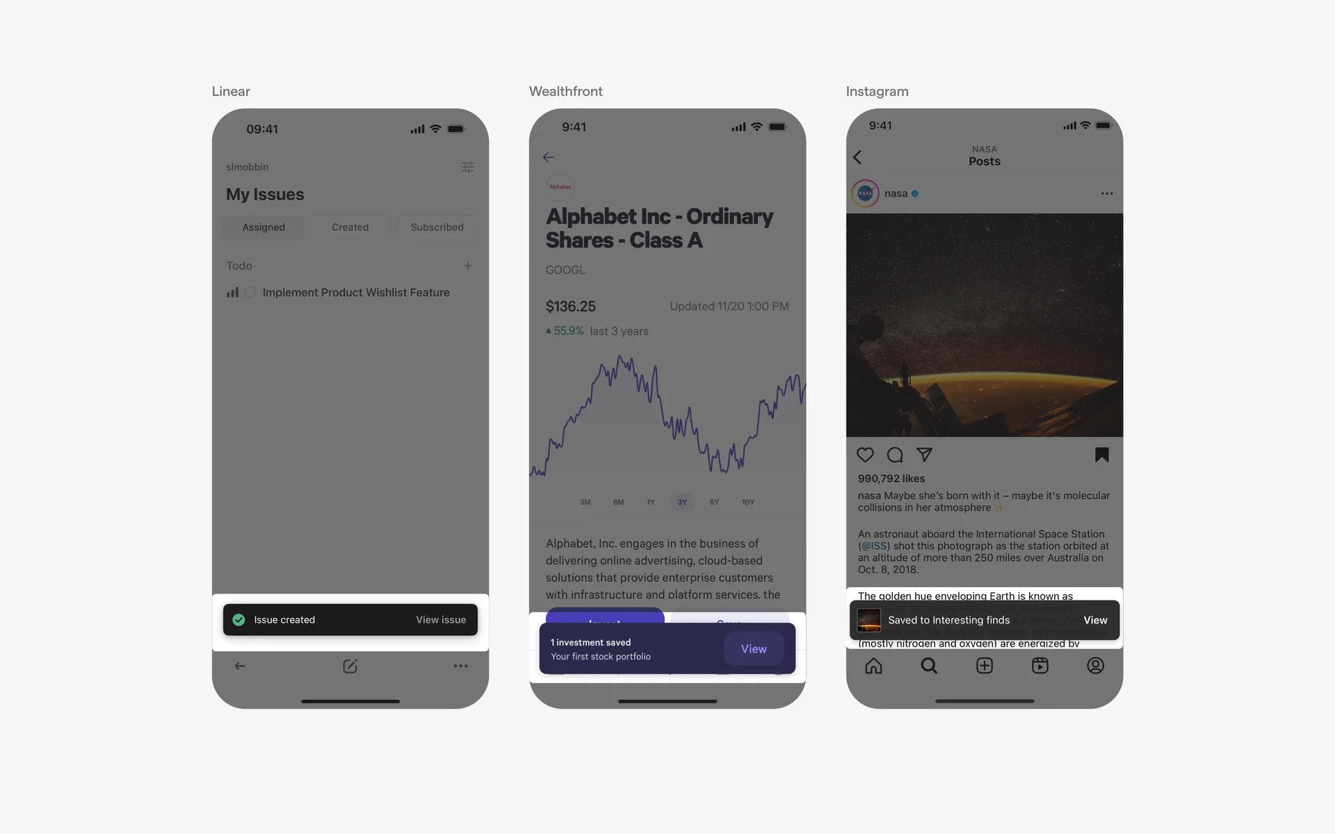
Follow-up action buttons
Placement of action buttons influences usability. For mobile applications, positioning at the bottom of the toast ensures effortless thumb reach:
Caret tip
In specific cases, adding a caret tip can subtly guide users’ attention or indicate the direction of a process, akin to a tooltip. However, this is less common in standard toast design:

When to use a toast?
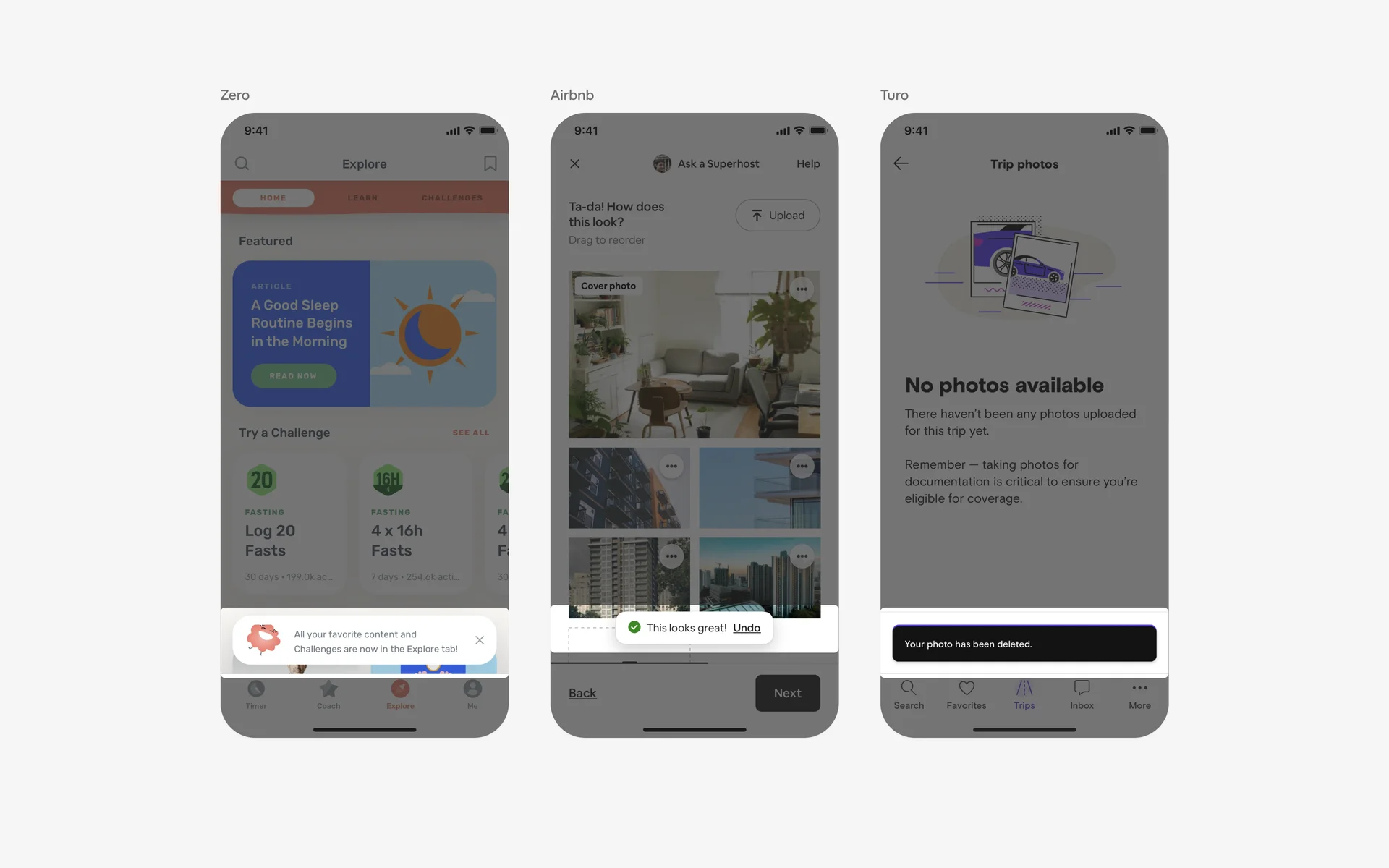
Success & acknowledgment
Post-action notifications serve as positive reinforcement, confirming that an operation was successful. These toasts often feature a green color scheme to visually communicate success, such as “Task deleted,” with an optional “Undo” button to revert the action. Incorporating mastering success as a web design agency owner can enhance understanding of user feedback mechanisms.
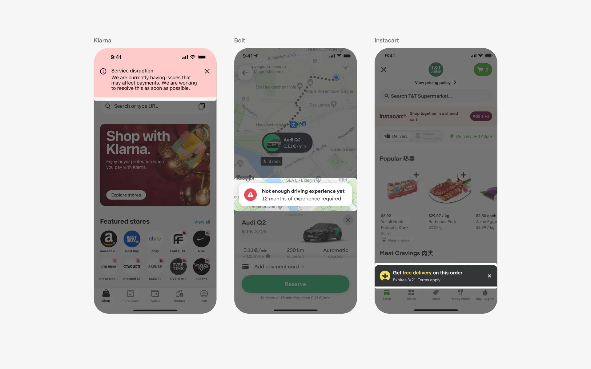
Error handling
In cases where errors occur—like network failures or invalid inputs—a toast provides immediate, clear feedback. Using a red color scheme, error toasts inform users about issues like “Network connection lost” or “Invalid input,” guiding them toward corrective actions. Proper error communication via toasts improves overall usability and trustworthiness of the application. For more on how JavaScript impacts such interactions, see exploring the versatile applications of javascript in modern web development.
Conflicting UI elements: Dialogs, Banners & Tooltips
Toast vs. Dialogs
Dialogs are modal windows that demand user interaction, often requiring immediate responses to critical information or decisions. Unlike toasts, dialogs are more intrusive, blocking other interactions until dismissed. Use dialogs when user input or confirmation is necessary, especially for high-stakes decisions.
Toast vs. Banners
Banners are persistent notifications that stay visible across multiple screens or until explicitly dismissed, suitable for conveying information that needs to remain accessible. In contrast, toasts are designed for transient messages that disappear automatically and do not interfere with navigation.
Toast vs. Tooltips
Tooltips provide contextual, detailed information about UI elements or instructions on how to use them. They are often triggered on hover or focus. Toasters, by contrast, offer quick, ephemeral feedback following an action, making them suitable for immediate user acknowledgment.
Proper understanding and implementation of toast components, along with awareness of conflicting UI elements, can lead to more intuitive and user-friendly interfaces. For further insights into modern web development practices, consider exploring what is the role of javascript in web designing.