


Effective communication is vital in delivering a seamless user experience within SaaS platforms. Among various UI elements, toast notifications stand out as a subtle yet powerful tool for real-time feedback. They help inform, confirm, or alert users without disrupting their workflow, thus playing a crucial role in user retention and satisfaction. This comprehensive guide explores everything you need to know about toast notifications, from their fundamental definition and ideal use cases to best practices for implementation.
What is a Toast Notification?
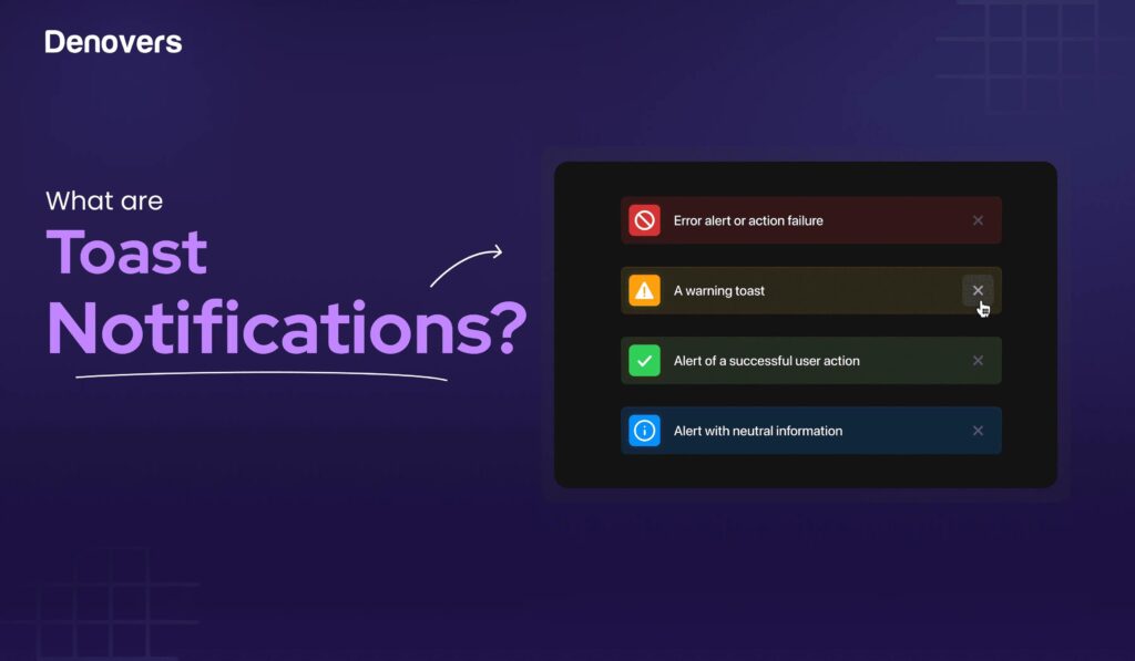
A toast notification is a short, unobtrusive message that appears on a user’s screen to inform them about a system event or update in a SaaS application. The concept originated with Microsoft’s Windows 8 operating system, where these lightweight alerts provide quick feedback without interrupting ongoing tasks. The term “toast” is used because these alerts pop up briefly, akin to a slice of toast emerging from a toaster.
These UI components are often referred to as toast popups, highlighting their transient nature. Unlike modal dialogs or popups that require user interaction to dismiss, toast notifications automatically disappear after a set duration, ensuring they remain non-disruptive. They typically appear in designated areas such as the top-right or top-center of the screen, designed to catch the user’s eye without obstructing essential content. Their ability to deliver timely information subtly and efficiently makes them indispensable in enhancing the overall user experience.
Learn more about what is the role of javascript in web designing to understand how scripting enhances such UI elements.
When to Use Toast Notifications
Implementing toast notifications at appropriate moments can significantly improve user engagement and clarity. Here are some key scenarios where they are most effective:
-
Success Messages: Confirming successful actions, such as submitting a form, saving changes, or completing a transaction. For example, displaying “Profile updated successfully” after a user saves their profile details.
-
Error Alerts: Informing users about issues that don’t halt their workflow but require attention, like “Failed to load the page, please try again later.” These alerts help users understand what went wrong without causing frustration.
-
Informational Updates: Communicating non-critical but important information such as “New order received” or “Feature available for a limited time.” This keeps users informed about system status or updates.
-
Confirmation of Actions: Validating user-initiated actions, for instance, “Item deleted” after removing an item from a list, reassures users that their actions were successful.
-
Background Process Completion: Notifying users when background tasks finish, like “File uploaded successfully,” allowing them to continue their tasks without waiting.
-
Connection Status Changes: Indicating network or server status, such as “Connected” or “No Internet connection,” so users are aware of connectivity issues in real time.
For a more detailed understanding of how to leverage JavaScript in web interactions, visit what is the role of javascript in web designing. Proper timing and context ensure that toast notifications serve as helpful touchpoints rather than nuisances.
When Not to Use Toast Notifications
While toast notifications are versatile, there are specific situations where their use is inappropriate or counterproductive:
-
Critical Errors or Security Issues: Serious problems like payment failures or security breaches require more prominent alerts, such as modal dialogs, that demand immediate user attention.
-
Detailed or Complex Information: Long instructions or extensive data are unsuitable for toasts, which are designed for brief messages. Use dedicated pages or modals for detailed content.
-
Immediate User Input Needed: Situations that require quick user responses, like confirming a critical decision, are better handled through modal prompts.
-
Repeated or Excessive Notifications: Overloading users with frequent toasts can lead to frustration or notification fatigue, causing users to ignore all alerts.
-
Interrupting Focused Tasks: During tasks requiring intense concentration, such as filling out complex forms or performing calculations, toasts can be disruptive.
-
Persistent Information: Since toasts automatically dismiss after a few seconds, they are ineffective for messages that users need to reference later.
-
Mobile Devices for Critical Messages: Small screens may cause users to miss vital alerts, making persistent or more prominent notifications preferable.
Understanding these limitations helps in designing a balanced notification strategy that enhances UX without overwhelming users.
Where to Place Toast Notifications?
Proper placement of toast notifications is crucial for visibility and user comfort. Consider the following guidelines:
-
Optimal Placement: Position alerts at the top-center or top-right of the screen, which are easily noticeable yet unobtrusive. Be cautious with top-right placement to accommodate users with screen magnifiers or accessibility tools.
-
Context-Dependent Placement: Adapt positioning based on the application’s layout and the type of information. For example, status bars in Windows and MacOS often host toast notifications, adhering to the Law of Proximity.
-
Placement with Badging: When badges or indicators are present, position toast messages below them to maintain a clear visual hierarchy.
-
Avoid Covering Content: Ensure toasts do not obscure critical content or interactive elements, preserving seamless user interactions.
-
Exclusion from Modal and Wizard Interfaces: Do not display toasts over modal dialogs or multi-step wizards, as these interfaces demand full user focus.
Strategic placement contributes significantly to the effectiveness of toast notifications and overall user satisfaction.
How Do Toast Notifications Impact User Experience?
Toast notifications serve as an essential communication bridge between the system and users, providing instant feedback on actions and system statuses. When implemented thoughtfully, they help users understand the results of their interactions without interruption, fostering confidence and efficiency.
However, overuse or poor execution can diminish their value. Excessive or poorly timed notifications may lead to user frustration, decreased trust, and potential abandonment of the platform. For instance, frequent alerts about background processes or minor updates can clutter the interface and distract users from their main tasks.
Incorporating best practices in design and timing ensures toast notifications enhance UX rather than hinder it. For more insights into how scripting influences user experience, revisit what is the role of javascript in web designing.
10 Best Practices for Implementing Toast Notifications
To maximize the effectiveness of toast alerts, adhere to these proven principles:
1. Ensure Clarity and Relevance
Design toasts with concise, purpose-driven messages that users can quickly grasp. Tailor content to specific scenarios to add contextual value.
2. Use Appropriate UI Elements
- Utilize colors and icons for instant recognition (e.g., red for errors, green for success).
- Incorporate actionable buttons for quick responses or dismissals.
- Enhance clarity with relevant images or progress indicators, such as progress bars during downloads.
3. Provide User Control
Allow users to dismiss notifications manually or interact with them, such as undo options or quick replies, fostering autonomy.
4. Maintain Consistency
Follow uniform design standards and placement throughout the application to promote familiarity and predictable behavior.
5. Reserve for Non-Critical Updates
Limit toasts to positive feedback or informational updates. Avoid using them for critical errors that require immediate attention or detailed explanations.
6. Optimize for Efficiency
Design notifications to deliver essential information swiftly, enabling users to stay on task without unnecessary navigation.
7. Manage Notification Overload
Implement features like a Notification Center where users can review past alerts, preventing clutter and missed messages.
8. Respond Appropriately to User Actions
Ensure that interactions with toasts trigger relevant actions—opening the app, initiating tasks, or dismissing alerts—aligned with user intent.
9. Keep Design Minimal
Adopt a clean, unobtrusive visual style that blends seamlessly into the interface, avoiding visual noise.
10. Enable Easy Dismissal
Always include a manual close option (like an “x” button), even if the notification auto-dismisses, giving users control over their interface.
Examining real-world applications illustrates these principles in action. Platforms like Slack and Trello utilize toast notifications effectively to keep users informed without disruption.
Examples of Toast Notifications in Popular SaaS Platforms
- Slack: Notifies users of new messages, mentions, or activity in channels and direct messages when the app isn’t in focus.
- Microsoft Outlook: Displays toast alerts for incoming emails, calendar reminders, and updates.
- WhatsApp: Shows brief banners for new messages, especially on Android devices, allowing quick viewing without opening the app.
- Facebook: Uses toast messages for new likes, comments, or friend requests to keep users engaged.
- Spotify: Presents notifications for song changes or playlist updates.
- Android OS: System-level toast alerts inform about background activities like downloads or network status changes.
- Uber: Notifies users when their ride is arriving or when there are updates to their trip.
- Trello: Shows alerts when cards are moved, commented on, or updated.
- Instagram: Sends quick updates on new followers, comments, or messages.
These examples highlight how effective toast notifications can seamlessly integrate into user workflows, enhancing engagement and satisfaction.
In Summary
Mastering toast notifications involves understanding their purpose, strategic placement, and best practices. When used appropriately, they can significantly elevate the user experience by providing timely, relevant feedback. Conversely, improper implementation may lead to frustration or overlooked messages. Key considerations include:
- Recognizing when to deploy toasts and when to avoid them
- Placing notifications thoughtfully within the interface
- Designing them for clarity, control, and minimal disruption
Achieving this balance requires a nuanced understanding of your audience, the nature of your content, and the context of interaction. For tailored advice on integrating toast notifications into your SaaS product, your path to a successful web design career: a complete guide can be a valuable resource.
If you’re unsure how to incorporate these elements effectively, Denovers offers expert UX design services to optimize user engagement through strategic notification systems. Contact us for a free demo and elevate your product’s user experience today!