Creating a compelling and user-friendly website involves understanding the core components that influence design, functionality, and user experience. Each element plays a strategic role, combining to form an engaging digital environment that guides visitors seamlessly through your content. This article explores the fundamental parts every web page should incorporate, highlighting their significance and how they work together to enhance usability and aesthetics. Whether you’re developing a simple portfolio or a complex e-commerce platform, mastering these elements is crucial. For those interested in the broader scope of planning and executing web projects, insights into the time required for professional website development can be found here. Additionally, understanding how to build a resilient, serverless backend is vital for modern web applications — learn more about creating robust serverless solutions. As the industry shifts towards scalable and efficient architectures, exploring the advantages of serverless frameworks becomes increasingly relevant.
Header
The header is the topmost section of a web page and serves as a critical point for initial user engagement. Since it appears immediately upon page load, the header must be strategically designed to convey the website’s identity and facilitate navigation. It often contains essential elements that help visitors orient themselves and explore the site efficiently.
Typical components of a header include:
- The company or brand logo, serving as a visual identity marker
- Call-to-action (CTA) buttons that prompt immediate responses
- Navigation links to key sections or categories
- Links to social media profiles
- Contact details such as phone numbers or email addresses
- Language selection dropdowns for multilingual sites
- Search fields for quick content access
- Subscription prompts or newsletter sign-up buttons
- Links for product actions like free trials or app downloads
It’s important to avoid overcrowding the header with too many elements; a cluttered header diminishes clarity and usability. Designers, often in collaboration with marketing teams, select the most strategically important components to include. For example, the header on a shipping company’s website might feature the logo on the left, a prominent CTA button on the right, and navigation links in between. It is visually separated from the rest of the page via a divider line, creating a clear distinction that enhances usability.
The placement of header elements is crucial because users tend to scan from the top down, especially from left to right in languages like English. This pattern makes the header an ideal location for the most important navigation and CTA elements—often positioned in the corners for maximum visibility. Consistency in header design across pages reinforces user familiarity and trust. Common practices include sticky headers that remain visible while scrolling, two-layer navigation for complex sites, and making the logo clickable to return to the homepage.
CTA Button
A call-to-action (CTA) button is a vital element designed to motivate users to perform a specific, valuable action—such as making a purchase, signing up, or contacting the company. It transforms passive visitors into active participants, guiding them toward conversion goals.
Effective CTA buttons are:
- Highly visible: They stand out through size, color, and placement
- Clearly labeled: Using microcopy that directly states the intended action, like “Get Started” or “Download Now”
- Strategically positioned: Usually above the fold or in prominent areas
- Consistent in style: To maintain visual harmony and reinforce their importance
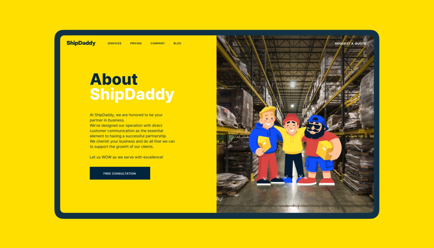
Designers craft CTA buttons to catch the eye within seconds, often using bold colors and contrasting text. A well-placed and compelling CTA can significantly increase engagement rates. For example, the homepage of ShipDaddy prominently features a CTA button that encourages visitors to book a service immediately, demonstrating the power of clear visual prompts.
Similarly, websites like Mayple utilize multiple consistent CTA buttons across sections, allowing users to navigate seamlessly from different entry points. This consistent placement and design foster familiarity, which can be crucial for user retention and conversion.
Hero Section
The hero section is the prominent area at the top of a webpage that appears before scrolling. It acts as a visual and informational hook, capturing visitors’ attention with compelling imagery, typography, or multimedia elements. Its primary goal is to quickly communicate the core message or value proposition of the site.
A hero element can include:
- A striking hero image, video, or animated graphic
- Clear, persuasive headline text
- Subtext or supporting information
- A prominent CTA button to guide further action
The visual content in a hero section should resonate emotionally with visitors, establishing an immediate connection and encouraging further exploration. For instance, a fintech service’s homepage might showcase an animated illustration that illustrates financial growth, engaging users instantly.
The design of this section varies according to purpose but always aims to set the tone, reinforce branding, and prompt user interaction. Properly executed, the hero section becomes a memorable visual cue that leaves a lasting impression.
Footer
Located at the bottom of a webpage, the footer provides supplemental navigation and information that visitors may seek after engaging with the main content. It serves as a secondary hub for links, contact details, and legal information, supporting overall site usability.
Common footer elements include:
- Brand identity symbols and logos
- Support links: FAQ, About, Privacy Policy, Terms of Service
- Credits and acknowledgments
- Contact information and forms
- Links to social media profiles
- Testimonials, badges, or certification icons
- Subscription forms or newsletter sign-up buttons
In websites with infinite scrolling, the traditional footer may be less prominent; however, fixed-footers can serve as persistent navigation aids. The footer should harmonize with the overall design and stylistic theme, ensuring it complements the user experience rather than disrupting it.
Slider
A slider, or carousel, is an interactive component that displays a series of images, offers, or content panels in a rotating or sliding manner. Frequently used on e-commerce or portfolio sites, sliders save space and attract attention through dynamic visual presentation.
Advantages include:
- Space efficiency: Showcasing multiple items within a limited area
- User engagement: Interactive and visually appealing
- Highlighting key messages, products, or offers
However, sliders can also have disadvantages:
- Potentially slow page load times
- Risk of content being overlooked or skipped
- Usability issues on mobile devices
- Sometimes perceived as intrusive ads
Designers must weigh these pros and cons when integrating sliders, ensuring they add value without hindering overall site performance. For example, a portfolio landing page might use an animated slider to showcase various projects, engaging visitors immediately.
Search
The internal search function allows visitors to find specific content quickly within a website. When well-implemented, it acts as a shortcut, saving time and enhancing overall user experience. The search interface typically consists of a search box or bar, where users can type queries.
Effective search systems:
- Deliver relevant results swiftly
- Are prominently placed for easy access
- Include features like autocomplete or filters to refine results
For websites with extensive content, such as large e-commerce stores or media platforms, internal search becomes indispensable. It supports users in bypassing complex navigation and directly accessing desired information. However, it’s essential to balance search with navigation, as some users prefer browsing rather than searching. For example, a booking platform might feature an advanced search form at the top to help users find specific services quickly.
Menu
Menus are fundamental navigation tools, guiding users through the website’s structure. They can be horizontal, vertical, dropdown, or megamenus, each suited to different content types and site complexities.
Key types include:
- Horizontal menus: Common in headers, presenting primary navigation
- Sidebar menus: Vertical lists on the side of pages
- Dropdown menus: Expandable options hiding sub-items
- Megamenus: Large, multi-column dropdowns for extensive options
- Hamburger menus: Collapsible menus for mobile or minimal designs
Design choices should be based on user research, ensuring menus are intuitive and accessible. For instance, a fashion e-commerce site might use a megamenu to display categories like “Men,” “Women,” and “Accessories,” facilitating quick browsing.
Breadcrumbs
Breadcrumbs provide a trail of navigation links, showing users their current position within the site’s hierarchy. They assist in wayfinding, especially on large, multi-layered websites, by allowing users to backtrack easily.
Benefits include:
- Enhanced findability: Clarifying site structure
- Reduced clicks: Jumping directly to previous levels
- Better space utilization: Using a compact horizontal trail
- Decreased confusion: Clear indication of current location
- Lower bounce rates: Better user confidence and engagement
Breadcrumbs are especially useful for e-commerce platforms, news sites, and blogs with complex categorization. They complement primary navigation, aiding users in understanding the overall site architecture.
Form
Forms are interactive elements enabling users to submit information, such as registration details, feedback, or search queries. A well-designed form should be simple, intuitive, and quick to complete, reducing barriers to user engagement.
Best practices for forms involve:
- Clear labels and prompts
- Logical flow of input fields
- Minimized required steps
- Visual cues and tips for assistance
For example, a contact form on an eco-tourism website allows visitors to specify their preferences or queries, facilitating communication. Simplified forms increase the likelihood of completion and improve user satisfaction.
Cards
Cards are modular layout units that display related information in a visually organized manner. They allow for easy scanning and comparison of items, often arranged in grids or lists.
Typical uses include:
- Product previews with images, titles, and actions
- Blog posts summaries
- Portfolio items
- Related products or articles
Designers use cards to create clean, digestible content blocks. For instance, a restaurant website may display menu items in individual cards, each with a photo, description, and order button, enhancing clarity and interaction.
Video
Video content has become an increasingly important part of web pages, serving as an engaging way to communicate messages rapidly. Well-crafted videos activate multiple senses simultaneously, making information more memorable.
Uses include:
- Hero section visual hooks
- Demonstrations of products or services
- Customer testimonials
- Brand storytelling
However, videos should be optimized for fast loading and responsiveness to avoid impairing user experience. An outdoor activity site might feature a short video showcasing holiday experiences, instantly conveying atmosphere and excitement.
Progress Indicator
A progress indicator visually displays how much of a task or content has been completed, guiding users through lengthy processes like forms, tutorials, or articles. It reduces uncertainty and enhances confidence.
Benefits include:
- Clear understanding of remaining steps
- Motivation to complete multi-step actions
- Better time management perception
For example, a multi-step registration process can feature a progress bar at the top, signaling users how close they are to finishing. This element improves overall usability and user satisfaction.
Favicon
A favicon is a small icon displayed in browser tabs, bookmarks, and address bars. It reinforces brand recognition and helps users locate your site visually among multiple open tabs or saved bookmarks. Despite its small size, a well-designed favicon contributes significantly to overall site credibility and identity.
Tags
Tags are metadata labels that categorize content, enabling quick filtering and navigation. They are especially common in blogs and content-heavy sites, allowing users to find related items easily. For example, a fashion blog might tag articles with “summer,” “casual,” or “formal” to facilitate targeted browsing.
Tags support dynamic content organization, often created by users themselves, providing flexible classification beyond fixed categories. This enhances discoverability and user engagement.
The careful selection and testing of these elements are essential for creating a harmonious and effective web page. The balance between user needs and business objectives guides the design process, ensuring that each component contributes to overall usability and aesthetic appeal. For further insights into web development timelines, visit this resource, and explore building scalable serverless solutions. Staying updated with the latest in web architecture can help unlock new possibilities for your projects.