


User interface (UI) elements are the foundational building blocks of digital products, shaping how users interact with apps and websites. They serve as the touchpoints that guide, inform, and empower users throughout their journey. From buttons to navigation menus, mastering these components is crucial for creating intuitive, engaging, and efficient interfaces. As UI design continues to evolve, staying updated on the most common and effective elements ensures your work remains relevant and user-centric. This comprehensive guide introduces the core UI elements you need to know, explaining their functions, best practices, and when to use them to enhance user experience.
UI Elements: An In-Depth Glossary
UI components generally fall into four primary categories: input controls, navigational aids, informational elements, and containers. Understanding these categories helps in organizing your design process and ensuring consistency across your project.
- Input controls facilitate user data entry. For example, when asking for a user’s country, input controls allow them to provide this information seamlessly.
- Navigational components assist users in moving through a product or website efficiently. Common examples include tab bars on iOS devices and hamburger menus on Android.
- Informational components are used to display messages, alerts, or content that users need to see.
- Containers group related content together, helping to organize information visually and functionally.
Here is a curated list of some of the most prevalent and vital UI elements:
1. Accordion
Accordions are collapsible sections that allow users to expand or collapse content panels. They enable efficient navigation through large amounts of information within a limited space, making complex data more manageable and accessible.
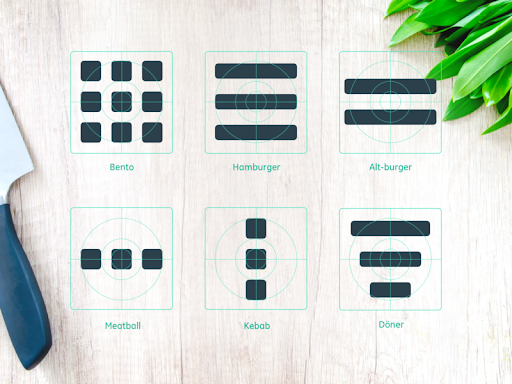
2. Bento Menu
Named after the Japanese bento box, this menu style arranges options in a grid layout. It’s especially popular in mobile interfaces, offering a clean, organized way to present multiple options simultaneously. UI designers often choose food-inspired names for their elements, which adds a playful touch to design language. You can explore different menu styles used in UI design here.
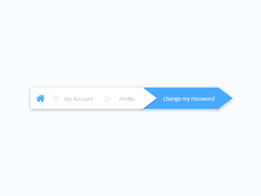
3. Breadcrumb
Breadcrumbs are navigational trails that display the user’s current location within a website or app hierarchy. Usually positioned at the top, they provide context and facilitate easy backtracking or movement between steps, enhancing usability especially in multi-layered sites. See an example of breadcrumb navigation in action here.
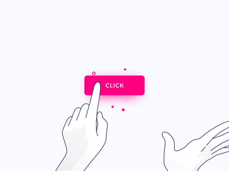
4. Button
Buttons are essential interactive elements that trigger actions such as submitting forms, opening dialogs, or navigating to other pages. They are typically shaped with clear labels, making their purpose immediately recognizable. An example of a clickable button can be seen here.
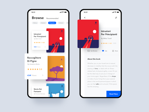
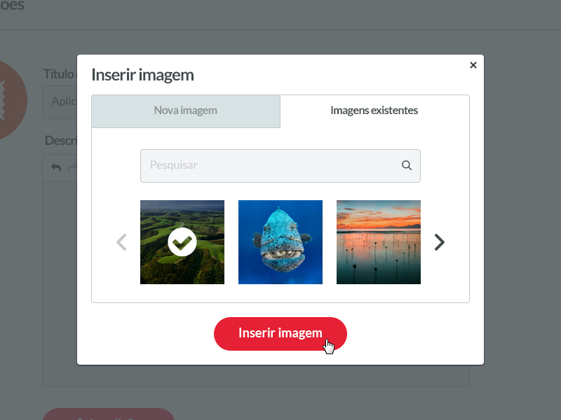
5. Card
Cards are versatile UI modules that display a combination of text, images, and interactive elements. They serve as entry points for content, making it easy to browse multiple options side by side without overwhelming the user. Cards optimize space and are ideal for showcasing products, articles, or media snippets. An illustration of card usage is available here.
6. Carousel
Carousels enable users to browse through a sequence of images or content pieces, often with navigation arrows or indicators. They are useful for highlighting featured content or products, allowing multiple items to share the same space. To ensure usability, follow guidelines from established sources like the Nielsen Norman Group when implementing carousels. An example is shown here.
7. Checkbox
Checkboxes are small square boxes that users can check or uncheck to select options. They operate independently, allowing multiple selections, making them suitable for forms and preference settings. Check out an animated example here.
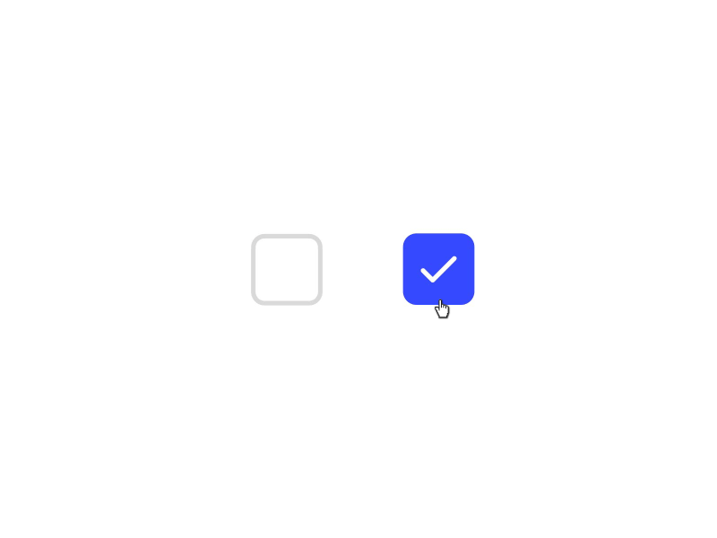
8. Comment
Comments display user-generated content, such as feedback or replies, arranged chronologically. They are common in social media feeds, blogs, and discussion forums, fostering interaction and community engagement.
9. Döner Menu
A variation of hamburger menus, döner menus consist of three lines of different lengths stacked vertically. They often represent filter groups or settings, providing a compact way to access additional options.
10. Dropdown
Dropdown menus reveal a list of options when clicked, allowing users to select one item from multiple choices. Despite some criticism regarding usability, they remain a prevalent element in forms and navigation. An example of dropdown behavior can be viewed here.
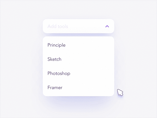
11. Feed
Feeds display real-time updates of user activity, content, or notifications. Social media platforms like Twitter exemplify this, presenting a continuous stream of posts, images, or videos.
12. Form
Forms are structured interfaces for collecting user input, such as shipping details or survey responses. They typically consist of various input fields and submission buttons. See a sample form here.
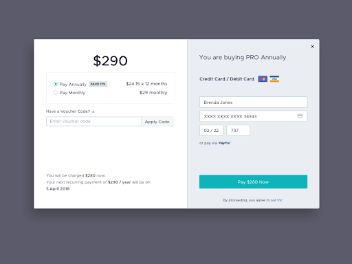
13. Hamburger Menu
The classic three-line icon, representing a menu, is widely used in mobile interfaces. It provides access to navigation links or additional options, especially in constrained screen spaces.
14. Icon
Icons are visual symbols that communicate actions or content quickly. Well-designed icons improve clarity and usability, guiding users efficiently. For icon design tips, check out this comprehensive guide.
15. Input Field
Input fields are areas where users can enter data, such as search queries or form responses. They are fundamental to user interaction, whether for login screens, search bars, or data entry.
16. Kebab Menu
Comprising three vertical dots, the kebab menu groups additional options or settings in compact form, often appearing in mobile or compact layouts.
17. Loader
Loaders inform users that a process is ongoing, preventing confusion during data retrieval or processing. They come in various forms, from spinning circles to progress bars. An animated loader example is here.
18. Meatballs Menu
Similar to the kebab menu, the meatballs menu uses three horizontal dots to indicate more options. Clicking reveals additional actions or settings.
19. Modal
Modals are overlay windows that demand user interaction before returning to the main interface. Commonly used for confirmations or alerts, they focus user attention on critical tasks, such as confirming deletions. An example modal appears here.
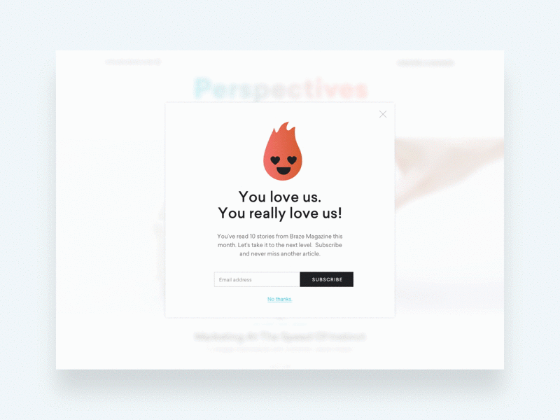
20. Notification
Notifications alert users to new messages, updates, or errors. They often appear as small badges or pop-ups, providing immediate feedback or prompts for action.
21. Pagination
Pagination divides large content sets into multiple pages, aiding navigation and content organization. Usually found at the bottom of lists or articles, it helps users understand their position within a dataset.
22. Picker
Date and time pickers simplify selecting temporal data. They ensure consistent formatting and ease of use, especially on mobile devices. An example is available here.
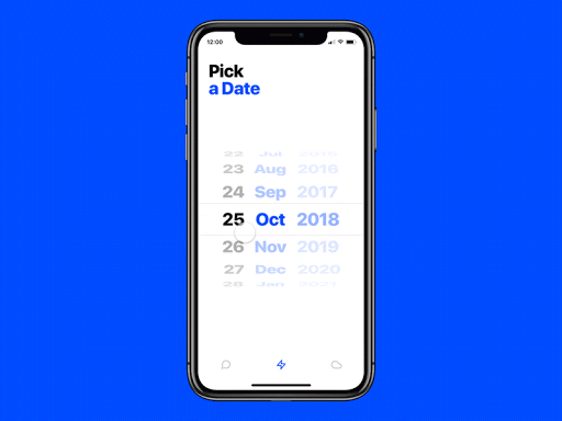
23. Progress Bar
Progress bars visually represent the completion status of multi-step processes like checkout procedures, allowing users to track their progress and anticipate completion.
24. Radio Buttons
Unlike checkboxes, radio buttons permit only a single selection within a group. They are ideal for mutually exclusive choices, such as selecting a payment method. See how they function here.
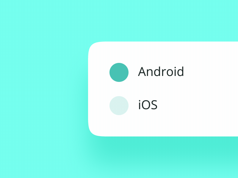
25. Search Field
Search fields, often accompanied by icons like magnifying glasses, enable users to find specific content within a system or website quickly.
26. Sidebar
A sidebar provides auxiliary navigation or content, positioned on the side of a page. It can be permanently visible or toggleable, helping organize complex interfaces.
27. Slider Controls
Sliders allow users to select values or ranges by dragging a handle along a track. They are commonly used for volume, brightness, or price range adjustments.
28. Stepper
Steppers enable users to increment or decrement a value in predefined steps, useful in quantity selectors or settings adjustments.
29. Tag
Tags categorize or label content, making it easier to browse or filter related items. They are widely used on blogs, e-commerce sites, and social media.
30. Tab Bar
Typically found at the bottom of mobile screens, tab bars provide quick access to primary sections of an app, enhancing navigation efficiency. See a typical tab bar in action here.
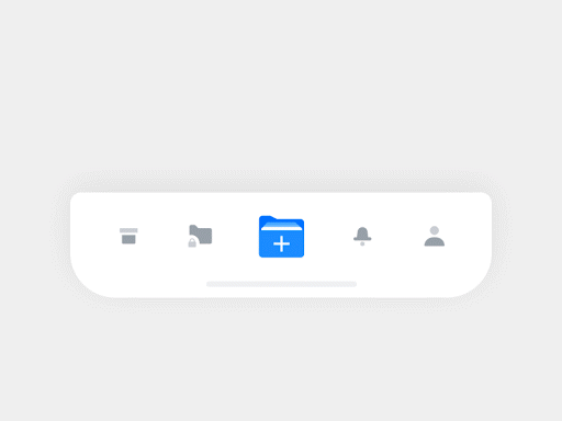
31. Tooltip
Tooltips offer brief hints or explanations when users hover over or focus on an element, improving understanding without cluttering the interface.
32. Toggle
Toggles act as on/off switches, allowing users to activate or deactivate features or settings easily.
Final Thoughts
Mastering these core UI elements is essential for designing interfaces that are intuitive, accessible, and engaging. Staying informed about best practices and emerging trends ensures your designs meet user expectations and stand out in the digital landscape. Whether you’re developing a complex application or a simple website, these components form the building blocks of effective user experiences.
If you’re interested in expanding your skills further, consider exploring resources on responsive design here or learning how to launch your own web design venture with this comprehensive startup guide.
FAQ
1. What are UI elements?
UI elements are the interactive parts of an app or website, including buttons, icons, menus, and input fields. They enable users to communicate with and navigate through digital products efficiently.
2. Can you give examples of common UI components?
Yes, examples include breadcrumbs, checkboxes, dropdown menus, forms, icons, input fields, notifications, and many others, each serving specific roles in user interaction.
3. What are the main categories of UI design components?
UI components are typically grouped into four categories: input controls (like input fields and checkboxes), navigational elements (such as tab bars and hamburger menus), informational displays (like notifications and tooltips), and containers (to organize related content).