Creating visually appealing and user-friendly websites hinges on more than just stunning graphics and compelling content. One of the foundational pillars of effective web design is alignment — the strategic placement of elements to establish order, clarity, and professionalism. Proper alignment guides visitors seamlessly through your site, enhances readability, and reinforces your brand’s credibility. By understanding and applying core alignment principles, designers can craft websites that are not only beautiful but also highly functional. This guide explores the different types of alignment, their significance, and practical tips to implement them effectively across various web elements.
Introduction
While many focus on the aesthetic appeal of a website, the significance of proper element placement often goes unnoticed. Visual harmony and consistency in layout are crucial for making a website intuitive and engaging. Research indicates that approximately 94% of users’ first impressions are influenced by design quality, emphasizing the importance of visual elements such as text, images, colors, and videos. A well-structured site builds trust, appears credible, and encourages visitors to explore further, which directly impacts conversion rates.
However, layout organization extends beyond aesthetics. Proper alignment ensures that content is easy to follow, contributes to a cohesive look, and enhances overall user experience. It helps create a sense of order and hierarchy, making your website not just attractive but also intuitive to navigate. Working with experienced web design professionals can ensure that alignment, spacing, and visual hierarchy are thoughtfully executed—leading to a more engaging and trustworthy online presence.
What is alignment in web design?
Alignment is a fundamental concept that involves positioning various elements within a web page in a way that creates balance and directs the viewer’s attention. It determines where to place objects, text, images, and other components to establish visual connection and hierarchy. Proper alignment not only makes a site look polished but also simplifies navigation and improves comprehension.
In practice, alignment involves choosing how elements relate to each other—whether they are centered, left-justified, right-justified, or arranged asymmetrically to achieve a desired aesthetic. This principle ensures that different sections of a website relate harmoniously, making the entire layout appear organized and professional. It’s essential to understand that alignment is not solely about symmetry; sometimes, asymmetrical arrangements can produce dynamic and balanced designs.
In this article, we delve into various alignment types, principles, and practical implementation strategies to help you craft well-organized, visually appealing web pages. Whether you’re designing for desktop or mobile, mastering these fundamentals is key to delivering a seamless user experience.
Understanding Alignment in Web Design
Having a clear grasp of alignment principles is highly valued in the web design industry. When a website’s layout is thoughtfully organized, it signals professionalism and enhances usability. Proper alignment makes content easier to scan and understand, which increases user satisfaction and engagement.
Strategic alignment can improve readability, facilitate navigation, and boost SEO effectiveness. For instance, aligning text and images consistently across pages creates a cohesive experience, encouraging visitors to stay longer. Implementing alignment correctly also simplifies responsive design, ensuring your website looks great on all devices—be it a large desktop monitor or a small smartphone.
Arrangement of visual elements involves positioning texts, images, videos, and buttons in a way that promotes clarity and focus. This often means placing key content where users naturally look first, such as at the top or center of the page, and maintaining adequate spacing to prevent clutter. Proper alignment highlights vital features and ensures a smooth transition between sections, making your site more inviting and easier to explore.
The importance of alignment in web design
Aligning webpage components is more than a visual detail; it’s a strategic tool that enhances overall site quality. Correct alignment contributes to a consistent, professional appearance and helps establish a cohesive user interface. When elements are properly aligned, users find it easier to process information, leading to increased trust and credibility.
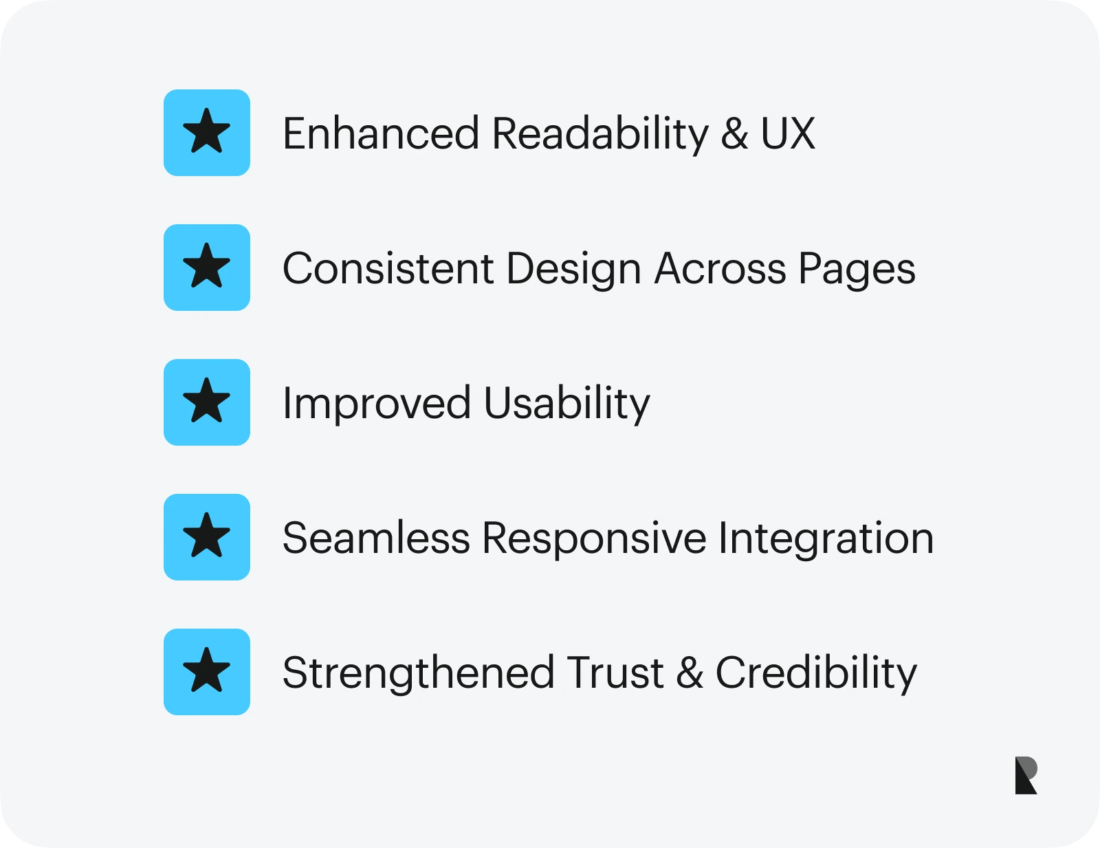
Benefits of effective alignment include:
Enhanced readability and user experience
Carefully aligned text and content blocks facilitate easier reading and comprehension. Proper line spacing, consistent margins, and alignment of headings with body text guide visitors naturally, reducing cognitive load. This streamlined presentation encourages users to engage more deeply with your content and take desired actions.
Uniform design across pages
Maintaining consistent alignment throughout your website creates a unified look. When headers, navigation menus, and footers align properly, it reinforces a sense of order and professionalism. This consistency assures visitors of your site’s reliability and encourages them to explore more pages.
Improved usability
Clear, aligned interfaces make navigation intuitive. Users can quickly locate menus, buttons, and important information, resulting in a more satisfying browsing experience. Well-aligned elements also help prevent confusion and reduce bounce rates.
Responsive design compatibility
Proper alignment simplifies the adaptation of your website to different screen sizes. Elements that are consistently aligned adapt more easily to mobile devices, tablets, and desktops, ensuring a seamless experience regardless of device. This adaptability is critical in today’s multi-device landscape.
Building trust and authority
A neatly structured website appears more professional and trustworthy. When content is organized logically and visually, visitors are more likely to trust your brand and engage with your offerings. Even if your site contains valuable information, poor presentation can diminish its perceived credibility.
Types and Principles of Alignment
Alignments are primarily categorized into horizontal and vertical types, each with specific subcategories suited to different design needs. Understanding how to utilize these types effectively allows you to craft visually cohesive and easily navigable websites.
Different Types of Alignment
Alignment types help organize content logically and aesthetically. Mastering these ensures your website adapts well to various screen sizes and maintains visual harmony.
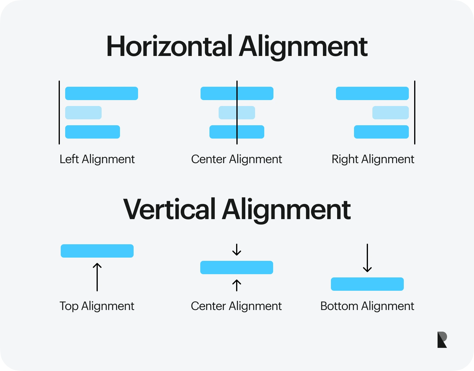
Horizontal Alignment
Horizontal alignment determines how elements are positioned along the left-right axis within a container. It includes:
1. Left Alignment
Positioning elements along the left margin, this is the most common and natural alignment for Western languages. Left-aligned text and images create a clean, predictable reading flow, especially for paragraphs and body content. It’s ideal for most content types, providing a familiar structure to users.
2. Right Alignment
Aligns elements to the right margin. This is less common but useful for specific design accents, such as side notes or captions. It’s also employed in languages that read from right to left. Using right alignment can create visual interest when balanced appropriately.
3. Center Alignment
Centers content horizontally within a container. This style is often used for headings, titles, or focal images, as it draws attention and creates balance. Centered elements can serve as visual anchors, especially in landing pages or call-to-action sections.
Edge Alignment
Refers to content aligned precisely to the edges of containers or sections, often used for images or banners that need to span full width or align flush with page borders.
Vertical Alignment
Vertical alignment positions elements along the top-bottom axis. It includes:
1. Top Alignment
Aligns elements to the top of their container. This is common for headers, navigation menus, or images that need to be prominent at the start of a section.
2. Bottom Alignment
Positions elements toward the bottom of their container. Useful for footer content or aligning labels with input fields.
3. Center Alignment
Vertically centers elements within a container, ideal for icons, buttons, or text that need to be balanced in the middle of a section or component.
Principles of Alignment in Design
Proper alignment is guided by key principles to enhance clarity and aesthetics:
- Proximity: Group related items by placing them close together, signaling their relationship.
- Consistency: Use uniform alignment styles across pages to create a predictable and professional look.
- Balance and Proportion: Distribute visual weight evenly, whether symmetrically or asymmetrically, to foster harmony.
- Visual Hierarchy: Use alignment to emphasize important elements, guiding users through your content.
- Legibility: Ensure text and content are aligned for optimal readability, reducing eye strain and improving comprehension.
Implementing Alignment in Various Elements
Alignment isn’t limited to text; it’s equally critical for images, groups of elements, and layout grids.
Typography and Grid Systems
Using grid frameworks like Bootstrap or Tailwind CSS, designers can align texts and components systematically. For example, body text is typically left-aligned, while headlines may be centered for emphasis. Modular grids help organize complex layouts, ensuring consistency across your site.
Text Alignment
Align headings and paragraphs to establish a clear visual hierarchy. Consistent line spacing and font choices improve legibility, making your content accessible and engaging.
Image Placement
Align images properly to create focal points and maintain visual balance. Centering images works well for featured visuals, while aligning to the top or right integrates images seamlessly within text blocks.
Groups of Elements
Containerizing groups of related items, such as navigation menus or product listings, ensures they stay organized. Using CSS grid or flexbox allows precise control over their alignment, spacing, and responsiveness.
Common Practices and Troubleshooting Alignment
Proper alignment is vital, but mistakes can occur, leading to cluttered or unprofessional layouts. Typical issues include inconsistent margins, misaligned text, or irregular spacing.
Common Alignment Mistakes and Solutions
To avoid common pitfalls, adhere to best practices such as maintaining uniform margins, using grid systems, and verifying alignment across devices. Resources like a detailed guide on javascript web development browserstack can help developers refine their layout techniques.
Wrapping Up
Alignment is a cornerstone of effective web design, impacting aesthetics, usability, and credibility. When applied thoughtfully, it creates harmony, emphasizes key content, and guides visitors effortlessly through your site. Whether you’re working on a simple landing page or a complex e-commerce platform, mastering alignment principles ensures your website communicates clearly and professionally. By paying attention to how elements relate and interact visually, you’ll craft websites that are not only beautiful but also highly functional and engaging.
For further insights into web development and design strategies, exploring resources like how to get more web design work for your freelance web design business accessally can be highly beneficial.