Building a professional, dynamic website that adapts seamlessly to all devices is a fundamental goal for web developers today. Bootstrap, as a widely adopted open-source CSS framework, simplifies this process by offering a collection of pre-designed components, layout tools, and responsive features. Originally created by Twitter in mid-2010, Bootstrap has become an indispensable resource for developers aiming to streamline their workflow and produce visually appealing, consistent websites. Its versatility and user-friendly nature make it an excellent choice whether you’re a seasoned coder or just starting in web development.
To fully harness Bootstrap’s capabilities, mastering the principles of responsive design and understanding modern frameworks is crucial. Using frameworks effectively can reduce repetitive work, ensure uniformity across projects, facilitate cross-browser compatibility, and accelerate the development process. For instance, by learning how to implement a responsive grid system, developers can create layouts that automatically adjust to various screen sizes, enhancing user experience across desktops, tablets, and smartphones.
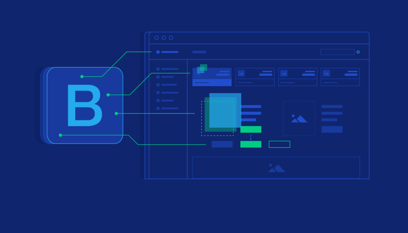
Bootstrap’s active open-source community provides extensive support, making it easier for newcomers to find solutions and improve their skills. Central to Bootstrap’s layout system is its grid, a flexible 12-column structure that enables precise control over content placement. The framework also includes a variety of styled elements such as images, buttons, and navigation bars, which can be customized to align with specific branding needs.
Features of Bootstrap Framework
Bootstrap offers a comprehensive suite of features designed to accelerate and enhance web development:
- Cross-browser Compatibility: Ensures a consistent appearance and functionality across all major browsers like Chrome, Firefox, Safari, and Edge, reducing the need for browser-specific adjustments.
- Customizable Themes: Allows developers to tailor the framework’s look through variables and customization options, aligning design with brand identity.
- JavaScript Plugins: Built-in interactive components such as carousels, dropdown menus, tooltips, and modals enable rich user interactions without extensive coding efforts.
- Responsive Grid System: The core 12-column layout adapts fluidly to different screen sizes, providing a solid foundation for responsive design.
- Pre-styled Components: Ready-to-use elements including buttons, forms, navigations, and modals, which can be easily customized with CSS or SASS.
These features collectively make Bootstrap a versatile and powerful toolkit that simplifies the creation of professional websites. Its responsiveness, combined with extensive customization options, helps developers meet diverse project requirements efficiently.
Core Benefits of Using Bootstrap
Adopting Bootstrap offers numerous advantages that streamline development workflows and improve project outcomes:
- Responsive Design Creation: Its mobile-first approach ensures websites function flawlessly on devices of all sizes through a flexible grid and adaptable components, eliminating the need for complex media queries.
- Time-saving Components: Pre-designed elements and templates minimize manual coding, enabling rapid prototyping and deployment.
- Cross-browser Consistency: Built-in normalization and styling guarantee that sites look uniform across all browsers, enhancing user experience and simplifying debugging.
- Consistent Design and Code Standards: Using Bootstrap enforces uniformity, facilitating collaboration within teams and maintaining a cohesive visual identity across projects.
These benefits make Bootstrap an essential framework for developers committed to building high-quality, user-friendly websites efficiently.
Why Should IT Professionals Learn Bootstrap?
In today’s fast-paced digital landscape, Bootstrap is a vital skill for web developers and IT professionals. Its ease of customization via utility classes and SASS support allows for quick adjustments to meet specific project needs, significantly speeding up development cycles. Bootstrap’s robust prototyping capabilities enable developers to transform ideas into functional layouts swiftly, making it ideal for iterative design processes.
Moreover, its mobile-first design approach ensures websites are optimized for all devices, providing a seamless user experience. The framework’s active community and comprehensive documentation support continuous learning and problem-solving, making it easier for developers to stay up-to-date with the latest trends and techniques. Learning Bootstrap empowers you to craft professional, adaptable websites and stay competitive in the evolving field of web development. For further insights on enhancing your online presence, consider exploring strategies to improve your web design quality through expert guidance at this resource.
Key Features of Bootstrap 5 (Latest Version)
Bootstrap 5 introduces numerous improvements that make it more modern, efficient, and easier to use:
- Enhanced Documentation: Expanded examples and clearer guidance facilitate faster learning and implementation.
- Improved Grid System: Advanced support for Flexbox enables more flexible and precise layout control.
- Updated JavaScript Components: Transition from jQuery to vanilla JavaScript for better performance and reduced dependencies.
- Utilities API: Simplifies the creation of custom utility classes, allowing for more tailored styling solutions.
Performance enhancements include faster loading times and smaller file sizes, thanks to optimized CSS and JavaScript files designed for modern browsers. Developers are encouraged to review the official Bootstrap documentation for detailed instructions and best practices.
Advantages of Using Bootstrap
Implementing Bootstrap in your projects offers multiple benefits:
- Uniform Framework: Maintains consistent look and feel across all pages and components, reducing discrepancies.
- Extensive Customization: Easily modify themes and components to match branding and design requirements.
- User-Friendly and Accessible: Designed to be approachable for developers of various skill levels, with extensive support resources.
- Responsive Layouts: The robust 12-column grid ensures adaptability across devices.
- Active Support Community: Regular updates, tutorials, and forums provide ongoing assistance and inspiration.
These advantages contribute to faster development cycles, better maintainability, and higher-quality websites that meet modern standards.
Common Bootstrap Mistakes
Despite its strengths, improper use of Bootstrap can lead to issues like bloated code, inconsistent layouts, or maintainability challenges. Common pitfalls include:
- Misunderstanding Framework Capabilities: Relying solely on default styles without customization results in generic designs. It’s important to leverage Bootstrap’s customization options to create unique branding.
- Directly Overwriting Core CSS: Editing Bootstrap’s core files can complicate updates. Instead, developers should override styles using separate CSS files or SASS variables.
- Overusing Features Without Context: Incorporating all components indiscriminately increases code bloat and impacts performance. Selectively using only necessary features leads to cleaner, faster sites.
- Poor JavaScript Management: Loading all JavaScript plugins unnecessarily can slow down the website. Optimize by including only what’s needed.
- Neglecting Modern Development Tools: Ignoring build tools like Webpack or preprocessors like SASS limits customization potential. Utilizing these tools enables more efficient workflows.
Avoiding these common mistakes ensures that your Bootstrap-based projects are efficient, maintainable, and visually compelling.
Why Should You Use Bootstrap?
Bootstrap simplifies the development process, allowing you to create attractive, responsive websites with less effort. It provides a solid foundation that accelerates prototyping, ensures cross-browser compatibility, and promotes consistent design standards. By mastering Bootstrap, you can stay ahead in a competitive industry, delivering high-quality projects efficiently.
Start by building a strong understanding of responsive design principles and modern frameworks. Enroll in programs like QuickStart’s Software Engineering Bootcamp to gain hands-on experience with Bootstrap and related technologies, equipping yourself with the skills necessary for successful web development. Discover more about how structured training can transform your career and project outcomes here.