Designing an engaging and user-friendly interface often hinges on effective visual organization. Card-based layouts have become a fundamental component in modern UI design, enabling designers to present content in a clear, organized, and aesthetically pleasing manner. Whether you’re creating a social media feed, an e-commerce catalog, or a dashboard, understanding the principles of card design can significantly enhance user experience and interface consistency.
In this comprehensive guide, you’ll learn what UI cards are, their core components, practical examples, optimal use cases, and step-by-step instructions to craft compelling card designs. Additionally, you’ll discover how well-implemented card layouts can improve responsiveness, readability, and overall usability. For further insights into web design trends and their impact on performance, explore resources on which Perth agency excels in web design and how web design influences SEO and page speed.
What is Card Design in UI?
If you’ve ever browsed Netflix, swiped through Tinder, or scrolled social media feeds, you’ve interacted with card-based interfaces. In UI design, a card is a rectangular or square container that encapsulates a discrete piece of content. This approach helps organize information visually, making complex data more approachable.
According to the Nielsen Norman Group, a card is a UI pattern that groups related information within a flexible-sized container resembling a playing card. Each card serves as a self-contained unit that signals to users which information belongs together, enhancing clarity and navigation.
Anatomy of a UI Card
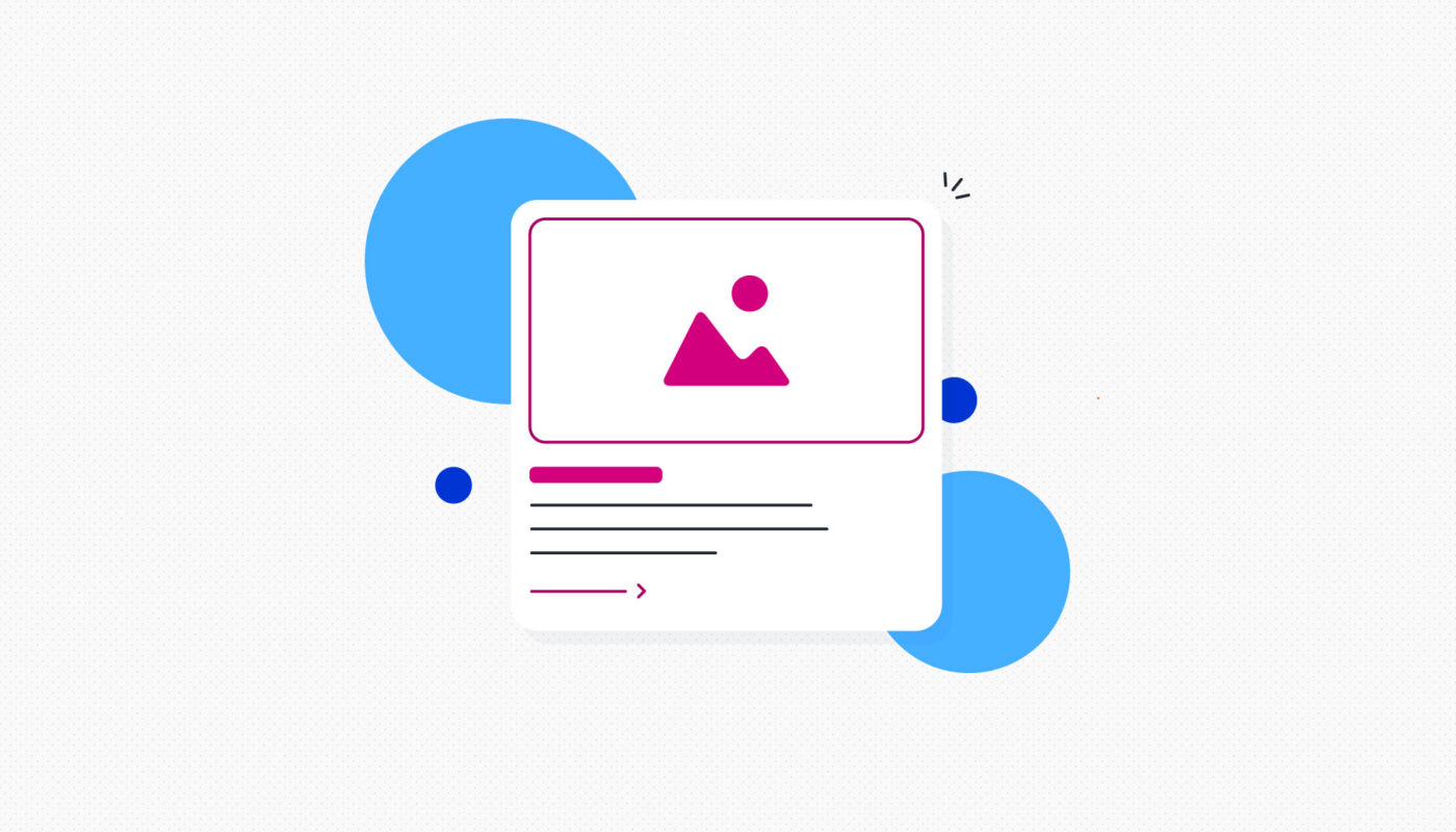
A typical UI card includes:
- An image or visual element
- A headline (and sometimes a subheadline)
- A brief description or summary
- A call-to-action (CTA) button or link
Cards are interactive; clicking or tapping on them often leads to more detailed content, functioning as gateways to further information or actions.
Examples of Effective UI Card Usage
- Streaming Service Home Screens: Platforms like Now TV display each show within its own card. Clicking a card reveals more details, and a CTA button directs users to stream content.
- Health and Fitness Apps: The Fitbit app uses cards to represent various metrics such as sleep, activity, or zones. Tapping a card provides a detailed view.
- Social Media Feeds: Posts are presented within individual containers, making it easy to scan and engage.
- E-commerce Platforms: Online stores like Etsy or ASOS showcase products in card formats, highlighting images, prices, and quick actions.
- Project Management Tools: Apps like Trello or Asana use cards to represent tasks, enabling drag-and-drop organization.
- Dating Apps: Profiles are displayed as cards that users can swipe or tap for more info.
When to Use Card Design
Card layouts excel when displaying heterogeneous content types—such as images, text, and interactive elements—on a single page. They are particularly effective in:
- Dashboards with varied data visualizations (charts, stats, summaries)
- Browsing interfaces where users need an overview before making a selection
- Social media feeds and product galleries
- Platforms emphasizing browsing over searching
However, for specific searches or detailed filtering, list formats may be more appropriate.
Benefits of Card Design in UI
Implementing card layouts offers numerous advantages:
- Versatility: Suitable for diverse content types across numerous platforms.
- Responsiveness: Easily adaptable to different devices and screen sizes, ensuring a seamless experience.
- Scannability: Breaks down complex information into digestible, bite-sized pieces.
- Consistency: Maintains a uniform look and feel across different content sections, improving usability.
- Aesthetic Appeal: Creates a clean, organized, and visually balanced interface.
How to Design Effective UI Cards
Follow this step-by-step process to create compelling card designs:
1. Define Your Content
Determine what information each card will showcase. Consider the purpose: for instance, a user profile card might prioritize imagery, whereas a blog summary might focus on headlines and snippets.
2. Sketch the Layout
Use sketches or wireframes to experiment with element placement—deciding whether the image goes on top or side, where the CTA should be, etc. This planning ensures a logical flow and balanced composition.
3. Design Your Cards
Leverage design tools like Figma, Sketch, or Adobe XD to build your prototypes. Start with simple shapes to outline containers, then add text, images, and buttons.
4. Style Your Cards
Apply visual styles—colors, typography, shadows—to enhance appeal and accessibility. Ensure sufficient contrast and legibility. For guidance on effective color schemes, refer to this complete color theory guide.
5. Define Interactions
Consider how users will interact with your cards. Will there be hover effects, clickable expansion, or swipe gestures? Incorporate feedback mechanisms like hover states or animations to improve usability.
6. Test Across Devices
Prototype and test your designs on various screens to verify responsiveness and functionality. Adjust as needed to optimize performance and user experience.
Final Thoughts
Well-crafted UI cards enable your interface to display diverse content clearly and attractively. They contribute to a clean, organized aesthetic while fostering intuitive navigation. By understanding their anatomy, best practices, and strategic application, you can elevate your UI design to deliver engaging, user-centric experiences. For more insights into UI design principles, explore additional resources such as responsive grid systems and best practices for mobile interfaces.