Creating intuitive and visually appealing user interfaces often involves leveraging modular components that adapt seamlessly across various devices and screen sizes. Among these, the card has emerged as a versatile element that encapsulates related information in a concise, clickable format. This comprehensive guide explores the fundamental aspects of card components, their design properties, practical applications, and how they enhance user experience in modern web and app interfaces.
In recent years, the popularity of modular UI patterns has surged, driven by the need for responsive and flexible designs. The card component, resembling a small, contained unit, serves as a visual and functional building block that encourages user interaction—prompting clicks or taps to reveal more detailed content. Its design draws inspiration from physical cards, utilizing borders, background variations, and shadows to signify clickability and group related information effectively.
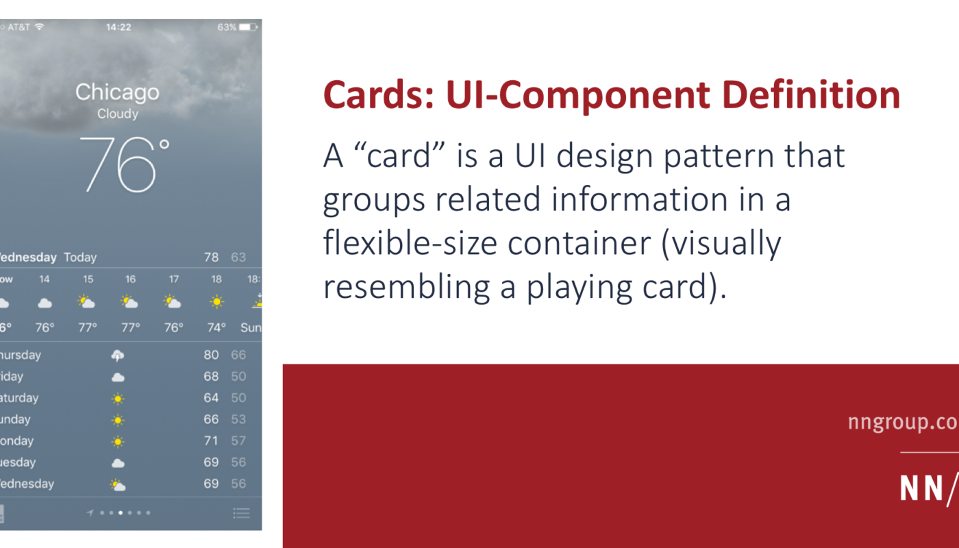
A typical card contains a mix of media and text elements, such as images, titles, summaries, timestamps, hashtags, and secondary actions like social sharing buttons. For example, a wireframed card might include an image at the top, followed by a headline, a brief description, a date, and interactive icons. Visual cues like borders and drop shadows help distinguish each card from the background, while optional rounded corners and spacing contribute to a clean aesthetic. An example wireframe illustrating such a card is shown below:

Cards are often associated with flat design 2.0, which combines simplicity with subtle depth cues to indicate interactivity. This approach reintroduces visual depth—via shadows and borders—while maintaining a clean, minimalist look. Major platforms like Google’s Material Design and Twitter’s card system have popularized this pattern, emphasizing its effectiveness in organizing heterogeneous content.
Key Properties of Card Components
1. Grouping Related Information
Cards serve as containers that organize multiple related pieces of content into a single, digestible unit. Whether showcasing an article, product, or social post, each card typically includes different media types—images, text, icons—linked by a common concept.
2. Summarization with Links to Details
A card provides a brief overview or snippet of content, acting as a high-level entry point that entices users to explore further. Instead of displaying full details, cards include links or buttons directing users to dedicated pages for more comprehensive information.
3. Visual Resemblance to Physical Cards
Design elements such as borders, background colors, and shadows create a visual analogy to physical cards. These cues establish a sense of grouping, making it clear that the enclosed items belong together. Drop shadows often serve as signs of clickability, especially when the entire card responds to user interaction.
4. Flexible Layouts
When multiple cards are displayed in a grid or list, they accommodate varying content types and sizes. Some cards might feature extensive text or images, while others are more minimal. Typically, the width remains fixed, but height adjusts dynamically to content, enabling a responsive and adaptable layout.
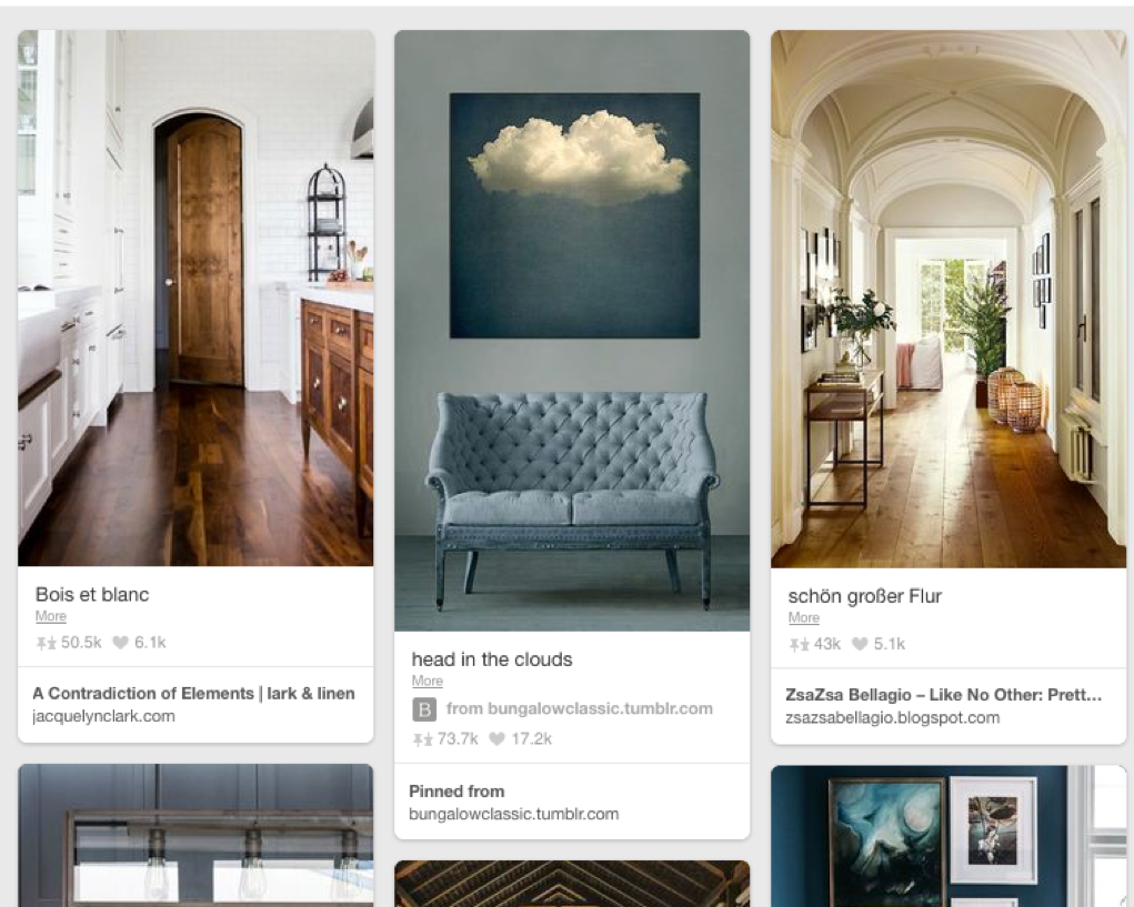
An example of a card-based layout is Pinterest, which demonstrates how cards can effectively group diverse media and information:
The Relationship Between UI Cards and Hypertext Models
The concept of cards dates back to early hypertext systems, where content was divided into discrete, page-sized units—an approach that contrasted with continuous scrolling. This “deck-of-cards” model allowed users to navigate content by flipping through distinct pages, similar to turning physical cards. Modern digital cards adapt this idea, presenting content in small, manageable chunks that can be stacked or laid out in grids, rather than full-screen elements.
For instance, the iOS weather app displays forecasts in full-screen cards that users swipe through, exemplifying the older model. Contemporary UI cards, however, are smaller, often arranged in multi-card layouts, emphasizing modularity and visual organization over full-page navigation.
This evolution illustrates two core principles: first, that many design trends are iterative and revisited with new twists; second, that foundational usability principles endure, guiding effective interaction design over decades.
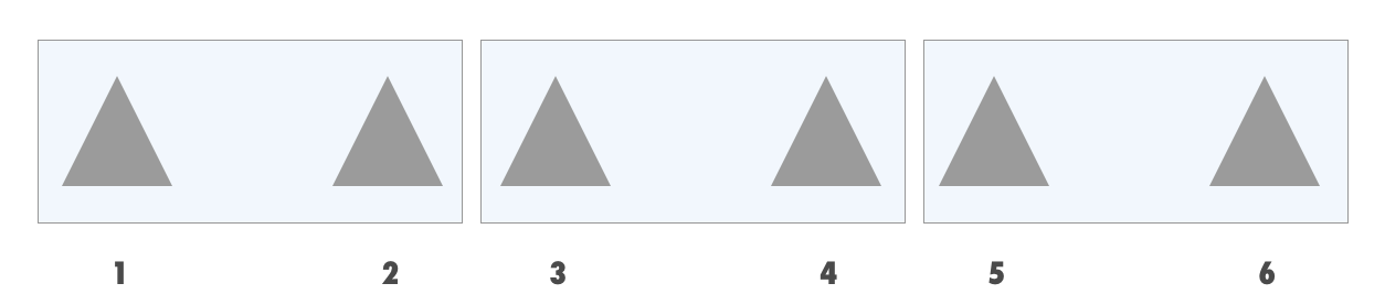
The Principle of Common Regions in Visual Grouping
Cards leverage the “common regions” principle from cognitive psychology, which states that items enclosed within a shared boundary are perceived as related. This principle can override proximity-based grouping, allowing designers to create clear visual associations through borders and background colors. For example, a set of triangles with shared borders and backgrounds are perceived as grouped, even if they are spatially separated, demonstrating how visual boundaries reinforce content relationships.
Here’s a visual explanation:
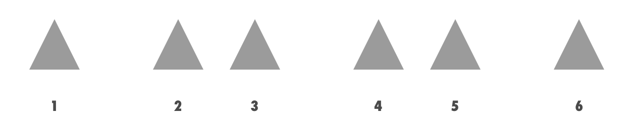
Top Image: Triangles close together are perceived as grouped due to proximity.
Bottom Image: Borders and background colors explicitly group triangles, regardless of their spatial arrangement.
When to Use Cards Effectively
Cards excel in browsing scenarios where users explore multiple items or collections rather than searching for specific content. They are particularly suitable for displaying heterogeneous content types—such as dashboards, social feeds, or media galleries—where each item differs in structure or media.
However, they are less effective for:
- Priority-based content, where list hierarchy emphasizes importance.
- Scannability needs, since list views with predictable layouts facilitate quick information retrieval.
- Comparison tasks, as inconsistent card structures can hinder side-by-side evaluation.
Research indicates that list layouts are more efficient for quick scanning, especially when users need to locate specific details like prices or dates. For example, a list view allows users to quickly compare prices across products, whereas card layouts may require more effort due to variable formatting.
Visual comparisons show how list views support rapid scanning:

- Left: Card layout makes it difficult to quickly find specific information like price.
- Right: List layout arranges items predictably, supporting faster scanning.
Furthermore, eye-tracking studies reveal that users often revisit multiple items when comparing options in inconsistent layouts, emphasizing the importance of visual consistency.
Best Practices for Designing Card Components
- Use cards to display heterogeneous content, such as dashboards or social media feeds.
- Maintain visual consistency among cards when comparing items.
- Use clear visual cues—borders, shadows, background colors—to signify clickability.
- Ensure the entire card is interactive to maximize touch zones and improve usability, especially on mobile devices.
- Avoid overloading cards with too much information; keep summaries concise and focused.
- In cases of homogeneous content, consider list or grid layouts for better scannability and easier comparison.
In summary, cards are a powerful UI pattern for grouping related information into digestible, interactive units. They enhance user engagement and content organization, especially when tailored to the context of browsing, heterogeneous content types, and responsive design principles. For more insights into effective web design practices, explore which are the leading digital agencies specializing in web design and who is currently the top coach for web design businesses.