


Achieving a visually captivating and harmonious website can be a daunting challenge for developers and marketers alike. The secret to creating a balanced aesthetic lies in understanding how to effectively distribute colors across your design elements. This is where the classic 60/30/10 rule comes into play—an age-old principle that has proven its worth in both interior and web design. By applying this straightforward yet powerful guideline, you can elevate your website’s visual appeal, improve user experience, and strengthen your brand identity with ease. Let’s delve into how this rule works, its benefits, and practical ways to incorporate it into your projects.
What is the 60/30/10 Rule?
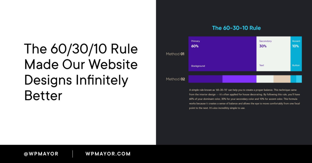
The 60/30/10 rule is a time-tested concept originating from interior decorating, now widely adopted in digital design. It recommends dividing your color palette into three distinct proportions to achieve a balanced look: 60% for the dominant hue, 30% for the supporting color, and 10% for accent shades. This structured approach helps guide the viewer’s eye naturally through your content, establishing a clear visual hierarchy.
The dominant color typically covers large areas like backgrounds or main sections, providing a neutral or cohesive foundation. The secondary color enhances the design by supporting the primary hue, often used in headers, sidebars, or secondary elements. The accent color is reserved for highlighting important features such as call-to-action buttons, links, or key icons, drawing immediate attention.
You can explore more about how modern web design incorporates innovative color strategies at this resource, which discusses advanced design techniques for emerging digital industries.
Benefits of Applying the 60/30/10 Rule
Designing a website that captures and retains visitor attention is no easy feat. In an era overwhelmed with digital content, establishing a memorable brand presence hinges on effective use of color. Recognizing a brand by its signature palette is a common experience, which underscores the importance of strategic color application.
Enhances Visual Appeal
A well-balanced color scheme boosts your site’s aesthetic value, making it more inviting and professional. Hipcamp’s website exemplifies this, combining a light-grey background with vibrant green accents inspired by nature, creating a cohesive and attractive look that resonates with its outdoor theme.
Improves User Experience
Establishing a clear visual hierarchy simplifies navigation, helping users find information effortlessly. Notice how the phrase “Find yourself outside” on Hipcamp’s homepage immediately captures attention with its green hue and bold font, guiding users toward the search function seamlessly.
Reinforces Brand Identity
Consistent color use solidifies your brand’s visual language. As seen on Hipcamp, the recurring green shades foster brand recognition and evoke trust, especially when aligned with their nature-focused messaging.
Boosts User Engagement
Visually appealing websites motivate visitors to explore further. The balanced use of colors invites interaction—whether it’s clicking a button or scrolling through content—leading to higher engagement and conversions.
Simplifies Design Decisions
Applying the 60/30/10 rule offers a straightforward framework that streamlines the creative process. Rather than experimenting randomly, designers can confidently allocate colors, maintaining consistency across pages. For instance, the simplicity of Hipcamp’s palette demonstrates how restraint can produce a sophisticated and cohesive design.
How to Implement the 60/30/10 Rule in Your Website
Adopting this rule involves a three-step process: selecting your color palette, testing and refining, and maintaining consistency.
1. Choose Your Colors and Apply Proportions
The 60% – The Foundation
Select a dominant color that aligns with your brand identity. This is often a neutral hue like white, black, or a subtle tone, used for backgrounds or large sections. Use tools such as Adobe Color to generate harmonious palettes that suit your brand.
The 30% – Supporting Role
Pick a supporting color that complements the primary hue without overpowering it. This color can be employed in headers, sidebars, or secondary content areas to add visual interest.
The 10% – Highlight
Reserve your accent color for key elements requiring emphasis, such as CTA buttons, links, or important notices. Ensure sufficient contrast for accessibility, and consider testing color combinations for readability.
2. Test and Adjust
After initial implementation, review your design critically. Gather feedback from users or colleagues, and analyze how the colors work together. Don’t hesitate to stand two meters back from your screen or view your site on different devices to assess overall harmony. Adjust proportions if necessary, ensuring that each color serves its intended purpose effectively.
3. Maintain Consistency
Apply the same color distribution throughout your entire website. Consistency reinforces your branding and provides a unified user experience. Extending this approach to your marketing materials can amplify brand recognition even further.
Note: When working with image-heavy pages, applying the rule can be more challenging. In such cases, sticking to neutral backgrounds and using accent colors for key elements can help maintain balance.
Real-World Examples
Seeing the 60/30/10 rule in action illustrates its practicality and effectiveness.
Canva


As a design platform, Canva demonstrates mastery of color balance. The site’s primary white background (60%) is complemented by varying shades of blue (30%) to add depth, and purple accents (10%) highlight interactive elements, creating an engaging user interface.
Alice Writes Copy

This website exemplifies a darker color scheme, with deep blue dominating (60%), supported by neutral greys (30%), and vibrant peach accents (10%) to draw attention to specific CTAs and features, maintaining visual harmony despite the bold palette.
MailChimp

MailChimp’s homepage showcases white as the dominating color, with natural tones from imagery supporting the secondary role, and the signature yellow as the standout accent, effectively guiding user focus.
Spotlight

Our own website for the Spotlight plugin employs a white background for clarity, with a light blue supporting hue and a vivid red accent to emphasize key areas, illustrating a straightforward application of the rule.
Revamp Your Website with the 60/30/10 Framework
If a full redesign seems overwhelming, you can still apply the rule gradually. Tools like Elementor’s Global Colors or Beaver Builder’s color palette options make it easy to adjust your palette without extensive coding. For those seeking a more comprehensive overhaul, partnering with a professional agency experienced in website design can ensure your colors are balanced perfectly, aligning with your branding goals.


(AI-Generated illustration)
Frequently Asked Questions About the 60/30/10 Rule
How does the 60/30/10 principle improve user interface design?
In UI design, this rule helps establish a clear visual hierarchy by assigning primary, supporting, and accent colors to different interface elements. The dominant hue sets the overall mood, the supporting color enhances navigation areas, and the accent draws attention to critical actions like buttons or icons, ultimately improving usability and aesthetic consistency.
Can the 60/30/10 rule be applied to character or product design?
Absolutely. In character design, the proportions guide the distribution of colors across clothing and features—60% for the main color, 30% for secondary elements, and 10% for highlights—creating a balanced and appealing look. Similarly, in product branding, this balance ensures visual harmony and brand recognition.
Are neutrals included in the 60/30/10 breakdown?
Yes. Neutral colors such as beige, gray, or white are often used as the dominant or supporting hues, providing a versatile backdrop that makes accent colors stand out. Their flexibility makes them a popular choice for establishing a neutral foundation or supporting role within the palette.
Final Thoughts
Implementing the 60/30/10 rule in your web design process offers a simple yet effective pathway to create visually harmonious and engaging websites. By thoughtfully selecting and balancing your color proportions, you enhance user experience, reinforce your branding, and simplify decision-making in your design workflow. Explore tools and examples to inspire your application, and consider consulting professionals for complex projects. Mastering this principle can transform your website from ordinary to extraordinary—so start experimenting and find that perfect color harmony for your brand.