
Creating a cohesive and memorable visual identity is fundamental for any successful brand or product. A well-crafted style guide serves as the cornerstone of this consistency, ensuring that every touchpoint with your audience reflects your brand’s unique personality and values. Whether you’re developing a new product or refining an existing one, understanding the intricacies of design standards can significantly streamline your workflow, save costs, and elevate the overall user experience.
In this comprehensive guide, we explore the critical components of a style guide, its purpose, and best practices for implementation. From typography and iconography to color schemes and branding elements, we cover everything you need to develop a professional and scalable visual language. Moreover, we highlight how leveraging the right tools can facilitate collaboration between designers and developers, making updates and maintenance more efficient. If you’re interested in how to create a compelling and practical style guide, keep reading to unlock the secrets of effective design systems.
What is a Style Guide?
A style guide is a detailed document that outlines the visual and stylistic standards used across a product or brand. It specifies how design elements such as typography, icons, colors, and components should be used to maintain visual harmony and brand recognition. Typically developed after the initial wireframing or prototyping phases, a style guide acts as a reference point for designers, developers, and content creators.
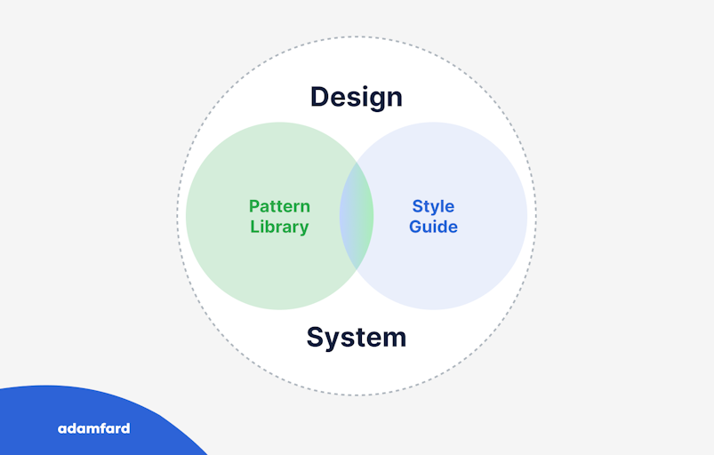
Think of a style guide as a blueprint that translates your brand’s personality into visual rules. It ensures that every interface, marketing material, and physical product maintains a consistent look and feel. Often, a style guide is considered an early version of a comprehensive design system, which further defines the relationships among elements and their appropriate use cases. For more insights into the design process, you can explore this detailed overview.
There are multiple approaches to when and how to create a style guide. The atomic design methodology advocates building all fundamental components first and assembling products from these building blocks. Conversely, some teams may choose to develop a style guide later, focusing initially on rapid validation of ideas without strict design standards.
Why Is Developing a Style Guide Important?
Implementing a style guide offers numerous advantages that contribute to the efficiency and quality of your design and development processes. Here are some of the most compelling reasons:
Time Efficiency
Having a repository of ready-to-use design elements means that you don’t need to recreate common components repeatedly. For example, whenever you need a “sign up” button, you can simply reference the style guide instead of designing it from scratch. Modern tools like Figma, Zeplin, and InVision allow you to save the code snippets for each element, enabling you to reuse them effortlessly across different screens and projects.
Cost Savings
Time saved translates directly into financial benefits. When design and development teams can quickly access and implement standardized elements, project timelines shorten, and expenses decrease. This streamlined workflow reduces the need for redundant work, making your processes more economical overall.
Consistency in Design and Code
Inconsistent design and implementation can lead to a disjointed user experience and increased maintenance efforts. A style guide enforces uniformity in visual elements such as buttons, icons, and typography, which helps in maintaining brand integrity. It also minimizes discrepancies in code, ensuring that the product looks and functions as intended across various platforms.
Improved Performance and Focus
By automating routine design and coding tasks, teams gain more time to concentrate on refining user experience, enhancing product logic, and innovating. This focus on quality over repetitive tasks results in a more polished and user-centric product.
Core Components of a Style Guide
A comprehensive style guide covers several key areas, each critical for establishing a consistent visual language:
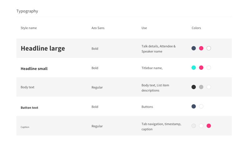
Typography
Typography guidelines include specifications for headings (H1, H2, H3, etc.), body copy, image captions, and the choice of typefaces. Generally, it’s advisable to limit your palette to one or two fonts to maintain simplicity and coherence. Consistent typographic hierarchy ensures clarity and improves readability across all interfaces.
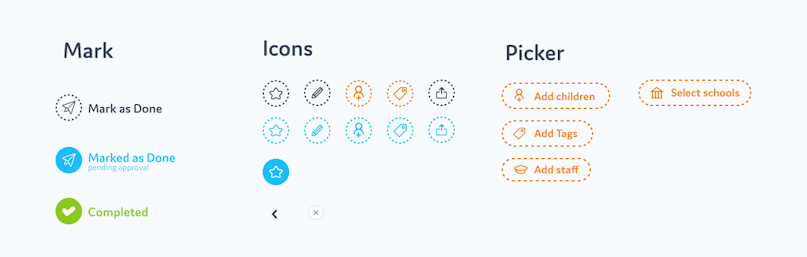
Iconography
Icons should be used consistently, with uniform line weights, fills, and style conventions. Recognizable and intuitive icons enhance user understanding and navigation. You can source icons from free repositories or commission custom designs for a more tailored look.
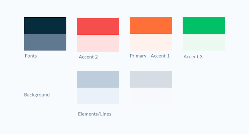
Color Palette
A well-defined color scheme typically includes 2-3 primary brand colors—such as base, accent, and neutral tones. Additionally, semantic colors like green for success or red for errors are essential for conveying status and feedback. For further insights on color usage in UI design, refer to this resource.
UI Components and States
Buttons, dropdowns, toggles, and other interface elements must adhere to a consistent style. It’s crucial to define their appearance and interaction states (hover, active, disabled) to ensure a seamless user experience.

Layout Grids
Grid systems organize content and ensure alignment across different screens and devices. Clear grid specifications help maintain visual harmony and responsive behavior.
Branding Elements
Logos and other branding assets should be versatile enough to adapt across various mediums and resolutions. For example, multiple logo versions (landscape, square, portrait) ensure compatibility with diverse applications, from web interfaces to physical merchandise.

What Should the Final Style Guide Look Like?
The most effective style guides are maintained within collaborative, easily accessible platforms. While PDFs or Google Docs can serve as initial references, they lack the flexibility needed for rapid updates and implementation. Instead, tools designed for design systems—such as storybook, Figma, InVision, Zeplin, or specialized solutions like Zerogear—are preferred.
These platforms enable real-time collaboration, allow developers to access code snippets directly linked to design elements, and facilitate global updates through components and styles. For instance, in Figma, using components and shared styles simplifies updating multiple instances simultaneously, which is vital for large or evolving projects.
Pro tip: Incorporate symbols (in Sketch) and components (in Figma) along with global styles to streamline updates and maintain consistency effortlessly.
Final Thoughts
Investing time in creating a detailed, well-structured style guide is invaluable for ensuring a cohesive visual identity, enhancing team collaboration, and reducing long-term costs. With the right tools and disciplined processes, your design system can evolve seamlessly alongside your product, ultimately delivering a superior experience to your users. For more insights on professional web design practices, visit this comprehensive guide.