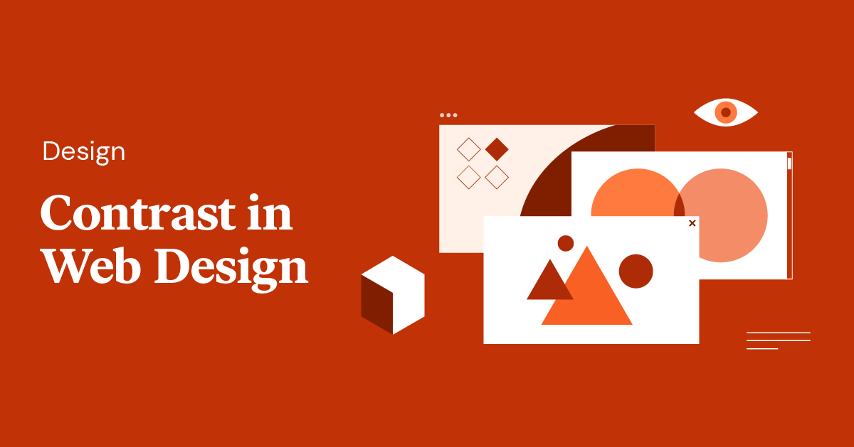
Creating visually compelling websites requires a keen understanding of how design elements interact. One of the most fundamental principles that can significantly enhance user experience and aesthetic appeal is contrast. When used effectively, contrast guides the viewer’s attention, establishes hierarchy, and reinforces your brand identity. This guide explores how to leverage contrast in web design through various techniques, supported by real-world examples and best practices to ensure your site not only looks professional but also functions seamlessly.
The Significance of Contrast in Web Design
Contrast is one of the five core visual principles in interface design, serving as a vital tool for creating clarity and focus within a digital environment. Essentially, contrast involves juxtaposing different design elements—such as colors, sizes, spaces, or shapes—to make specific features stand out or recede, depending on your goals. The relationship between contrasting elements becomes more pronounced when their differences are stark, helping users easily differentiate between various parts of your website.
In practice, contrast influences how users perceive and navigate your site. Regardless of whether it’s through color schemes, typography, or spatial arrangements, the strategic use of contrast ensures your content is accessible, engaging, and easy to understand. As noted in authoritative design resources, the harmony of contrasting elements forms a cohesive and aesthetically pleasing visual experience.
6 Types of Contrast in Web Design
1. Color Contrast
Color contrast is perhaps the most recognizable form of visual differentiation. It plays a crucial role in making text readable and interface elements distinguishable. For example, a dark font on a light background enhances readability, particularly for users with visual impairments or color vision deficiencies. Using high-contrast palettes ensures your content is accessible to a broader audience.
Controlling color contrast with overlays is a popular technique. Applying semi-transparent overlays on background images can create a visual separation between text and imagery, improving legibility. For instance, a black overlay beneath a hero headline can make text pop without obscuring the background image’s details. Such methods are frequently employed in hero sections to dramatize key messages.
Another effective approach involves filter effects, which can add subtle contrast within images. CSS filters like brightness, contrast, or grayscale can alter imagery dynamically, allowing designers to highlight specific elements while maintaining visual harmony. For example, darkening a photograph and overlaying white text balances the overall composition and enhances readability. When selecting filter effects, ensure they align with your site’s overall color scheme and branding.
2. Size Contrast
Size is a powerful tool for establishing importance and guiding user focus. Larger elements naturally draw more attention, making them ideal for headlines, call-to-action buttons, or key visuals. Properly calibrated size differences create a clear visual hierarchy, ensuring users understand what to prioritize.
Baselining text sizes based on their significance can make your content more intuitive. Using a much larger font for headings compared to body text emphasizes their importance and directs user flow. Similarly, size variation in layout elements—such as wider columns for featured articles versus narrower secondary sections—helps establish a logical flow of information.
For example, the homepage of The Atlantic employs contrasting column widths to indicate the prominence of main stories. The wider central column naturally attracts more attention, with the size differences subtly guiding the reader through prioritized content. Remember to make size differences obvious; subtle variations can be overlooked, diminishing their effectiveness.
3. Spatial Contrast
Spacing—both negative space and padding—significantly affects how elements relate to each other visually. Adequate spacing highlights individual components and prevents clutter, making your design easier to scan and understand.
Using generous spacing around elements directs focus and creates a sense of elegance. For instance, a solitary image with ample white space around it can become the focal point of a page, as seen on ETQ’s shoe care page, where the isolated sneaker draws attention to its cleanliness after a cleaning process.
Padding and margins also serve to separate items distinctly. In a product grid, contrasting background colors combined with sufficient padding around each item accentuate their individuality and make the interface more engaging. Always consider responsiveness—spacing that works well on desktop screens may need adjustment for mobile devices to maintain visual clarity.
4. Foreground and Background Contrast
The interaction between foreground and background elements shapes the overall visual narrative of your site. Dynamic backgrounds, such as parallax effects or vivid imagery, can create a sense of depth and movement, emphasizing contrast with static or subdued foreground content.
Parallax scrolling, as exemplified by NASA Prospect, uses layered backgrounds that move at different speeds relative to foreground elements. This technique enhances visual interest and provides a sense of immersion, making the contrast between static and dynamic layers more striking.
Vivid imagery paired with simple, contrasting text is another way to create impactful contrast. The NYT Cooking site uses rich photographs against a muted background, allowing the visuals to take center stage while maintaining readability through careful color choices. Be mindful of loading times when selecting background media to ensure a smooth user experience.
5. Element Types Contrast
Mixing different media types—such as photographs, illustrations, icons, and text—can produce compelling visual variety. Combining these elements within a single design not only adds aesthetic interest but also enhances storytelling.
Dramatizing narratives with mixed media helps communicate complex ideas more effectively. For example, Asana’s website juxtaposes images of real people with screenshots of its digital interface, highlighting the human aspect behind its SaaS product. Likewise, diverse element types on Illo’s site—ranging from animations to photographs—illustrate their creative versatility and emphasize their message of diversity through visual contrast.
Choose media types that resonate with your target audience and support your content’s message. Modern illustrations might appeal to a younger demographic, while high-quality photographs could be more suitable for a professional or luxury brand.
6. Shape Contrast
Shapes form the structural foundation of your design. Differentiating shapes—circles, triangles, rectangles—can create visual interest and establish hierarchy or separation between content sections.
Using shapes to distinguish story elements is a common technique. On Blush’s website, colorful, varied shapes segment different sections, guiding the viewer’s eye naturally across the page. Similarly, Outsmart Labs employs scattered circles to add dynamism to an otherwise minimalist monochrome layout, demonstrating how simple shapes can bring vibrancy and cohesion.
Experimenting with shape styles—such as rounded, geometric, or organic forms—can evoke different emotional responses and reinforce your brand personality. When selecting shapes, consider how they interact with other design elements to maintain harmony and clarity.
Designing for Contrast to Make Your Website Stand Out
The essence of effective web design lies in creating a site that not only functions flawlessly but also distinguishes itself visually. Incorporating contrasting elements demonstrates your ability as a designer to craft innovative, balanced compositions. It signals your mastery of visual hierarchy and helps your brand leave a lasting impression.
By thoughtfully applying contrast—whether through color, size, space, or shape—you can elevate your design work and set yourself apart from competitors. Explore different styles and effects, such as 3D rendering or hand-drawn sketches, to develop a unique visual language that resonates with your audience.
For those seeking to refine their skills further, resources on project management and best practices are invaluable. To stay ahead in the industry, consider consulting top-tier agencies and guides, such as this comprehensive resource on managing web development projects in 2026, or exploring the most innovative healthcare web design firms. Incorporating contrast effectively not only enhances aesthetics but also improves usability and engagement, making your websites truly stand out.