Understanding the intricacies of design systems is essential for creating visually compelling and user-friendly content. Whether you’re a seasoned designer or just starting out, grasping how various components work together can significantly improve your work. This guide explores core elements like grid systems, margins, columns, and rhythmic alignment, offering insights to refine your design approach and achieve greater consistency and creativity.
Creating seamless and engaging layouts depends heavily on a solid comprehension of these fundamental building blocks. For instance, effective information architecture plays a crucial role in structuring content in a way that guides users effortlessly through your site. To deepen your understanding of such principles, explore mastering information architecture the key to a seamless website experience. This knowledge serves as a foundation for designing intuitive and accessible digital experiences.
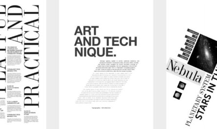
Grid systems are at the heart of many successful designs. They provide a framework that helps organize content logically and aesthetically. These systems rely on components like guides, columns, gutters, and baseline grids, which work together to create harmony and order. When used skillfully, grids can lead users through content smoothly, but knowing when to break these rules creatively is equally important. An example worth examining is Jon Moore’s Off Center Alignment post, which underscores the importance of purposeful deviation from standard grid usage. Developing mastery over these elements allows you to balance structure and creativity effectively.
Margins are another critical aspect, acting as invisible boundaries that frame your content. Proper margin use ensures your design feels balanced and breathable, preventing content from appearing cramped or overwhelming. The appropriate margin size varies depending on the medium—print or digital—and the specific context. For print, typical margins range from 0.25” to 0.5”, while web designs often use percentage-based spacing like 3% to 10% on sides and 5% to 15% on top and bottom. Understanding your content’s environment and intent is vital to selecting the right proportions. For those involved in detailed layout work, such as typesetters, these considerations are especially crucial.
Columns and gutters further refine content segmentation. They enable designers to organize ideas, create visual hierarchy, and balance complex information within a layout. Single columns suit straightforward content, whereas multi-column grids facilitate more flexible and dynamic arrangements. Gaps between columns, known as gutters, introduce whitespace that enhances readability without cluttering the design. Popular frameworks like Bootstrap or 960 Grid offer ready-made solutions, but mastering custom setups—such as a 12-column grid with a 2% gutter—provides greater flexibility and control. This approach allows for adaptable layouts that can be applied across both digital and print projects, ensuring your content remains clear and engaging.
Horizontal guides like hang lines and baselines are invaluable for maintaining alignment and rhythm. Hang lines help position floating or segmented content consistently, while baseline grids establish a uniform vertical rhythm. When carefully calibrated—often using the font’s line height or leading—these guides create a cohesive visual flow. For example, employing the Golden Ratio (approximately 1.618) to set your baseline spacing can add an aesthetically pleasing rhythm to your typography. Such precision enhances readability and visual harmony, especially in print design, but is equally effective in digital interfaces.
Rhythm in design refers to the patterned repetition of elements, creating a sense of order and predictability. It’s akin to a dance beat or a musical rhythm, guiding viewers’ eyes across the layout. Establishing consistent column widths, spacing, and alignment patterns helps develop this rhythm, making your design more intuitive and aesthetically pleasing. When all these elements work together—aligned small details and overarching structure—the result is a cohesive, engaging visual narrative. Remember, a grid system is a tool to complement your creative instincts; it doesn’t automatically make you a better designer but helps avoid common pitfalls and enhances overall quality.
Practice in applying these principles is key. Regularly experimenting with grids and breaking them intentionally will sharpen your eye for balance and harmony. Over time, you’ll recognize opportunities where strategic deviations can elevate your work—creating designs that are both structured and innovative. Engage with the community, share your projects, and learn from feedback to continuously refine your skills.
For additional insights on creating well-structured websites, consider exploring unlocking the power of custom web development in 2025. Whether designing from scratch or selecting a template, understanding how to choose the right options can significantly impact your project’s success. When planning your site, reviewing guides such as choosing the right website design package: a comprehensive guide can help you make informed decisions that align with your goals. Moreover, for those interested in bespoke solutions, unlocking the power of custom websites: a complete 2025 guide offers valuable strategies for leveraging tailored web development.
In conclusion, mastering these foundational components enhances your ability to craft compelling, functional, and aesthetically pleasing designs. Keep experimenting, break the rules thoughtfully, and always seek feedback to grow as a designer. The more you practice, the more intuitive these tools become, allowing you to create with confidence and purpose.