


Achieving pixel-perfect precision in web development is both an art and a science. It involves translating meticulously crafted design mockups into functional websites that mirror the original visuals down to the smallest detail. While the pursuit of absolute pixel perfection can be challenging—especially across diverse devices and screen sizes—it remains a vital goal for delivering a polished, professional user experience. This guide delves into the core principles, preparatory steps, and best practices to help developers and designers work harmoniously toward creating websites that meet high standards of accuracy and visual consistency.
Why Striving for Pixel Perfection Is Crucial
Understanding the importance of pixel-perfect web development extends beyond mere technical accuracy; it fundamentally influences how users perceive and interact with your brand online. When every element aligns flawlessly, it fosters trust, enhances usability, and reinforces brand identity. A consistent visual language—achieved through precise typography, color schemes, and spacing—builds a cohesive experience that users subconsciously associate with professionalism and quality.
Enhancing User Experience through Precision
Pixel perfect design ensures that buttons, images, and layout elements appear exactly as intended across various devices. This consistency improves user engagement, as visitors experience a seamless interface that feels reliable and well-crafted. Proper alignment and spacing contribute to intuitive navigation, reducing confusion and encouraging interaction.
Strengthening Brand Identity
Meticulous attention to detail in design reinforces brand consistency. Uniform typography, color usage, and element placement across pages create a unified visual narrative. Even subtle discrepancies—like misaligned buttons or inconsistent spacing—can undermine perceived quality and diminish trust. Achieving pixel-level accuracy demonstrates dedication to excellence and helps communicate your brand’s values effectively.
Essential Steps for Achieving Pixel-Perfect Development
To reach high standards of pixel precision, both designers and developers must follow a structured process. This involves careful preparation, clear communication, and rigorous quality checks. The following steps outline how to systematically approach this goal.
Hire a Skilled WordPress Designer
Engaging an experienced WordPress designer offers numerous benefits, including focused attention to detail, swift project turnaround, and cost-effective solutions. A proficient designer will prepare web designs that are inherently pixel-aligned and compatible with development workflows. For comprehensive insights into establishing effective design workflows, explore a guide to starting and running a successful WordPress agency.
1. Utilize Design Tools Supporting Symbols and Components
Employ design software like Sketch or Adobe XD, which facilitate the creation of reusable symbols or components. These elements—such as buttons, cards, or icons—ensure consistency across the entire website. When a component is styled as a symbol, updating it in one place automatically reflects everywhere, streamlining revisions and maintaining uniformity. Incorporating a comprehensive design system further consolidates styles, including colors, typography, and spacing, simplifying the development process.
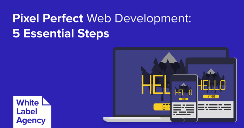
2. Define Responsive Breakpoints and Screen Resolutions
Designing for multiple devices requires selecting target screen widths—such as 1440px for desktops, 375px for mobile, and 768px for tablets. Recognize that real-world browsers resize dynamically, so your designs should account for responsiveness. Modern tools like Figma and Adobe XD offer features to set constraints and simulate responsive behaviors, but traditional workflows often rely on fixed resolutions. When planning layouts, consider how typography scales, how images adapt, and how content reorganizes on smaller screens. For example, designing mobile and desktop versions separately ensures clarity, especially when dealing with complex elements like navigation menus or sidebars.
3. Communicate Non-Obvious Responsive Behaviors
Elements like sidebars or decorative images may behave differently on various devices. Clarify with developers whether a sidebar should shift position, collapse, or be hidden entirely on mobile. For repeatable components such as team member cards, specify whether new items should align left or center when added to rows. Data tables also require special handling: they often scroll horizontally on mobile to preserve readability. Thoughtful planning here prevents ambiguity and ensures the final site responds gracefully across all devices.
4. Review and Implement the Design System
Before development begins, assess whether the design system is comprehensive and clear. It should specify styles for typography, buttons, links, and other UI elements, with CSS snippets ready for implementation. Creating a default style guide page—showing all basic components—helps prevent inconsistencies. Use tools like Zeplin or Avocode to extract CSS directly from designs, reducing manual errors. Remember to license and embed custom fonts properly, as font discrepancies can affect visual fidelity and responsiveness.
5. Conduct Rigorous Quality Assurance
After development, verify that the website matches the original design files at specified resolutions. Tools like the PerfectPixel browser extension enable overlay comparisons, highlighting deviations. Test across multiple browsers, devices, and screen sizes to ensure fidelity. Address discrepancies by collaborating with designers to clarify intentions or make necessary adjustments. This thorough QA process is essential for confirming that the final product aligns with your pixel-perfect standards.
Final Considerations
Achieving near-perfect pixel accuracy demands thoughtful planning, precise execution, and ongoing validation. While absolute perfection across all devices may be impractical, aiming for consistent visual quality signals professionalism and commitment to excellence. By leveraging reusable components, clear communication, and diligent testing, you can deliver websites that impress users and reinforce your brand reputation.
For those seeking to deepen their understanding, explore resources on building effective design systems, or learn how to construct your website in five simple steps. Whether you adopt a “close to pixel perfect” approach or strive for absolute accuracy, the key lies in meticulous preparation and quality assurance.
What are your standards for visual fidelity? Share your thoughts and experiences, or reach out if you need expert assistance in achieving your web development goals.