Achieving a website that exudes the same sleekness, intuitiveness, and visual appeal as Apple’s is a goal many digital creators aspire to reach. Apple’s online presence isn’t just about aesthetic appeal; it’s a carefully crafted experience that combines minimalism, user-centricity, and technical prowess. This guide delves into the fundamental principles behind Apple’s website design, offering insights and strategies to help you develop a similarly compelling digital platform.
Building a site that captivates users and fosters engagement requires more than copying visual elements. It involves understanding core design philosophies, technical considerations, and user experience strategies that make Apple’s website stand out. Whether you’re a startup, a corporate brand, or an eCommerce platform, adopting these principles can elevate your online presence and create an engaging, professional, and memorable website.
In the modern web development landscape, embracing serverless architectures can significantly enhance your site’s scalability and performance. For example, exploring ways to leverage serverless solutions can simplify backend management and reduce costs. To better understand these benefits, you might find resources on unlocking the power of serverless architecture for modern web development invaluable. Additionally, gaining insights into building effective serverless web applications can help you optimize your site’s functionality.
Let’s begin by exploring the core principles that underpin Apple’s website design, which can serve as a blueprint for your own projects.
Core Principles of Apple’s Website Design
Apple’s website seamlessly combines aesthetic elegance with functional excellence. Every element, from layout to interaction, adheres to fundamental design principles that ensure the site is both beautiful and user-friendly. Understanding these principles allows you to emulate their success and craft websites that resonate with visitors.
Minimalism and Clean Layouts
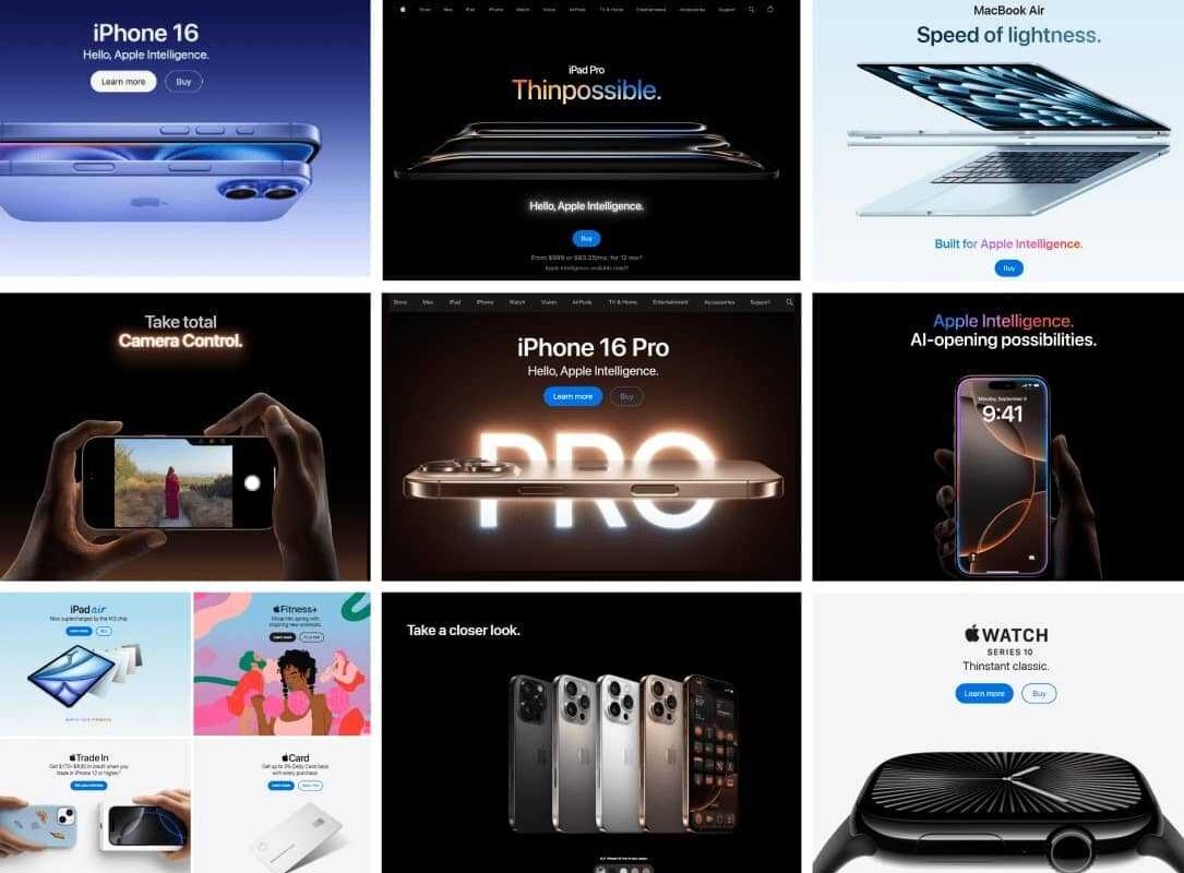
A defining characteristic of Apple’s website is its minimalist approach. By prioritizing simplicity, Apple minimizes distractions and directs focus toward the core content—its products. The use of grids, generous white space, and a structured layout create a sophisticated, high-end feel that reinforces the brand’s premium image.
Apple employs contrasting backgrounds—either dark or white—paired with sparse, purposeful imagery. This consistent use of negative space not only enhances visual clarity but also guides user attention precisely where it needs to go.
Contemporary Style
Apple’s design sets a standard for modern web aesthetics. Its clean lines, bold contrast, and smooth motion effects create an engaging experience that encourages interaction. This contemporary style not only keeps the website current but also improves user engagement and reduces bounce rates by creating an inviting environment.
Typography, Readability, and Accessibility
Typography plays a crucial role in Apple’s website, with the custom-designed San Francisco font serving as a signature element. About a decade ago, Apple transitioned from Helvetica Neue to San Francisco, which has since become its visual identifier across devices and platforms.
Different font weights are strategically employed to establish a clear visual hierarchy, making content easy to scan and comprehend. The consistent color schemes further enhance readability and navigation.
Accessibility is a core aspect of Apple’s design philosophy. Features such as adjustable text sizes, contrast settings, and VoiceOver support ensure that users with varying needs can access and enjoy the website seamlessly. For instance, Apple’s typography isn’t just about style; it’s a carefully curated experience that communicates the brand’s commitment to inclusivity.
For those looking to incorporate similar typography principles, exploring tools and resources on building effective serverless web applications can offer practical guidance.
Product-Centric Approach
Apple’s website is fundamentally designed to showcase its products. Every detail, from high-resolution images to videos, emphasizes product qualities, making them enticing and desirable.
- Brand and Design Consistency: Uniform styling across pages fosters a trustworthy and recognizable experience.
- Visual Showcase: Large images and videos present products from multiple angles, highlighting innovative features.
- White Space Utilization: Thoughtful spacing directs user attention without overwhelming.
- Intuitive User Experience: Easy navigation encourages exploration and smooth purchasing journeys.
Content and Information Structure
Apple’s UX design ensures visitors find relevant information efficiently, without feeling overwhelmed. The site delivers content progressively, providing minimal initial details with options to explore deeper.
For example, when browsing for a new MacBook, the homepage features the latest model with straightforward options: “Learn More” and “Buy/Preorder.” Clicking “Learn More” reveals detailed specifications, technical breakdowns, and interactive demos—such as visual comparisons of camera capabilities—making complex data engaging and digestible.
The purchasing process is simplified with customization options—like selecting storage or color—presented through visual interfaces that update in real time. For instance, selecting different MacBook configurations becomes an engaging experience that guides users effortlessly toward their ideal choice.
Comparison pages further aid decision-making, offering side-by-side specifications for different models, such as iPads, enabling users to weigh options conveniently.
Customer support features, including live chat, FAQs, and repair scheduling, are seamlessly integrated into the site, ensuring assistance is always accessible. Engaging animations, well-placed call-to-action buttons, and smooth scrolling create a continuous journey from discovery to purchase.
Simple and Intuitive Navigation
Navigation is central to Apple’s user experience. The menu system is straightforward, with categories like Mac, iPad, iPhone, and Support. Hover-triggered mega-menus with blurred backgrounds provide quick access to subcategories, maintaining clarity.
Clear calls-to-action (CTAs) are strategically placed and visually distinct. For instance, the “Buy” buttons are prominently displayed using contrasting colors, guiding users toward actions without cluttering the interface.
Visual hierarchy is meticulously maintained through size, color, and typography, ensuring that key information stands out. Large headlines introduce features, supported by smaller supporting text and images, guiding visitors naturally through content.
Smooth scrolling and subtle animations enhance engagement, providing a polished feel that keeps users immersed. As users explore product pages, animated transitions and fade-ins make the experience feel dynamic yet seamless.
CMS & Technical Considerations
Apple’s website relies on advanced frontend technologies and a robust CMS to deliver high performance and scalability. Techniques such as lazy loading optimize page speed, especially on mobile devices, ensuring a responsive experience across all platforms.
A mobile-first design approach guarantees usability on smartphones and tablets, crucial for modern audiences. Popular CMS platforms like Magento or Craft can support extensive product catalogs and eCommerce functionality, balancing content management with sales capabilities.
How to Build an Apple-Inspired Website
Creating a website inspired by Apple involves strategic planning beyond visual design. Define clear goals, understand your target audience, and select a suitable platform that supports your needs.
- Set Objectives & Identify Audience: Know what your site should achieve—whether it’s increasing sales, brand awareness, or user engagement.
- Choose the Right Technology: Select a CMS and frontend architecture that align with your functional requirements.
- Craft Clear Messaging: Ensure your content communicates value succinctly and persuasively.
- Prioritize Usability: Design intuitive navigation and interactive elements to enhance user experience.
- Build Trust: Incorporate testimonials, case studies, and security features.
- Optimize for Search Engines: Implement SEO best practices, including AI-driven search optimization, to attract organic traffic.
For a comprehensive approach, consider exploring top web designers in Perth WA find the best for your business needs to find expert assistance.
Why Apple’s Design Philosophy Works for B2B
While Apple’s aesthetic is often associated with consumer electronics, its principles translate effectively into B2B environments. An Apple-like website emphasizes clarity, professionalism, and ease of navigation, which are crucial for enterprise clients.
When a B2B platform adopts clean, focused design, it reduces cognitive load and fosters trust. As Mr. Shelton notes, “An intuitive, visually balanced site makes it easier for business users to navigate, engage, and convert.”
Implementing minimalist, goal-oriented design strategies can significantly improve lead generation and customer retention in corporate settings.
Tips for Achieving a Minimalist Website Design
- Leverage White Space: Use negative space strategically to enhance readability and highlight key elements.
- Maintain Design Consistency: Ensure symmetry, alignment, and uniform styles across all pages.
- Create Visual Breathing Room: Avoid clutter by limiting content per section, making the site easier to scan.
Remember: Design with a Purpose
Drawing inspiration from Apple’s stunning and interactive web design is a good starting point. However, each website should serve its unique purpose, tailored to its audience and goals. An effective website combines visual appeal with functional clarity, guiding visitors naturally toward desired actions.
A well-crafted, goal-oriented web presence not only attracts visitors but also converts them into loyal customers or clients, making your digital strategy truly impactful.
Examples of Apple-Like Websites
While Apple’s site is a benchmark, other companies also embrace minimalist and highly polished designs. For instance:
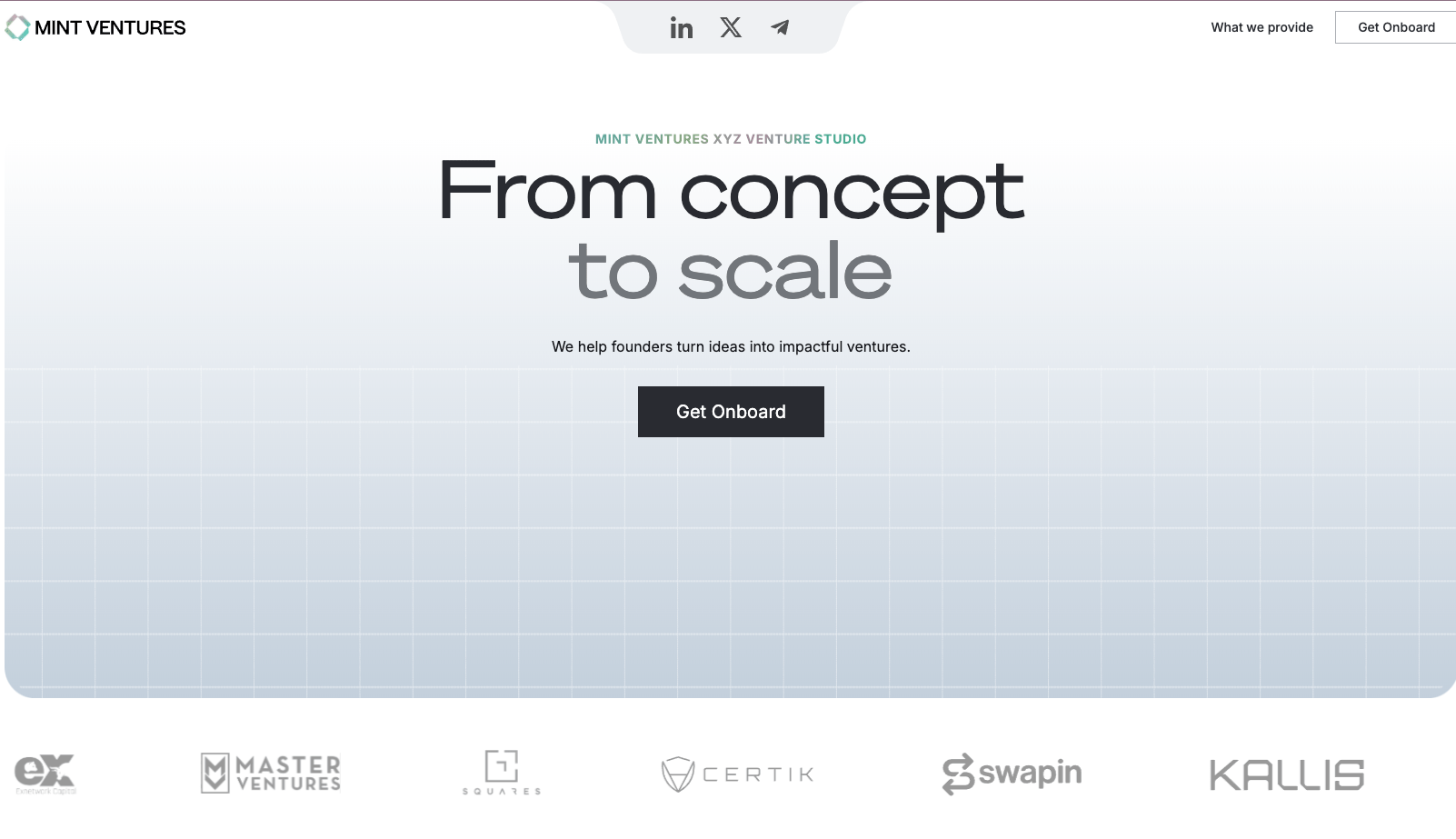
Mint Ventures demonstrates a clean, structured layout with consistent visual elements.
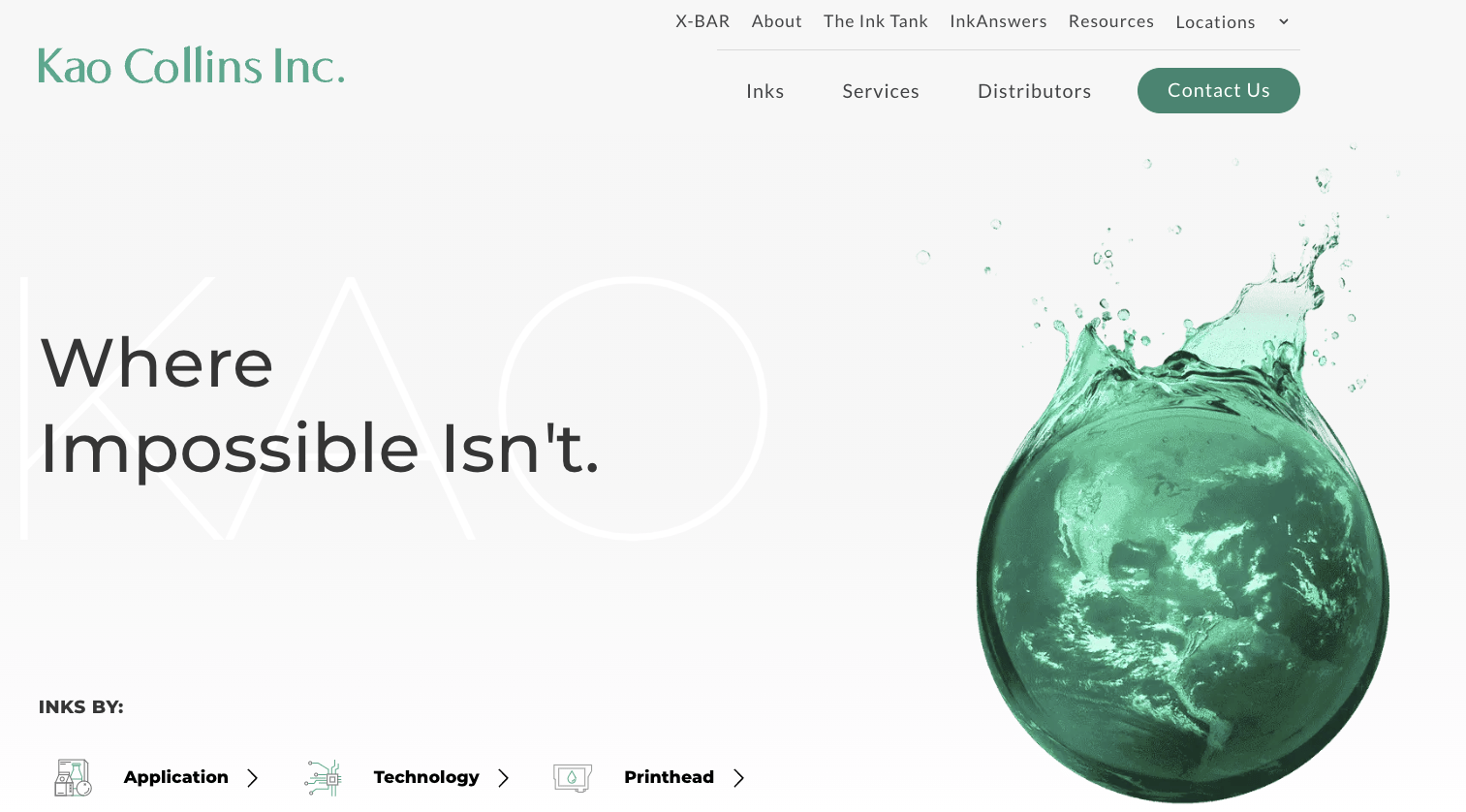
Kao Collins features generous white space, iconography, and clear user pathways that enhance usability.
Propel.me employs bold typography and engaging visuals to keep visitors interested.

BSC Analytics uses organized content and clean design to deliver an optimal user experience.
Bring Your Most Inspired Web Designs to Life
With over two decades of experience, DBS specializes in crafting corporate websites that embody the same level of excellence and performance as Apple’s. Our expertise ensures your digital presence will be both visually stunning and highly functional.
FAQs
Clients frequently praise Apple’s website for its:
- Clear and straightforward navigation with a well-organized information architecture.
- Use of white and black backgrounds combined with ample negative space.
- High-quality imagery that accurately showcases products and services.
- Modern minimalist style characterized by clean fonts and restrained color palettes.
- Consistent branding and messaging across all sections.
- User-friendly features like a top navigation bar with drop-down mega menus and icon-based sub-menus, which make browsing intuitive.
Apple’s site design leverages a simple yet effective three-tier navigation structure. White or black backgrounds and negative space focus user attention on key content, simplifying the consumption of vast amounts of information. The consistent use of a modern, minimalist aesthetic aligns with Apple’s innovative brand identity, reinforcing its reputation as a leader in technology.
Maintaining a cohesive style across pages—via typography, color schemes, imagery, and messaging—ensures brand integrity while delivering a seamless user experience.