


Colors play a critical role in the success of any visual project, acting as a powerful tool that influences perceptions, emotions, and usability. Thoughtful color choices can set the tone of a brand, attract attention, and enhance user experience. However, selecting the right palette isn’t always straightforward; it requires understanding color fundamentals, theory, and strategic application. This comprehensive guide explores how to harness the potential of color to make your designs more impactful and engaging.
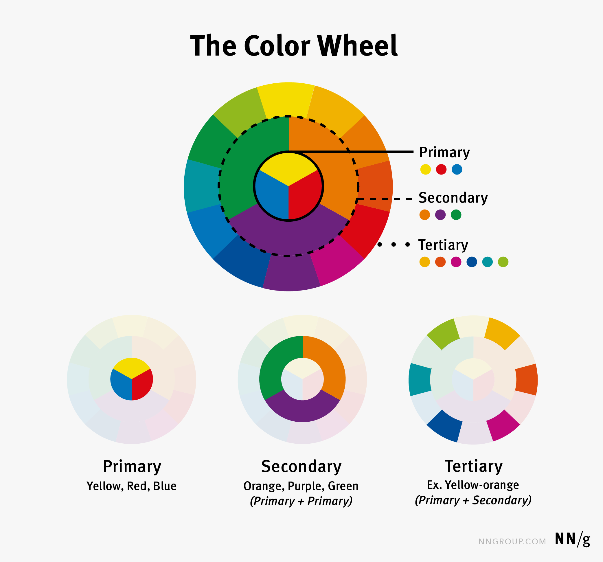
Colors are how our eyes interpret different light wavelengths. Historically, Sir Isaac Newton, in 1666, categorized colors into three groups: primary, secondary, and tertiary. Primary colors—yellow, red, and blue—serve as the foundation, while secondary colors—orange, purple, and green—are created by mixing primaries. Tertiary colors result from combining primary and secondary hues, such as yellow-orange or red-violet. Newton arranged these colors on a color wheel to illustrate their relationships, providing a visual tool that remains fundamental in design today. The color wheel helps designers understand how colors interact and complement each other, serving as the basis for many color harmonies and schemes.

Understanding Color Theory
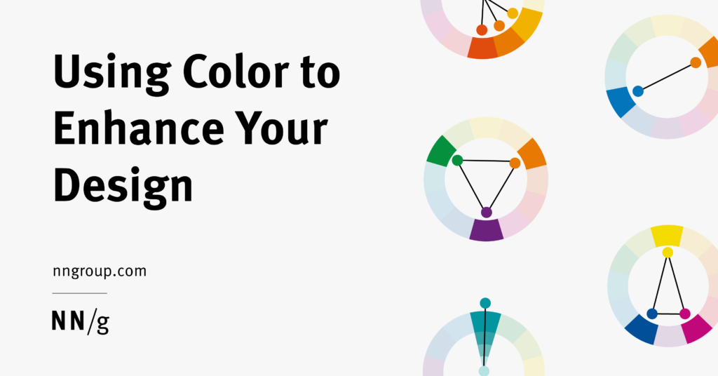
Color theory encompasses various concepts that explain how different hues work together visually. Although the full scope of color theory is extensive, a core idea is color harmony—a collection of colors that naturally work well in combination. These harmonies form the foundation of effective color palettes and help create balanced, aesthetically pleasing designs. Some of the most common harmony types include:
- Analogous: Colors adjacent to each other on the wheel, producing low contrast and a harmonious look. For example, blue, blue-green, and green.
- Complementary: Opposite colors on the wheel, creating high contrast and visual impact, such as red and green.
- Split-complementary: A variation where a color is paired with the two colors adjacent to its complementary, softening the contrast.
- Triadic: Three equally spaced colors (every 120 degrees), offering vibrant balance.
- Monochromatic: Variations in tone, shade, and saturation within a single hue for subtlety and cohesion.


While more complex schemes using four or more colors exist, they can be challenging to balance effectively. Beginners often find success by starting with two or three hues, ensuring clarity and visual hierarchy.
Interpreting Color Meanings
Although many articles claim universal color meanings—such as red representing danger or passion—these associations are often culturally specific and vary across regions. For instance, in China, red symbolizes luck, whereas in the U.S., it often signifies warning or urgency. Additionally, individual perceptions differ; some users may be unable to distinguish certain colors due to color vision deficiencies, emphasizing the importance of testing for accessibility. When using colors symbolically, it’s essential to consider cultural context and perform user testing to confirm that your color choices convey the intended message globally.
Applying Color Effectively in Design
A color palette is a curated set of colors selected for a specific project, brand, or interface. Each hue is chosen deliberately to reflect the desired aesthetic and functional qualities. Developing a palette can be complex but manageable by following these guidelines:
- Choose a harmonious base: Start with a color harmony—such as monochromatic—for simplicity, then experiment by swapping hues to find appealing combinations. Resources like Adobe Color can aid in palette creation.
- Limit your palette: Restricting yourself to three primary colors helps maintain clarity and avoid overwhelming users. Think of it as the visual equivalent of a well-organized room—less clutter leads to better focus.
- Align with branding: Always incorporate existing brand colors or guidelines to ensure consistency across all touchpoints.
Building a Color Palette
Creating a compelling palette involves iterative experimentation. Begin with a simple harmony, like monochromatic, and tweak the shades until the combination feels right. For example, using a dominant neutral color like gray or white (as in Nike’s website), with a secondary color to provide contrast, and an accent to highlight key actions, ensures a balanced and professional look.
Applying Your Palette
Once established, your palette must be applied consistently. The 60-30-10 rule provides a straightforward guideline: allocate roughly 60% of the design to the dominant color, 30% to the secondary, and 10% to accents. For instance, the Apple News app effectively employs this principle, using light backgrounds with bold accent colors for calls to action. This approach fosters visual harmony and draws attention where needed.
Testing your color choices is crucial. Use accessibility tools like accessible-colors.com to check contrast ratios, ensuring readability for users with visual impairments. For example, UberEats’ green logo contrasted poorly with an orange background, highlighting the need for adjustments to improve legibility.
Final Thoughts
Effective use of color is not accidental but the result of deliberate planning and iteration. When applied thoughtfully, color can elevate your brand perception, guide user interactions, evoke emotions, and enhance usability. By understanding the fundamentals of color theory, cultural implications, and best practices for application, designers can create visually compelling and accessible experiences that resonate universally. Remember, strategic color usage can transform a good design into a truly memorable one.