Effective web design hinges on understanding how layout choices influence user engagement, content flow, and overall site aesthetics. Whether optimizing for mobile, desktop, or a global audience, selecting the appropriate layout involves more than just visual appeal—it demands strategic thinking aligned with user behaviors and reading patterns. This comprehensive guide explores the core layout approaches—vertical, horizontal, and right-to-left (RTL)—and offers insights into crafting inclusive, user-friendly websites.
Designing a website is akin to choosing the right outfit for the occasion; each decision serves a purpose and shapes user experience. Just as selecting weather-appropriate attire enhances comfort and functionality, choosing the suitable layout ensures your site communicates effectively and caters to diverse audiences. As we delve into each layout type, remember that leveraging data-driven testing, such as A/B testing, can significantly improve your design outcomes. For more on the benefits of testing, explore these insights on testing advantages.
Understanding Eye Movement: The Foundation of Content Arrangement
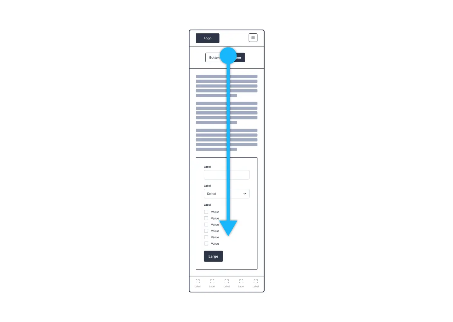
Before diving into specific layouts, grasping how users scan and process web content is crucial. Human eye movement follows natural patterns—most notably the Z-pattern—especially in left-to-right (LTR) reading cultures. This pattern begins at the top left, moves horizontally across the page, then diagonally down to the lower left, before crossing again. Recognizing this helps designers align content in ways that meet user expectations and facilitate easy navigation.
Visualizing this, imagine a website interface on a desktop screen where a prominent horizontal navigation bar guides the eye from left to right, reinforcing the importance of layout directionality. Understanding these eye movement tendencies allows designers to optimize layout flow, ensuring key information captures attention efficiently.
Vertical Layouts: The Tall and Focused Approach
Vertical design structures emphasize height and scrolling, making them especially suitable for mobile devices where vertical space dominates. These layouts resemble skyscrapers—tall, narrow, and designed for smooth vertical navigation.
Advantages:
- Mobile Optimization: Vertical scrolling naturally aligns with mobile device usage, allowing users to browse content seamlessly without horizontal constraints.
- Visual Content Emphasis: Portrait orientation prioritizes imagery and media elements, making it ideal for visually-driven websites.
- Focused Content Delivery: Vertical layouts enable deep content exploration without the distraction of horizontal scrolling.
Challenges:
- Limited Horizontal Space: Text-heavy or complex elements can feel cramped, affecting readability and visual hierarchy.
- Scrolling Fatigue: Excessive vertical scrolling may overwhelm users, especially on content-rich pages, leading to fatigue or disengagement.
Horizontal Layouts: Expansive and Exploratory
Horizontal layouts utilize the width of the screen to present content side-by-side, akin to sprawling landscapes. They are particularly effective on desktops where ample horizontal space fosters rich, detailed designs.
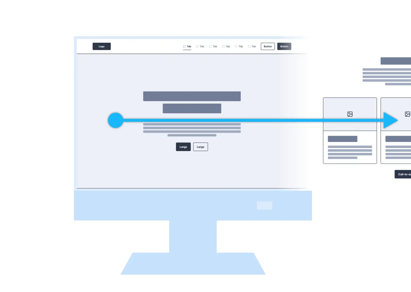
Advantages:
- Rich Content Display: Ample room for combining text, images, and multimedia elements facilitates comprehensive storytelling.
- Reduced Scrolling: Utilizing screen width allows more content to be visible at once, decreasing the need for constant scrolling.
- Alignment with Natural Eye Movement: Horizontal arrangements complement the typical left-to-right reading flow, enhancing readability on desktops.
Challenges:
- Mobile Limitations: Horizontal designs can feel restrictive or awkward on smaller screens unless carefully adapted.
- Visual Competition: Without careful layout, images and text may compete for attention, diluting visual impact.
Embracing Global Diversity: Designing for RTL Languages
Websites targeting a global audience must accommodate languages such as Arabic, Hebrew, Farsi, and Urdu, which are read from right to left. Incorporating RTL design principles is more than just flipping text; it involves mirroring layout structures and ensuring intuitive navigation.
Key Considerations for RTL Design
- Mirrored Layouts: Reflect the entire visual hierarchy, placing navigation and interactive elements on the right side of the page.
- Text Alignment: Ensure that textual content aligns to the right, matching the natural reading flow of RTL languages.
- Visual Harmony: Position images, icons, and other visual cues in ways that support, rather than disrupt, the RTL reading experience.
- Usability Testing: Conduct testing with native RTL speakers to identify and resolve navigational or comprehension issues effectively.
Developing inclusive websites means respecting linguistic and cultural differences. Proper RTL adaptation ensures your site remains accessible and user-friendly across diverse regions.
Making Informed Layout Choices for Diverse Audiences
Choosing the optimal layout depends heavily on your content type and target audience. For mobile-centric sites, vertical scrolling offers ease of use, while desktop-oriented designs can leverage expansive horizontal layouts for detailed presentations. When serving multilingual audiences, especially those using RTL scripts, mirrored and adapted layouts foster inclusivity and better engagement.
Incorporating data-driven design strategies, like performing thorough testing, can reveal what layout resonates best with your audience. To understand how testing can refine your website’s performance, review these insights on testing benefits. Similarly, exploring the top tools for building websites—many offering free options—can streamline your design process. Discover some of the most popular free website builders to find the best fit for your project. For those interested in rapid deployment without coding, check out the leading no-code development platforms tested and ranked for 2025.
Centering the User Experience in Web Design
At the core of all layout decisions is the user. By understanding and respecting natural eye movement patterns and reading habits—whether left-to-right or right-to-left—designers can craft experiences that feel intuitive and welcoming. Adapting your website’s structure to accommodate diverse scripts and cultural preferences not only broadens your reach but also fosters trust and satisfaction among users worldwide. Effective, inclusive design ensures your content is delivered clearly, beautifully, and efficiently across all platforms and audiences.