


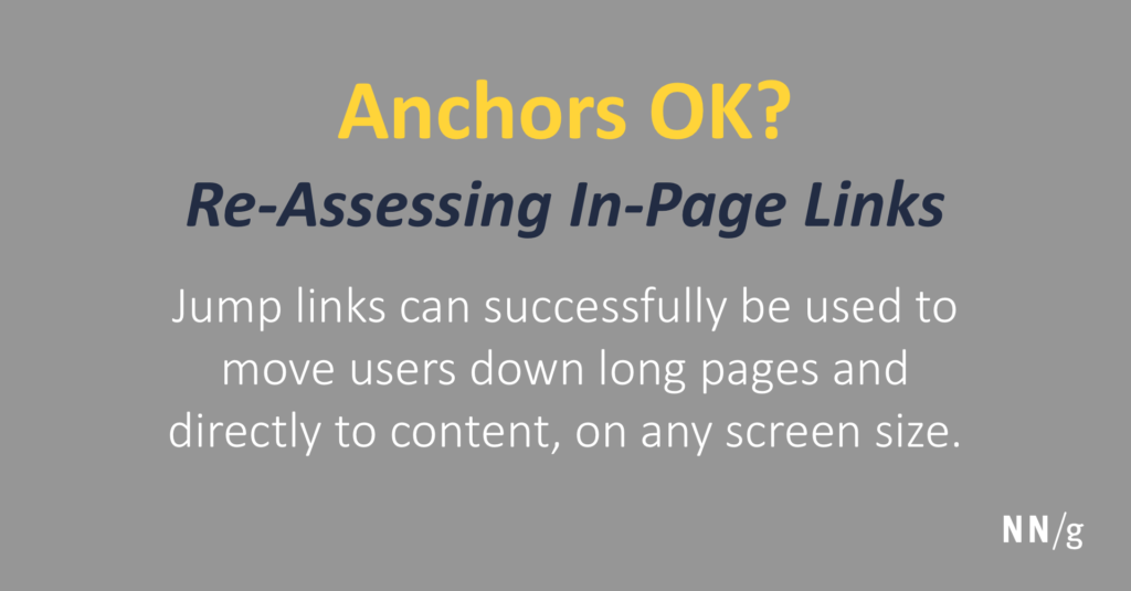
In the evolving landscape of web design, the use of intra-page links—commonly known as anchor links or jump links—has become increasingly prevalent. These links facilitate quick navigation within the same webpage, contrasting with traditional links that direct users to different pages. While once discouraged, their strategic implementation can significantly enhance user experience, especially on content-rich or mobile-optimized sites. This article explores the benefits, best practices, and potential pitfalls of in-page links, providing insights into when and how to employ them effectively.
Why In-Page Links Can Be Confusing for Users
Historically, the primary concern with in-page links was that they conflicted with users’ mental models of what a link should do. Typically, users expect clicking a link to take them to a different webpage, not to a different section of the same page. When an in-page link behaves differently from this expectation, it can cause confusion or disorientation, especially if the destination isn’t clearly indicated. For example, a link labeled “Read More” should ideally lead to additional content, but if it jumps to a section further down the same page without clear cues, users might misinterpret its function.
The Advantages of Using In-Page Links
Despite these concerns, in-page links offer tangible usability benefits. They serve as efficient navigational tools, especially for lengthy pages, by allowing users to jump directly to relevant sections. This capability:
- Acts as an informal table of contents, helping visitors understand the structure of the content.
- Provides quick access to specific information, reducing the need for excessive scrolling.
- Enhances engagement by making content more discoverable, particularly in long, scrolling pages.
Incorporating these links thoughtfully can streamline user journeys, particularly on mobile devices where screen real estate is limited. As device diversity increases, the utility of jump links becomes even more critical in ensuring accessibility and ease of navigation.
Typical Use Cases for In-Page Links
In-page links find their most common applications in three areas:
Table of Contents: For extensive articles or documentation, in-page links serve as a navigational overview, allowing users to jump directly to sections of interest.
Back to Top: On long pages, a “Back to Top” link helps users quickly return to the beginning without repeated scrolling. While these links duplicate the scroll bar’s function, they can save time and effort, especially on mobile devices where scrolling is less efficient.
Indexes and FAQs: Alphabetical or numbered lists of topics or questions benefit from in-page links, enabling users to access specific entries swiftly. Such links are particularly valuable when users are searching for particular information rather than browsing all options.


Adapting to Different Screen Sizes
When in-page links were first introduced, web pages were mostly viewed on similar-sized screens, typically desktops. Today, however, users access content on a wide array of devices—from tiny smartphones to large high-resolution monitors. As screen size decreases, the usefulness of jump links increases because content that fits comfortably on a desktop can span multiple screens on a mobile device. For example, a brief article that appears on a desktop might require significant scrolling on a phone, making quick navigation even more essential.
Consider the Mayo Clinic’s website: on a 13-inch laptop, an article’s four paragraphs and a video can be seen at once, but on a mobile device, only two paragraphs fit on the screen. Here, in-page links can help users navigate efficiently across different devices.
Implementing In-Page Links Responsibly
Effective use of in-page links involves careful planning and design choices. To maximize their benefits while minimizing confusion, consider the following guidelines:
Content Length and Structure
In-page links are most valuable on pages with substantial content. If content is too brief, these links may be unnecessary or even distracting. Before adding jump links, evaluate whether the content can be condensed or reorganized. Often, thoughtful editing reduces the need for navigation aids altogether.
For pages with multiple distinct topics, segmenting content into separate pages might be more user-friendly than piling everything onto a single long page. When content sections are concise, in-page links might add unnecessary complexity or make the page appear cluttered.
Clear and Descriptive Headings
Structure content into clearly labeled sections. Use descriptive headings that serve as signposts, enabling users to scan and understand the content hierarchy quickly. When in-page links are used as a table of contents, they act as shortcuts to these headings, improving overall accessibility.
Labeling and Differentiating Links
To avoid confusion, label in-page links distinctly, such as adding “On this page” or “Section” indicators. Visual cues and clear labels help users differentiate between links that navigate within the page and those that lead to other pages. For screen reader users, including explicit labels ensures they understand the nature of each link.
Confirming and Managing Jump Behavior
When users click an in-page link, the page should scroll smoothly to the target section, ideally positioning it near the top of the viewport. To enhance clarity, leave a small amount of whitespace or preceding text visible, so users recognize where they are.
If sticky headers or fixed navigation bars are present, ensure they do not obscure the target content. Properly offset scrolling or adjusting scroll behavior can mitigate this issue.
Making In-Page Links Sticky
On larger screens, consider keeping navigation links visible by making them sticky or fixed. For example, a persistent table of contents can stay in place as users scroll, providing easy access to different sections at all times. However, avoid placing these links in areas traditionally reserved for primary navigation, as this can further confuse users expecting navigation links to load new pages.
Indicating User Location
Highlight the current section within sticky navigation to orient users. For instance, the active link can be distinguished with a different color or background, helping users understand their position on the page—similar to “you-are-here” indicators.
Handling Browser Back Button Behavior
Decide how the browser’s Back button should behave when navigating via in-page links. Typically, it should return users to their previous scroll position rather than navigating away from the page. Clear behavior enhances usability, especially on lengthy content.
Comparing In-Page Links and Accordions
Alternatives like accordions—expandable sections—also organize large content but require user interaction to reveal information. While accordions keep pages compact, they can hide content from initial view, reducing discoverability. In contrast, in-page links provide immediate access to all sections, making content more transparent and accessible.
When Are In-Page Links Beneficial?
When implemented thoughtfully, in-page links can significantly improve navigation within lengthy content, particularly on mobile devices. They help users find relevant information swiftly, reduce frustration, and create a more seamless browsing experience. The key is to ensure that their design aligns with user expectations and that they are tested for usability.
For more advanced insights into creating engaging web interfaces, explore techniques for better web interactions. To see how creative in-page navigation can enhance user engagement, review a collection of striking landing page designs. Additionally, understanding the timeline for acquiring web development skills can help you plan effective navigation strategies—find out more at how quickly can you master web development a comprehensive timeline.
Final Considerations
Ultimately, the decision to incorporate in-page links should be driven by content complexity, user needs, and device context. When used judiciously, they can be powerful tools for enhancing usability. Always validate their effectiveness through usability testing and metrics analysis, ensuring that they truly serve your visitors’ navigation habits and preferences.