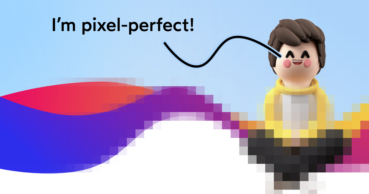
Every front-end developer has faced the pressure of creating designs that look exactly like the mockups provided by designers. The pursuit of pixel perfection—where the implemented webpage matches the original design down to the last pixel—can often seem like an elusive goal. Despite years of experience in HTML and CSS, many developers still find it challenging to reproduce visual details with absolute precision, raising questions about the practicality and importance of achieving such meticulous accuracy.
This article explores the realities behind pixel-perfect design, the reasons why absolute consistency is impossible across the vast array of devices and browsers, and practical techniques to bring your implementations as close as possible to the intended design—what I like to call “pixel-pretty-close.” We’ll also discuss how understanding measurement, optical alignment, and small tweaks can significantly enhance the visual harmony of your projects.
The Myth of Absolute Pixel-Perfection
Let’s address the elephant in the room: in a strict sense, pixel perfection is unattainable. The web is an inherently variable environment, with countless factors influencing how a page renders. When I took screenshots of the same Amazon listing on different devices—say, on Chrome for Windows and Safari for Mac—you might notice subtle differences in pixels. Although the images look nearly identical to the naked eye, their pixel compositions differ significantly when examined closely.
This variation stems from the fact that different devices—whether a high-DPI Retina display or a standard LCD—render colors and pixels differently. Additionally, factors such as device type (desktop, tablet, smartphone), screen technology (OLED, LCD, E-ink), zoom levels, user settings, hardware performance, and even color calibration influence how content appears. For instance, a design that looks perfect on a developer’s high-resolution monitor may appear slightly off on a mobile device or an older screen.
Unlike backend systems, where hardware is controlled and consistent, front-end environments are unpredictable. Back-end developers often enjoy the advantage of working with identical hardware, but front-end developers must contend with a staggering array of devices and variables. This diversity makes the goal of pixel-perfect replication unrealistic and unnecessary. The key isn’t perfect pixel matching but creating an experience that feels consistent and visually appealing to the user.
Designers typically don’t expect every pixel to align perfectly under a magnifying glass. Instead, they want the design to look harmonious to the human eye—what I refer to as “pixel-pretty-close.” Minor misalignments or spacing discrepancies are acceptable as long as the overall aesthetic remains intact and professional-looking.
Measuring Distances and Ensuring Consistency
When you receive a mockup, it’s often provided through tools like Figma or Zeplin, which offer live, interactive representations of the design. These tools allow you to select elements and extract measurements such as spacing, colors, and sizes. However, relying solely on these figures can be misleading, because they aren’t always perfectly accurate or directly transferable to the web.
Instead, I recommend taking your own measurements using built-in screenshot tools available on most operating systems. On macOS, the cmd-shift-4 shortcut allows you to draw a selection box and see pixel distances directly, making it easy to compare your implementation with the mockup. For Windows, tools like Greenshot or ScreenRuler are excellent options, while Linux users can use KRuler or similar utilities.
Always measure both the mockup and your code in the same way, then tweak your styles until the distances match as closely as possible. Treat this process like a game of spot-the-difference: side-by-side comparison helps you identify subtle discrepancies and refine your layout incrementally.
Learn how to use measurement tools effectively; precision in small details can elevate your design from “good enough” to “almost indistinguishable” from the mockup. Remember that even a few pixels of misalignment can disrupt the visual flow and perceived quality of your website.
The Power of Optical Alignment and Small Tweaks
Sometimes, mathematical centering or spacing isn’t enough to achieve a visually satisfying layout. Human perception often perceives alignment differently than raw measurements suggest. This is where optical alignment comes into play—adjusting elements slightly so they appear centered or aligned according to how our eyes perceive them.
For example, if you have a number or icon that appears slightly off-center, shifting it by a pixel or two can make a noticeable difference. A classic case involves aligning text or icons so that their visual weight feels balanced, rather than strictly mathematically centered.
Similarly, small adjustments such as shifting a paragraph slightly to eliminate unwanted gaps or fine-tuning letter spacing (kerning) can significantly enhance the overall appearance. Even if these tweaks are subtle, they contribute to a polished, professional look—especially on high-traffic or critical pages.
To facilitate these small shifts, consider creating reusable React components like ShiftBy, which applies minor translations to elements without disturbing the surrounding layout:
jsx

function ShiftBy({ x = 0, y = 0, children, ...delegated }) {

  return (

    <div

      {...delegated}

      style={{

        transform: `translate(${x}px, ${y}px)`,

      }}

    >

      {children}

    </div>

  );

}
Using such components ensures consistent, intentional adjustments across your project, making fine-tuning less chaotic and more manageable.
Building Confidence with CSS
CSS, while deceptively simple at first glance, can become complex when dealing with real-world layouts involving responsive design, cross-browser compatibility, and accessibility considerations. Achieving a design that feels “close enough” requires not just understanding CSS syntax but also developing an eye for detail and consistency.
Many JavaScript developers find CSS intimidating or challenging to master fully. To bridge this gap, I am developing a course called CSS for JavaScript Developers, which focuses on building confidence in CSS architecture, layout techniques, and responsive strategies. This course leverages the same technologies used in this blog to create dynamic, interactive components, helping developers design more effective, scalable interfaces.
If you’re eager to improve your CSS skills and create web pages that better align with your design goals, investing in structured learning can be transformative.
Collaborating Effectively with Design Teams
Technical skills are crucial, but strong collaboration with designers is equally important. Respectful communication and understanding each other’s perspectives foster smoother workflows and better outcomes. For example, when a designer requests pixel shifts or refinements, avoid dismissing these as trivial nuisances. Instead, see them as opportunities to improve the visual coherence of your project.
Designers often have an eye for subtle details that enhance the overall feel, even if those details seem minor. Conversely, as a developer, your input about accessibility or platform consistency can be invaluable, especially when design choices impact usability.
Building a good working relationship with designers ensures that your technical expertise complements their creative vision, leading to more polished and user-friendly products.
Final Thoughts: The Value of Slight Adjustments
Designing from scratch can be frustrating. Despite choosing beautiful colors and fonts, the result can sometimes look amateurish if spacing and alignment are off. Small misalignments may seem insignificant but can cumulatively undermine the professionalism and credibility of your site.
Most users don’t notice precise pixel alignments; they judge a page based on overall feel and visual harmony. When a website looks cohesive and well-structured, it exudes quality and reliability—even if the details are not perfectly pixel-matched.
Remember, perfect pixel-perfection is an impossible standard due to device variability. However, by paying attention to details—measuring accurately, making optical adjustments, and ensuring internal consistency—you can create experiences that feel polished and trustworthy. In the end, a well-implemented, visually harmonious site can significantly elevate your project’s credibility and user perception.
Last updated on March 14th, 2025