Discover a curated selection of exceptional SaaS websites that exemplify innovative design, compelling storytelling, and seamless user experience. These examples serve as a rich source of inspiration for developers, designers, and entrepreneurs eager to craft their own standout digital presence. Each site demonstrates how thoughtful visual elements, strategic content organization, and trust-building features can elevate a SaaS platform from functional to visually compelling. Dive into these case studies to explore approaches that blend aesthetics with usability, and learn how to translate ideas into captivating web experiences.
Features of Successful SaaS Websites
What truly distinguishes top-tier SaaS platforms from the average is their ability to combine storytelling with practical functionality. These sites incorporate elements that evoke emotional resonance while providing clear, rational reasons for users to subscribe or engage. Effective SaaS websites share several core features:
Explicit Feature Showcases: While straightforward, it’s essential to clearly display both the standard and unique functionalities of your product. A balanced presentation—free of excessive promotional language—demonstrates value convincingly. High-quality visuals such as screenshots or GIFs help in illustrating how your software operates, enabling visitors to grasp its benefits swiftly. For a comprehensive understanding of design tools, explore resources explaining what is the top free software for web design.
Engaging Visual Demonstrations: Visual assets like animated GIFs or interactive demos communicate features dynamically, making it easier for potential users to see the product in action. These elements reduce uncertainty and accelerate decision-making, guiding visitors from curiosity to engagement.
Interactive Experiences: Beyond static visuals, offering interactive demos or sandbox environments immerses users in the product. This hands-on approach helps them experience core functionalities firsthand, increasing confidence in the solution.
Social Proof and Credibility: Showcasing testimonials, client logos, and reviews establishes trust. Many successful websites position recognizable brand logos above the fold to reinforce legitimacy immediately. User-generated content and professional reviews further bolster credibility.
Intuitive Navigation: A well-organized site ensures visitors find relevant information effortlessly. Essential links—such as product details, pricing, resources, and login portals—are typically accessible in the top navigation bar, while legal and contact information resides in the footer, providing a seamless browsing experience.
13 Best SaaS Websites with Stunning Design
Explore these 13 exemplary SaaS websites, each illustrating innovative design principles and user engagement strategies that can inspire your own development process.
1. Copilot

Budgeting application Copilot Money’s homepage emphasizes social proof by prominently displaying awards and accolades from the Apple App Store at the very top. Beneath, the page features a collection of media logos and user reviews, including references from outlets like The Verge, TechCrunch, and the New York Times, with links to published articles that add authoritative weight. Testimonials sourced from real users on platforms like X (formerly Twitter) and the App Store are organized into a grid, further enhancing trust.
To showcase its AI-driven features, the landing page employs animated visualizations of spending categories over playful, pixel-art storefronts—each bearing recognizable financial institution logos. This subtle detail builds credibility by highlighting platform integrations. The sticky navigation bar ensures that the “Download” call-to-action remains accessible at all times, facilitating quick conversions.
2. Rainbow

Rainbow redefines the typical crypto platform aesthetic with its vibrant, surreal visual style. Departing from the usual corporate blues and grays, Rainbow employs bright oranges and electric pinks that immediately distinguish it in the crowded blockchain SaaS space. Its prominent CTA buttons and rainbow-themed sticky navigation reinforce its playful, approachable brand identity.
The homepage features a lively carousel of product screenshots and GIFs, demonstrating wallet functionalities without overwhelming visitors. An interactive keyboard animation—where rainbows explode upon clicks—transforms passive browsing into an engaging exploration. This playful yet professional approach proves that technical SaaS solutions can incorporate personality while maintaining trustworthiness through clear feature demonstrations.
3. Assemble

Assemble, a project management tool tailored for teams handling complex workflows, adopts a clean, zen-inspired design. Parallax effects and meticulous layout choices emphasize clarity and calmness, aligning with its core value of organized productivity. The site leverages interactive demos instead of static images, giving visitors a real feel for the platform’s calendar-centric user experience.
These animated previews help users quickly grasp complex features, with visual flourishes guiding understanding. Connect with the product’s core benefits through intuitive design choices that make navigating and exploring the platform straightforward and engaging.
4. Zazu

South African digital banking service Zazu caters to small businesses, entrepreneurs, and freelancers. Its website balances product visuals with social validation, recognizing that trust is vital in B2B financial services. An animated ticker of client logos separates the hero section from detailed product explanations, reinforcing credibility. Following this, a testimonial carousel featuring client photos, logos, and quotes seamlessly guides visitors through success stories.
The site’s storytelling approach builds confidence, demonstrating that real users find value in Zazu’s platform, which is crucial for financial SaaS solutions.
5. Scribe

Paris-based Scribe specializes in automated email signatures for organizations. Its website uses multimedia—like GIFs and interactive calculators—to clearly demonstrate the product’s capabilities. An animated demonstration at the top showcases signature customization, while an ROI calculator beneath allows visitors to input their team size, outreach volume, and revenue metrics for a personalized business case.
Additionally, a concise explainer video provides quick, accessible information, making it easy for prospects to understand the platform’s benefits without extensive reading.
6. Play

Play, a collaborative design environment for iOS app creation, prominently displays its Apple Design Award at the top to establish credibility. Its tabbed interface organizes features such as design canvas, prototyping, and app sharing, with embedded GIFs illustrating each capability.
User-generated content tagged with #MadewithPlay fosters community trust and authenticity. This social proof, combined with accolades and detailed feature demonstrations, creates a compelling narrative that encourages new users to explore the platform.
7. Tellet

Amsterdam-based Tellet, a user interview platform powered by AI, employs a vibrant pink-and-green palette complemented by scroll-triggered animations. As visitors scroll, interface screenshots and insights unfold gradually, providing a dynamic and engaging exploration of the platform’s capabilities.
Clear typography and digestible content organize features into colorful cards, making complex processes accessible. The site’s structure encourages users to learn about the platform step by step, enhancing understanding and trust.
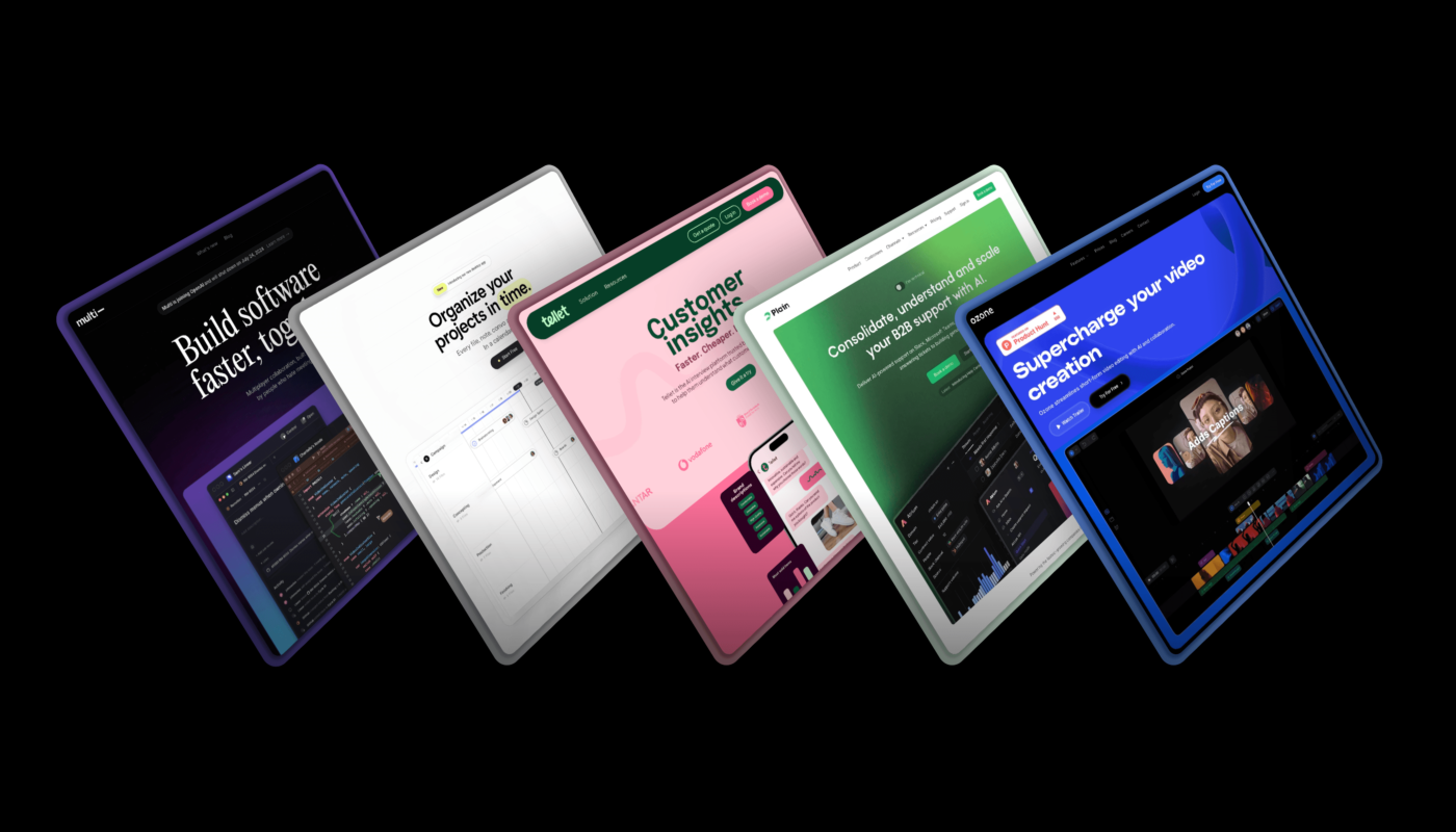
8. Multi

Before its acquisition by OpenAI, Multi was a macOS-based collaboration tool emphasizing real-time screensharing and AI-assisted meeting documentation. Its dark-themed website appeals to developers and technical users, with contrasting elements highlighting key features.
An interactive demo with moving cursors exemplifies collaborative capabilities, while a detailed changelog maintains transparency about product updates. The straightforward grid layout enables quick feature scanning without unnecessary distractions.
9. Bird

Bird, a customer lifecycle management SaaS for B2C brands, uses a captivating full-width looping video at the top to demonstrate its CRM capabilities dynamically. Below, a modular layout presents features with supporting descriptions and interface previews, allowing visitors to explore use cases such as ecommerce workflows, fintech verification flows, and travel booking campaigns.
Interactive tabs enable users to switch between scenarios, illustrating how the platform streamlines diverse customer journeys in real time.
10. Plain

Plain, an AI-powered customer support platform, organizes its features into contrasting full-width modules, creating a rhythmic visual flow. The homepage highlights issue tracking, Slack integration, and automation tools through clean, spacious layouts.
A standout feature is the toggle button in the hero section, allowing users to switch between technical and non-technical perspectives. This personalized approach ensures the site appeals to both developers and non-technical decision-makers, enhancing engagement across diverse audiences.
11. Vibrant

Vibrant, a Danish integrated payment platform, employs scroll-triggered animations that animate on-trend yellow hues into the design, creating visual interest and guiding the user’s eye. Customer testimonials are organized in a grid, showcasing diverse voices, while product screenshots and GIFs demonstrate real-world usage scenarios, establishing both credibility and clarity.
12. Musicfy

Musicfy, an AI music-generation SaaS, uses full-width modules with ample white space to organize features clearly. Its dark color palette balances creativity with professionalism, making complex AI capabilities approachable. The design emphasizes clarity and ease of understanding, ensuring visitors can quickly grasp the platform’s innovative offerings.
13. Ozone

Ozone, an AI-powered video editing platform, features a sleek black background with vibrant purple and blue accents. Its interface is mimicked through a framed demonstration that showcases collaboration features like real-time chat and draggable timelines. The site combines GIFs, screenshots, and descriptions within a card-based layout, creating an organized and engaging experience.
A prominent “Try for Free” CTA paired with a sticky navigation bar ensures visitors are encouraged to start using the platform immediately, boosting conversions.
Design and Build Your SaaS Website with Framer
Framer provides all the tools necessary to design, develop, and scale a professional SaaS website. With a comprehensive startup program offering a free year of Framer Launch, entrepreneurs can access a wide array of resources.
Explore the Framer Marketplace, which features over 2000 ready-made website templates and modular components—including hero sections, pricing tables, and testimonial carousels—optimized for software companies. Once your site is set up, leverage the integrated CMS to rapidly publish new pages such as blog posts, case studies, and landing pages, all without requiring engineering support.