Creating a website can seem overwhelming, especially when trying to coordinate design, content, and user experience. A well-structured plan is the backbone of a successful project, ensuring clarity and alignment among all stakeholders. This comprehensive guide walks you through every stage of planning your website, from initial concept to final touches, equipping you with the best practices and tools to bring your vision to life effectively.
Starting with a clear and detailed plan saves time, reduces miscommunication, and sets realistic expectations. Whether you’re working solo or with a team, this process helps you stay organized and focused, making the development journey smoother and more efficient.
Developing Your Website Strategy and Initial Framework
The first step in any website project is defining your core purpose. What do you want your website to achieve? Is it to generate leads, sell products, share information, or build an online community? Clarifying your primary goal helps shape every subsequent decision.
Identify your target audience to tailor your content and design to their preferences. Consider demographic details, interests, and behaviors. Understanding your users allows you to create a user-centric experience that resonates and drives engagement.
Next, outline your website’s key content areas. Think about what information or features your visitors need. This might include service descriptions, blog posts, contact forms, or multimedia galleries. Creating a comprehensive content outline early on guides the design and development process, ensuring all necessary components are addressed.
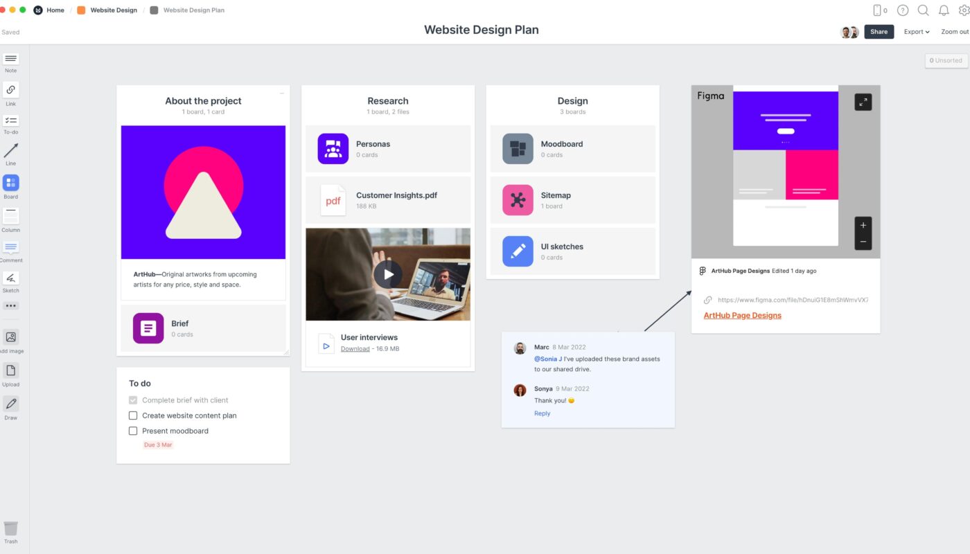
A central, organized project plan is essential. Instead of juggling scattered emails and documents, consolidate everything into a single, accessible platform. Tools like Milanote provide flexible boards to create a living blueprint of your website, which can evolve as your project progresses.
Building a Clear Visual and Structural Foundation
Creating a visual moodboard helps define the look and feel of your website. Gather inspiration from various sources—client references, color palettes, typography, and imagery—to establish a cohesive style. Use free image libraries such as Pexels or Unsplash to find visuals that reflect your desired tone.
Arrange your chosen images to explore composition, hierarchy, and visual flow. Experiment with different layouts, color schemes, and font choices. This process ensures your design direction aligns with your brand identity and appeals to your target audience.
Once your visual concepts are set, develop a sitemap. This diagram maps out the structure of your website, illustrating how different pages and sections relate. Organize content into logical groups, and consider common structures like hierarchical trees or flat architectures, depending on your content complexity.
A well-planned sitemap not only clarifies navigation but also helps estimate the scope of development. It acts as a blueprint for your team, providing a shared understanding of the website’s architecture.
Planning Content and User Experience
With the structure in place, focus on crafting compelling content for each page. Start by drafting key messages, headlines, and subheadings—think of this as a preliminary content map. Consider incorporating SEO keywords naturally to improve search engine visibility.
Visualize the layout of each page with sketches or wireframes. Even simple diagrams with boxes and arrows can clarify content placement and user flow. This step is crucial in identifying what content is most important and how users will interact with your site.
Embed relevant media such as videos, images, or interactive elements to enhance engagement. Platforms like YouTube or Vimeo allow easy embedding by copying share links and pasting them into your page plans.
Collaboration is vital during this phase. Sharing your drafts with team members or clients fosters feedback and refinement. Using tools like Milanote’s real-time editing features facilitates seamless teamwork, ensuring everyone stays aligned.
Enhancing User Experience Through Responsive Design
In today’s mobile-first world, responsive design is non-negotiable. Your website must adapt seamlessly to various devices and screen sizes, providing a consistent experience across desktops, tablets, and smartphones. To master responsive web design, explore strategies that optimize usability and visual appeal on all platforms. This resource offers valuable insights into creating fluid layouts and flexible images that enhance user satisfaction.
Finalizing Your Website Plan and Moving Forward
With the visual, structural, and content components mapped out, review your entire plan. Ensure that every element supports your core objectives and user needs. Share your comprehensive blueprint with stakeholders for approval and feedback.
This detailed planning process minimizes surprises during development, saving time and resources. It provides a solid foundation for designing, coding, and launching your website. Remember, a thoughtful plan is the first step toward online success—so invest the necessary effort now to enjoy smoother execution later.
If you’re interested in exploring more advanced strategies, consider reading about the key aspects of launching a thriving freelance web design career here. Additionally, mastering responsive design principles will ensure your site delivers an exceptional experience on any device, which is critical for engaging modern users.
