
Responsive web design has become an integral part of modern internet usage, shaping how websites adapt seamlessly across a multitude of devices. Today, users expect websites to look and function perfectly whether they are browsing on a tiny smartphone or a large desktop monitor. However, achieving this flexibility was not always straightforward. Developers have experimented with various techniques over the years, gradually evolving from rigid layouts to the sophisticated responsive frameworks we rely on today.
In this exploration, we delve into the origins of web design, early adaptation methods for different screens, and the revolutionary principles that defined modern responsive design. Understanding this history not only enriches our appreciation of current technologies but also provides insight into the ongoing innovations shaping the future of web development.
The Birth of the Web
The story begins on August 6, 1991, when Tim Berners-Lee launched the very first website. Hosted on a NeXT computer at CERN, this site served as a detailed introduction to the World Wide Web (W3) project. Although the original site eventually went offline, CERN undertook a project in 2013 to preserve some of the earliest digital artifacts, including the historic website. They successfully restored a version from 1992, allowing curious minds to explore the web’s humble beginnings at The Project at CERN.
While the initial web pages were simple and static, they laid the groundwork for future innovations in web design and functionality. The rapid growth of the web in the 1990s prompted developers to explore various techniques to improve usability and aesthetics across different devices and screen sizes.
Early Web Design Practices
In the nascent days of the internet, web design was characterized by simplicity and constraints. Most websites relied on basic HTML tags like <h1>, <p>, and <ul> to structure content. To organize complex layouts, developers used HTML tables extensively, which allowed for creating navigation menus and sidebars resembling those used today.

The introduction of Cascading Style Sheets (CSS) in 1994 by Håkon Wium Lie marked a significant turning point. The first formal CSS specification, CSS1, was released by the W3C in 1996, enabling web designers to separate content from visual presentation. This innovation allowed for more creative and flexible designs, paving the way for richer user experiences.
By the late 1990s and early 2000s, web aesthetics and usability patterns began to solidify. Sites like DeviantArt showcased designs that increasingly resembled modern layouts, with more sophisticated navigation and content organization.

The Pioneering Techniques for Screen Adaptation
Before the advent of fully responsive frameworks, developers experimented with various strategies to make websites work across different screen resolutions, which at the time were mostly limited to 640×480, 800×600, or 1024×768 pixels.
Liquid Layouts
One of the earliest methods involved liquid layouts, popularized by Glenn Davis. These used percentage-based widths instead of fixed pixels, allowing content to stretch or shrink relative to the browser window. This approach was a significant step towards responsiveness because it enabled sites to adapt more fluidly to different monitor sizes.
However, liquid layouts could produce undesirable results, such as overflowing content or excessive whitespace on larger screens, necessitating further innovations.
Resolution-Based Stylesheets
In 2004, Cameron Adams described a technique involving JavaScript to swap stylesheets based on browser window size. This method, known as resolution-dependent layouts, allowed developers to craft tailored stylesheets for specific resolutions, providing more control over the presentation.

Despite its advantages, managing multiple stylesheets increased complexity, especially given the inconsistent support across browsers at the time. The rise of JavaScript libraries like jQuery helped alleviate some of these challenges by providing cross-browser compatibility.
Mobile Subdomains
As mobile devices gained popularity, another approach emerged: creating dedicated mobile sites hosted on subdomains, such as m.example.com. For example, the desktop Facebook site resides at facebook.com, while its mobile counterpart is at m.facebook.com. These mobile-specific sites were optimized for smaller screens and limited bandwidth, ensuring faster load times and a better user experience.
While mobile subdomains provided tailored experiences, they also introduced maintenance challenges, as developers had to manage separate codebases. Redirecting users from desktop to mobile versions based on user-agent detection or browser width was common but increasingly cumbersome.
This approach laid the groundwork for more dynamic techniques, leading to the responsive frameworks we use today.
The Revolution: Responsive Web Design
By the late 2000s, the need for a unified approach to multi-device compatibility became evident. Early efforts involved workarounds like max-width: 100% for flexible images and CSS floats with clearfixes to manage layouts. Yet, these techniques were often fragile and complex to implement.
In 2010, Ethan Marcotte published a seminal article in A List Apart, proposing a new paradigm: flexible, fluid layouts that adapt gracefully to any screen size. His framework centered on three core components:
- Fluid grids: Layouts that adjust the number and size of columns based on screen width.
- Flexible images: Images that resize proportionally within their containers.
- Media queries: CSS rules that apply styles depending on device characteristics, such as width or resolution.
This methodology not only transformed web design but also introduced the term “responsive design,” which has become the standard.
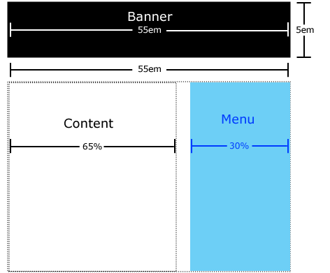
Fluid Grids
Instead of fixed pixel widths, fluid grids utilize percentage-based widths for columns, allowing the layout to expand or contract smoothly. For example, on mobile devices, a single column is typical, whereas desktops can display multiple columns side by side.

Flexible Images
Images that scale with their containers prevent overflow issues and maintain visual harmony across devices. Applying max-width: 100% ensures images resize automatically, fitting within their parent elements without distortion.
css

img {

  max-width: 100%;

  height: auto;

}
This technique ensures images remain proportionate and responsive, whether placed in a small or large container.
Media Queries
Media queries enable developers to specify CSS rules that activate under certain conditions, such as maximum or minimum widths. For example:
css

@media screen and (max-width: 500px) {

  .container {

    background-color: lightblue;

  }

}
They provide essential breakpoints for adjusting layout and style, making web pages adaptable to a vast array of screen sizes.
Implementing a viewport meta tag is crucial for media queries to function correctly on mobile devices:
html

<meta name="viewport" content="width=device-width, initial-scale=1.0" />
Mobile-First and Desktop-First Approaches
Designing with a mobile-first philosophy involves creating a minimal, optimized layout for smartphones, then progressively enhancing the design for larger screens using media queries with min-width. Conversely, desktop-first design starts with a comprehensive layout for desktops, then adapts for smaller devices with max-width.
Both strategies are valid, but many modern developers prefer the mobile-first approach for its performance benefits and simplified styling process. You can learn more about these philosophies in dedicated articles on responsive strategies.
Looking Ahead
Understanding the history of responsive web design highlights the ingenuity and persistence of developers who sought to create flexible, user-friendly websites. From early liquid layouts to sophisticated media queries, each step contributed to the seamless multi-device experiences we enjoy today.
For those interested in mastering layout techniques like card UI components, exploring best practices can be invaluable. Check out this resource to deepen your understanding.
If you’re aiming to advance your career in web development, knowing the evolution and principles of responsive design can help you land your ideal role. Consider reviewing these proven strategies to enhance your job search.
For newcomers eager to break into remote web design roles, it’s essential to familiarize yourself with contemporary techniques. This guide on how to secure an entry-level remote position offers practical advice.
Finally, charting your career path becomes easier when you understand the foundational concepts. Explore this comprehensive guide to map out your journey in the industry.
What’s your experience with the evolution of web design? Did I overlook any key milestones? Share your insights on social media and continue exploring the endless possibilities in web development.