


Language alone is not enough to persuade, inform, or entertain; the visual presentation of words—typography—plays a crucial role in how content is perceived and understood. Despite its omnipresence across all forms of written communication, many overlook how significantly typography influences user experience (UX) and user interface (UI) design. From books and articles to websites and apps, the way text appears can shape perceptions, guide interactions, and enhance engagement. Understanding the principles of typography is essential for creating compelling digital experiences that effectively communicate your message.
When you modify typefaces, adjust spacing, or align text thoughtfully, you are engaging in a form of typography. Yet, in the context of UX design, typography extends beyond aesthetic choices. Skilled designers carefully consider how typefaces integrate with other visual elements to reinforce the overall message. In this guide, we explore what typography truly entails, its relationship with UX/UI design, and key factors to consider when selecting typefaces for your projects.
This guide covers:
- What is typography?
- The importance of typography in UX/UI design
- The fundamental elements of typography
- Five critical considerations for choosing the right typeface
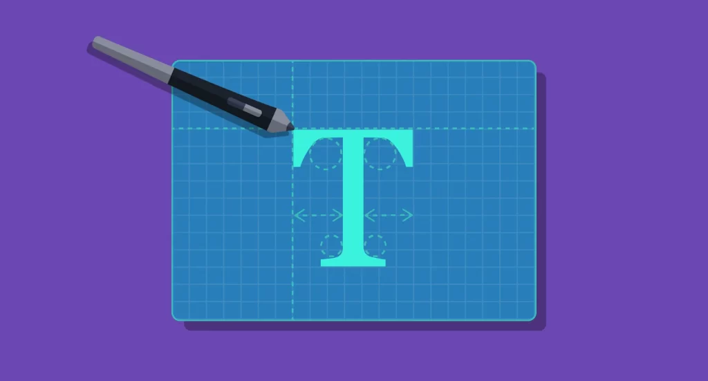
What is Typography?
Typography is the art and technique of arranging type to make written language visually appealing and easy to read, whether in print or digital formats. It involves selecting and organizing elements such as typefaces, font sizes, line spacing, letter spacing, and alignment to craft a specific visual message or emotional response. While traditionally associated with printed materials like books, magazines, and newspapers, typography has become an integral part of digital design, greatly influencing how users interact with online content.
The origins of typography date back to the 11th century, initially focused on printed works. With the advent of the internet, digital typography expanded rapidly, giving rise to countless type styles, from classic fonts like Times New Roman and Helvetica to modern, creative typefaces. In digital environments, typography is not just about setting a tone; it actively enhances usability and user satisfaction. Effective typography guides the reader’s eye, emphasizes important content, and creates a cohesive visual hierarchy that improves overall navigation.
For more insights, you might explore how effective project management can enhance your web design process in streamlining web design project management, which is crucial for delivering well-crafted typography within larger projects.
The Importance of Typography in UX and UI Design
The choice of fonts and their arrangement can dramatically influence how a website or application is perceived. Consider the widely criticized font Comic Sans; its playful style can undermine professionalism, demonstrating how typography impacts credibility. Small adjustments—like changing line spacing or font weights—can significantly improve readability and aesthetic appeal, affecting user engagement and overall satisfaction.
In UX and UI design, typography serves several vital functions:
- Capturing Attention: Attractive and appropriate fonts draw users in, encouraging them to explore further.
- Influencing Behavior: Well-chosen typography can persuade users to stay longer, explore more, or take desired actions.
- Supporting Brand Recognition: Consistent use of specific typefaces, alongside logos and visual elements, helps build a memorable brand identity. Over time, users subliminally associate certain fonts with particular brands, fostering trust.
- Creating a Visual Hierarchy: Effective typography organizes content, guiding users naturally through information. Clear distinctions between headings, subheadings, and body text streamline navigation, especially important in our fast-paced digital world.
Incorporating thoughtful typography enhances usability and can even improve your search engine ranking by ensuring your site is accessible and legible. For more comprehensive guidance on managing web development projects, visit effective project management strategies.
The Fundamental Elements of Typography
Before making decisions about font choices, it’s essential to understand core typographic elements and how they influence UX design.
Typefaces
Typefaces define the visual style of characters and are central to conveying tone and personality. It’s important to distinguish between a font and a typeface: a font is a specific style within a typeface family. For example, Arial Bold is a font, while Arial is the typeface. Common categories include serif, sans-serif, and decorative fonts. Serif fonts like Times New Roman are often used for traditional or formal content, while sans-serif fonts like Helvetica are preferred for modern, clean interfaces.


Hierarchy
Typography establishes a visual hierarchy that helps users distinguish between different types of content. Larger fonts often signal headers, while smaller ones indicate subheadings or body text. Variations in font size, weight, and style guide the reader through the information seamlessly, making content easier to scan and understand.


Consistency
Maintaining uniformity across your design is critical. Consistency in font usage, sizes, and styles prevents a disorganized appearance and helps users develop an intuitive understanding of your content structure. A well-defined typographic system ensures that readers can navigate content effortlessly, reinforcing clarity and professionalism.
White Space
White space, or negative space, surrounds text and graphics, contributing to readability and aesthetic balance. Adjusting margins, line spacing, and padding influences how comfortably users can read and absorb information. Proper use of white space directs attention to key elements and prevents clutter.


Alignment
Consistent alignment ensures that text and graphics are positioned in a way that feels balanced and intentional. Proper alignment enhances legibility and creates a polished appearance. Whether left, right, center, or justified, alignment choices should support the overall design harmony.


Color
Color adds vibrancy and emphasis to typography. It’s vital to consider contrast against backgrounds to ensure readability. Overusing bright or contrasting colors can be distracting, so a balanced approach enhances clarity and guides user focus effectively.


Contrasts
Using contrasting fonts, sizes, or colors helps highlight important content and creates visual interest. Contrasts improve legibility and help communicate content hierarchy, making it easier for users to differentiate between various sections or levels of information.


Five Key Factors When Choosing a Typeface
Selecting the right typeface involves more than just aesthetics; it requires strategic consideration of your brand and content goals.
Brand Identity
Your choice of fonts should reflect your brand’s personality. Whether your brand is serious, playful, innovative, or traditional, the typography must support these traits. For instance, a financial firm might favor classic serif fonts to convey stability, while a creative agency might opt for bold, experimental typefaces.
Tone and Message
Fonts communicate tone visually. A casual, handwritten font can express friendliness, whereas a sleek, modern font might suggest professionalism. Align your typography with the message you want to send to your audience.
Legibility
While decorative fonts can be eye-catching, they may compromise readability, especially in body text. Prioritize clarity to ensure your users can effortlessly consume your content. For complex projects, consult resources like effective project management to keep your design cohesive.
Consistency
Stick to a limited set of typefaces and styles across your entire website or product. Consistent typography builds familiarity, reduces confusion, and enhances user experience. Avoid switching fonts between pages unless intentionally creating a visual distinction.
SEO Compatibility
Choose web-friendly fonts that load quickly and are compatible with browsers. This ensures that search engines can crawl and index your site effectively, increasing organic visibility.
By understanding and applying these typographic principles, designers can craft websites and applications that not only look appealing but also provide intuitive and engaging user experiences. Proper typography guides users naturally through your content, encourages interaction, and reinforces your brand identity.
Interested in expanding your knowledge? Explore related topics like improving web project management or effective strategies for web development.
Want to learn more about typography in UX/UI design? Check out these related blog posts:
- Video: Everything to Know About Typography in Figma
- 4 Fast Ways to Level up Your Typography Game
- 20 Typography Terms You Need to Know