Understanding how visitors interact with your website is crucial for optimizing user experience and increasing conversions. Heat maps serve as a powerful visual tool that reveals the actual behavior of users, providing actionable insights that can inform design decisions, content placement, and overall site strategy. By translating complex data into intuitive color-coded visuals, heat maps allow teams to identify what works, what doesn’t, and where to focus their efforts for maximum impact. Whether you’re new to digital analytics or looking to refine your CRO tactics, mastering heat map analysis can significantly elevate your website’s performance and profitability.
What is a Heat Map?
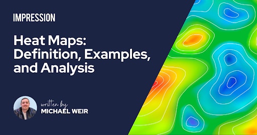
A heat map is a graphical representation that uses colors to depict data patterns, making complex information more accessible and easier to interpret. Typically, different hues indicate varying levels of activity, such as clicks, scrolls, or mouse movements, allowing viewers to quickly identify hotspots of high engagement or areas that are largely ignored. This method of data visualization has roots dating back to the 1800s, with early examples like Toussaint Loua’s population charts for Paris, which used shades of grey to illustrate demographic densities. The term “heat map” itself was coined in 1993 by software designer Cormac Kinney, who developed a tool to visualize financial market data in real time. Since then, heat maps have expanded across industries—from finance and sports to research—and are now indispensable in website analysis.
Introducing Website Heat Maps
Website heat maps offer an evidence-based approach to understanding user behavior. They visually depict how visitors scroll through pages, where they click, and how they navigate the site, providing a clear picture of engagement patterns. These maps serve as an intuitive complement to numerical analytics, enabling marketers, UX designers, and product teams to pinpoint areas of interest or confusion without needing extensive technical knowledge. Many heat mapping tools also record user sessions, allowing you to watch real interactions that further illuminate user intentions. This combination of visual data and user recordings supports more informed decisions in redesigning and testing web pages, ultimately enhancing user satisfaction and conversion rates.
How Do Website Heat Maps Work?
Heat maps function by aggregating various forms of interaction data—such as clicks, scroll depth, and mouse movements—and representing them with a spectrum of colors. Elements that attract many clicks or views are marked in ‘hot’ colors like red, while less-engaged areas appear in cooler shades like blue. Advanced AI algorithms, trained with eye-tracking and EEG data, now enhance these visualizations by predicting where users are likely to focus their attention. For example, a red hotspot indicates areas with high interaction, guiding designers to prioritize these zones for calls to action or key content. Conversely, cold spots reveal parts of the page that may be overlooked or underperforming. These insights can be filtered by user segments or specific journeys to tailor optimization efforts more precisely.
Heat maps are particularly effective when used as part of a broader CRO strategy. For instance, analyzing scroll behavior on a landing page can help position important elements—like inquiry forms—where they are most visible. Similarly, click maps can identify whether users are engaging with vital buttons or if their attention is diverted elsewhere, informing adjustments to layout or copy.
The Benefits of Website Heat Maps
Incorporating heat maps into your website optimization toolkit offers numerous advantages:
Creating Impactful, Visualized Data
Heat maps simplify complex user behavior data into accessible visuals that anyone on your team can interpret. The intuitive color gradients allow quick identification of high and low engagement zones, facilitating collaborative decision-making without requiring deep analytical expertise. Sharing these visuals with stakeholders or clients fosters transparency and aligns efforts towards common goals.
Fine-Tuning Calls to Action and Interactive Elements
Effective CTAs are vital for conversions. Heat mapping reveals whether your buttons and links are placed optimally and if their design encourages clicks. Adjusting size, color, or copy based on heat map insights can significantly enhance user interaction. Additionally, understanding how users engage with videos and forms allows you to optimize these elements for better performance—such as repositioning a form where it’s more likely to be seen or modifying video controls based on engagement patterns.
Eliminating Distractions from User Journeys
Heat maps help identify elements that distract or divert users from intended pathways. For example, if users repeatedly click on non-interactive icons or stray into irrelevant sections, it signals confusion. Removing or redesigning such distractions streamlines the user experience, leading to higher engagement and smoother conversions.
Guiding Users to Conversion Points
By analyzing where users abandon or hesitate, heat maps inform adjustments that can improve funnel performance. Repositioning or redesigning underperforming buttons and links makes it easier for visitors to follow the intended journey. Tracking user paths and drop-off points helps ensure each page supports the overall conversion process, increasing the likelihood of success.
Understanding Cognitive Load and Focus
AI-powered heat maps can evaluate how much visual information a page demands from users, highlighting areas that may overload or underwhelm visitors. Simplifying cluttered pages or emphasizing key sections can reduce mental fatigue, keeping users engaged and focused. This is especially useful in designing interfaces that balance information richness with clarity.
Analyzing Value Proposition Effectiveness
Effective landing pages quickly communicate their value propositions. Heat maps reveal whether these messages attract attention and are easy to process, particularly on mobile devices where space is limited. Insights from attention heat maps can guide the refinement of headlines, images, and layout to enhance message clarity and motivate action.
Optimizing Creative Content
Testing different creative approaches—such as imagery, headlines, or branding elements—and reviewing heat maps helps identify what resonates most with visitors. Fine-tuning visuals and messaging based on user attention data can lead to more compelling campaigns and higher engagement.
What Are the Different Types of Heat Maps?
Various heat map types serve specific analytical purposes. Leading tools like Hotjar offer several options:
Move Heat Maps
Also called mouse or hover maps, these visualize user cursor movements across the screen. They reveal how visitors navigate each page, highlighting areas that attract attention or guide reading patterns—often in an F-shaped pattern, typical of web content consumption.
Scroll Heat Maps
These maps illustrate how far visitors scroll down each page. Colors transition from red at the top to cooler shades further down, indicating which sections are viewed and which are skipped. The ‘above the fold’ area—the part visible without scrolling—is critical for placing key messages and calls to action.
Click Heat Maps
Displaying where users click most frequently, these maps identify popular navigation points, links, and buttons. They help assess whether important elements are receiving enough attention and if any non-clickable items are misleading users.
Engagement Heat Maps
Combining clicks, scrolls, and mouse movements, engagement maps provide an overall picture of which page areas draw the most visitor attention, enabling quick strategic insights.
Rage Click Heat Maps
These highlight areas where users repeatedly click or tap in frustration, often indicating technical issues like broken links or slow-loading elements. Addressing these can significantly improve overall user experience.
AI-Generated Attention Heat Maps
Using machine learning, these predictive maps estimate where users are likely to focus their attention, considering factors like visual clarity and cognitive load. They help anticipate user experience issues before they manifest.
Who Uses Website Heat Maps?
A broad spectrum of professionals leverage heat maps to enhance website performance. UX designers, marketers, data analysts, and product teams utilize these insights to refine user journeys and improve engagement. Business owners can also benefit from interpreting heat map data, but effective analysis demands knowledge of user psychology, design principles, and data interpretation. Many organizations partner with specialized agencies to maximize the value of heat mapping, ensuring insights translate into meaningful improvements.
Heat Map Examples and Use Cases
Heat maps are versatile tools that support various applications:
Combining A/B Testing with Heat Maps
Pairing heat maps with A/B tests allows you to compare different design variations effectively. For example, a case study with an online charity demonstrated how analyzing user interactions led to redesigning donation forms, significantly boosting donations by 29.5%. This approach ensures decisions are backed by real user data rather than assumptions.
Integrating with Google Analytics
Linking heat maps with analytics platforms like Google Analytics provides a comprehensive view of user behavior. While analytics reveal numerical trends, heat maps visually pinpoint specific areas of interest or frustration, enabling more targeted improvements—such as adjusting layout or content placement for better engagement.
Inspiring Hypotheses for User Testing
Heat maps help validate assumptions about usability issues, reducing guesswork. For instance, a UX team might observe excessive misclicks on certain buttons, prompting redesigns that are then tested through heat map analysis, leading to improved satisfaction scores.
Identifying and Fixing User Journey Errors
Session recordings combined with heat maps uncover obstacles like broken links or confusing navigation paths. Addressing these issues based on real user behavior increases the likelihood of completing desired actions, such as purchases or form submissions.
How to Implement Heat Maps on Your Website
Getting started is straightforward, with options ranging from free tools to advanced platforms. For small businesses or startups, Microsoft Clarity offers a no-cost solution that provides basic heat mapping functions. Paid solutions like Hotjar, CrazyEgg, or VWO offer richer features, including unlimited tracking, detailed analytics, and downloadable reports. Many platforms offer free trials, enabling you to evaluate their fit before investing.
By analyzing hotspots and coldspots, you can optimize content placement, streamline navigation, and enhance overall user experience. Combining heat maps with other testing methods, such as A/B experiments, ensures you make evidence-based decisions that lead to measurable results.
Heat Map Analysis and CRO by Impression
Utilizing heat maps as part of a comprehensive CRO process uncovers hidden opportunities and pinpoints issues affecting your website’s effectiveness. Our approach integrates heat mapping with behavioral science and website testing, ensuring a data-driven pathway to growth. Partnering with experienced professionals allows you to unlock the full potential of your site traffic, ultimately driving higher conversions and stronger ROI. To learn more about how we can help optimize your digital presence, contact our team today.