Creating an intuitive and visually appealing website involves more than just aesthetic choices; it requires strategic organization of content to guide users seamlessly through your site. Card UI design is a powerful tool to achieve this, as it structures information into digestible, engaging units that improve readability and user experience. By thoughtfully implementing various styles and elements, you can elevate your site’s visual hierarchy, making important content stand out while maintaining a clean layout. This guide explores the fundamentals of UI card design, different styles to consider, essential components, and best practices to maximize their impact.
What’s a UI card?
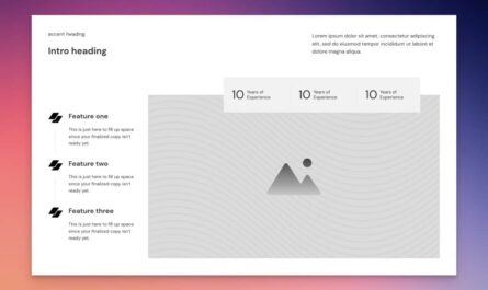
UI cards are rectangular, often bordered containers that group related information and media within a website layout. These compact units serve as modular building blocks, enabling designers to organize content efficiently and uniformly across pages. They typically contain elements such as images, headlines, descriptions, icons, and calls-to-action, all arranged to facilitate quick comprehension and navigation. For instance, a property listing website may utilize UI cards to display individual property details on a single page, allowing users to compare options without navigating away. To deepen your understanding of how to tailor websites to meet specific needs, consider exploring resources on customized web development.
Designers leverage these content blocks to highlight key features, showcase products, or present profiles in a visually ordered manner. Their versatility makes them essential for building clear, engaging interfaces that enhance overall site structure and user flow.
UI card designs: 4 styles
Different website objectives call for distinct card styles. Understanding these styles helps in selecting the right design to convey your message effectively:
- Pin-style cards: Inspired by Pinterest, these resemble physical pins with varying heights, arranged in a staggered grid. They’re ideal for visual content like images, videos, or snippets, making them perfect for social media feeds or content discovery platforms.
- Flat-style cards: Emphasizing simplicity, these cards feature clean typography, bold colors, and minimal icons. Their straightforward design, often enhanced with subtle hover effects, keeps the focus on content, suitable for modern interfaces seeking a sleek aesthetic.
- Grid-style cards: Organized in uniform rows and columns, grid-style cards are common in portfolios, galleries, and e-commerce sites. They facilitate easy browsing by maintaining consistent sizing and spacing.
- Magazine-style cards: Drawing inspiration from print layouts, these incorporate large images, varied typography, and layered content for an immersive, editorial feel. They work well for blogs, news outlets, and content-heavy platforms.
UI cards: Common design elements
Effective UI cards incorporate several core elements to present information clearly:
- Container: The outer frame that encapsulates all other components, often styled with borders, shadows, or background colors to distinguish the card from the surrounding content.
- Thumbnail: A small visual preview that provides immediate context about the content, such as an image or icon.
- Heading: The primary title, designed to catch attention with bold, larger fonts, establishing the main focus.
- Subheading: Additional contextual information that supports the main heading, often in a slightly smaller or lighter font.
- Supportive text: Brief descriptions or summaries that offer further insights or details.
- Media: Rich content like images, videos, or infographics that enhance visual appeal and engagement.
- Buttons: Call-to-action elements encouraging user interaction, such as “Learn More” or “Buy Now,” usually styled for prominence.
- Icons: Small graphics that quickly convey categories or actions, aiding in rapid comprehension.
For example, a Webflow blog post card might feature a container holding a thumbnail of the header image, a headline like “Why every digital creator needs a powerful website,” a subheading with the author’s name, and supportive text summarizing the article.
9 types of UI cards
UI cards can serve diverse functions depending on their design and purpose:
- Interactive cards: Respond to hover or click events with animations, providing immediate feedback and encouraging exploration. They are perfect for product showcases and portfolios.
- Content cards: Combine images and text to present previews of articles, videos, or resources, enticing users to explore further.
- Product cards: Display product images, descriptions, prices, and purchase buttons—ideal for online stores seeking to streamline browsing.
- Profile cards: Showcase individual information such as photos, names, roles, and contact details, often used in team sections or social profiles.
- Action cards: Focused on prompting specific user actions, featuring prominent CTAs, testimonials, and persuasive messaging.
- Dashboard or data cards: Present metrics, charts, and summaries for administrative panels, offering quick insights into performance.
- Media cards: Highlight multimedia content like videos, music, or GIFs, providing relevant details such as titles and creators.
- List cards: Group items or features into manageable sections, suitable for instructions, feature lists, or specifications.
- Modal cards: Overlaying pop-ups that focus user attention on forms, alerts, or important notices without navigating away from the current page.
Best practices for creating effective UI cards
Implementing UI cards with modern design principles enhances usability and aesthetic appeal. Consider these best practices:
Use contrast and shadows to outline the cards
Applying contrasting colors and subtle shadows helps define each card’s boundaries, making them pop against the background. This visual separation guides users’ eyes and simplifies interaction. For example, a light-colored card with a gentle shadow creates a sense of depth, improving overall readability. Consistency in contrast and shadow styles across your site fosters a cohesive look.
Maintain balanced font size and content hierarchy
Clear hierarchy guides visitors through your content effortlessly. Use larger, bolder fonts for headings (around 18–24 pixels), medium sizes for subheadings (14–16 pixels), and smaller fonts for supporting text (10–12 pixels). This structure ensures the most important information stands out, enhancing comprehension and engagement.
Have each card represent one concept
Focus each card on a single idea, product, or profile to avoid clutter and confusion. This approach creates a clean, intuitive layout where users quickly grasp the essence of each unit. For instance, a portfolio card should showcase one project with relevant images, a brief description, and a CTA, making it easy for visitors to differentiate between offerings.
Choose suitable images and animations
High-quality, relevant images elevate visual appeal, while subtle animations add interactivity without overwhelming users. Use animations sparingly—such as hover effects or slight transitions—to draw attention to key elements, like buttons or icons. Effective imagery and animations can enhance user engagement significantly.
Define a fixed spacing
Consistent spacing between elements—like margins, paddings, and gaps—creates harmony and improves readability. For example, setting a fixed 20-pixel margin between cards and 10 pixels of padding inside each card ensures a balanced, organized appearance.
Avoid inline links
Embedding hyperlinks directly within text can clutter your design and distract users. Instead, use distinct buttons or clearly styled call-to-action elements that stand out. For example, replacing inline text links with a prominent “View Profile” button at the bottom of a profile card improves clarity and usability.
Improve website navigation with Webflow
UI cards are versatile elements that, when well-designed, significantly enhance site navigation and user engagement. Proper implementation involves utilizing design libraries and UI kits available in platforms like Webflow. These resources provide customizable components and templates, enabling you to create visually appealing and functional cards with minimal effort. The Webflow community offers a wide range of examples, inspiring ideas, and tutorials to help you craft impactful digital experiences. To explore the full potential of personalized website design, consider consulting resources on creating bespoke web projects.
By thoughtfully applying these principles, you can leverage card UI design to craft a clear, engaging visual hierarchy that guides visitors effortlessly through your content and enhances overall user satisfaction.