Designing a webpage is a multi-faceted process that combines creativity, technical skills, user experience principles, and strategic planning. With the digital landscape continuously evolving, a well-designed webpage not only attracts visitors but also engages and converts them into loyal users or customers. In 2025, the principles of effective web design have become more refined, emphasizing accessibility, responsiveness, speed, and SEO optimization. This comprehensive guide aims to walk you through the entire process of designing a webpage, from initial planning to deployment, by exploring best practices, tools, and current trends.
1. Understanding the Purpose and Audience
Before diving into the technical aspects, it’s essential to clearly define the purpose of your webpage. Are you creating an e-commerce platform, a portfolio, a blog, or a corporate website? Each type has distinct requirements. Additionally, understanding your target audience — their demographics, preferences, and browsing behaviors — influences design choices such as layout, color schemes, and content structure.
- Define Goals: What do you want visitors to do? (e.g., make a purchase, subscribe, read content)
- Identify Audience: Age, interests, device preferences, accessibility needs
- Research Competitors: Analyze similar websites for strengths and gaps
2. Planning and Wireframing
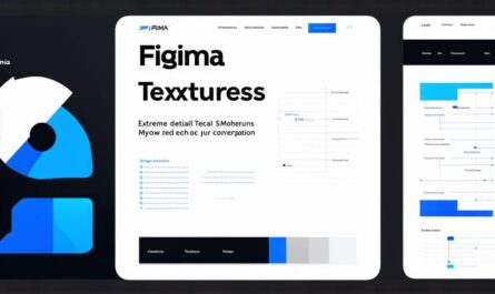
Effective web design begins with planning. Creating wireframes — simplified sketches of your webpage layout — helps visualize the structure without getting distracted by details like colors or fonts. Tools like Figma, Adobe XD, or Sketch facilitate this process.
| Component | Description | Purpose |
|---|---|---|
| Header | Contains logo, navigation menu, contact info | Navigation and branding |
| Hero Section | Large banner with headline and call-to-action (CTA) | Grab attention and direct users |
| Content Sections | Information, features, testimonials | Inform and persuade visitors |
| Footer | Links, social media, legal info | Provide additional navigation and info |
3. Design Principles and Best Practices
Visual Hierarchy and Layout
Effective layouts guide users’ eyes naturally through the page. Use size, color, and positioning to highlight important elements. The grid system (like Bootstrap or CSS Grid) ensures a balanced, responsive structure.
Color Scheme and Typography
Choose a color palette aligned with your branding. Use tools like Adobe Color or Coolors for inspiration. Typography should be legible and consistent, with a hierarchy that differentiates headings, subheadings, and body text.
Accessibility
Design with inclusivity in mind. Follow WCAG (Web Content Accessibility Guidelines) by ensuring sufficient contrast, keyboard navigation, alt texts for images, and semantic HTML tags.
Responsiveness
Design must adapt seamlessly across devices. Use responsive frameworks like Bootstrap or Foundation, and test on various screen sizes. In 2025, mobile-first design remains a standard to optimize for the majority of users.
4. Development: Turning Designs Into Reality
HTML: Structuring Content
HTML (HyperText Markup Language) forms the backbone of your webpage. Use semantic tags like <header>, <nav>, <section>, and <footer> to improve SEO and accessibility.
CSS: Styling Your Page
CSS (Cascading Style Sheets) controls visual aesthetics. Modern CSS techniques include Flexbox and CSS Grid for layout, variables for theming, and media queries for responsiveness.
JavaScript: Enhancing Interactivity
JavaScript adds dynamic features like sliders, forms validation, and modal windows. Frameworks like React, Vue.js, or Angular are popular for building scalable, interactive interfaces.
Performance Optimization
Fast loading speeds are critical. Optimize images (using WebP format), minify CSS and JS files, leverage browser caching, and utilize Content Delivery Networks (CDNs). Tools like Google PageSpeed Insights provide actionable recommendations.
5. SEO and Analytics
Designing with SEO in mind ensures your webpage ranks higher in search results. Use descriptive meta tags, structured data, and optimize page speed. Incorporate relevant keywords naturally into content.
Implement analytics tools like Google Analytics or Hotjar to monitor user behavior, identify bottlenecks, and refine your design based on real data.
6. Testing and Launch
Cross-Browser Compatibility
Test your webpage across browsers (Chrome, Firefox, Edge, Safari) and devices to ensure consistent appearance and functionality.
Accessibility Testing
Use tools like WAVE or Axe to identify accessibility issues and ensure compliance with standards.
Deployment
Choose a reliable hosting provider. Use version control systems like Git for managing updates. After deploying, continuously monitor performance and user feedback for ongoing improvements.
7. Future Trends in Web Design (2025)
- AI-Driven Personalization: Tailoring user experiences based on behavior and preferences.
- Progressive Web Apps (PWAs): Combining the experience of native apps with web accessibility.
- Dark Mode: Increasingly popular for reducing eye strain and saving battery life.
- Advanced Animations and Microinteractions: Enhancing user engagement without overwhelming.
- Voice Search Optimization: Preparing websites for voice commands and AI assistants.
Useful Resources and Tools
- MDN Web Docs — Comprehensive developer guides
- Web.dev — Best practices and tutorials from Google
- Adobe Color — Color palette generator
- Google Fonts — Free web fonts
- Google PageSpeed Insights — Performance analysis
- WAVE — Accessibility evaluation
Designing a webpage in 2025 involves a strategic blend of aesthetics, functionality, and user-centric principles. Staying updated with current trends, tools, and best practices ensures your website remains competitive, accessible, and engaging for your audience. Remember, a successful webpage is not just visually appealing but also optimized for performance, accessibility, and conversion.