Interactive maps have become essential tools for organizations aiming to showcase their reach, impact, and services across different geographical locations. They transform static data into engaging visual stories that captivate users and provide valuable insights. From highlighting project distributions to displaying store locations, these dynamic maps enhance user experience and support strategic communication efforts. Incorporating such maps requires thoughtful planning, data management, and design considerations to ensure they serve your goals effectively. Whether you’re in nonprofit, education, retail, or energy sectors, understanding the variety of map examples available can inspire your next web development project.
Getting Started With Interactive Maps
Creating effective interactive maps begins with understanding that there is no universal solution; each project must be tailored to specific needs. The first step involves collaborating with clients to clarify what the map should communicate, how the data should be visually represented, and how users will interact with it. This process includes exploring various functionalities, such as toggles between data types, filtering options, and display styles, to find the best fit for your audience.
Our team often shares multiple examples during the planning phase to help clients visualize different possibilities. These examples clarify what features are necessary, how data should be presented, and what visual aesthetics align with the brand. For example, you might consider whether the map will display a single data type like project locations, or multiple categories such as past and current initiatives, with options for users to switch views seamlessly. Also, determining the data source’s reliability and update frequency is crucial for maintaining accurate information.
Deciding whether to use pins for individual locations or other visualization methods depends on the map’s purpose. For instance, a map showing store locations would typically use pins, while a demographic map might use heat zones or shaded regions. These initial questions set the foundation for designing maps that are both informative and user-friendly.
Ongoing Map Management
Once the design phase is complete, the focus shifts to managing and updating the maps. We prioritize building maps that are straightforward for clients to control and modify. Many maps are integrated with content management systems (CMS), allowing editors to add, remove, or update pins and data points without technical expertise. For data that changes frequently or is sourced externally, connecting the map to live Google Sheets or other data feeds streamlines updates and ensures real-time accuracy.
For more complex datasets, especially those managed by third-party organizations, spreadsheets serve as efficient data repositories. Clients can upload data files directly or connect live data sources, enabling automated updates. This flexibility is vital when dealing with extensive datasets or when multiple contributors are involved.
Our extensive experience has led to a diverse portfolio of map types, each tailored to the project’s specific needs. Below are some compelling examples that showcase the versatility of interactive maps across industries and applications. These range from nonprofit project locations to corporate impact, infrastructure, and community engagement maps. Some of these maps were developed by us, while others are curated from innovative solutions encountered online. Sharing these examples helps clients refine their vision and select features that best serve their objectives.
Examples of Interactive Maps
International Women’s Media Foundation
The program map designed for IWMF (a project by NMC) uses location pins to denote countries where IWMF journalists have contributed. When users click a pin, a lightbox appears displaying details such as reporting trips, journalist bios, and program specifics, providing an engaging way to explore global media efforts.
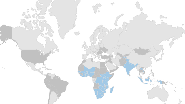
IntraHealth’s “Where We Work” map (another NMC project) effectively illustrates the scope of an organization’s operations. Using color coding, it highlights countries with active programs and those where work has been completed. Clicking on a highlighted nation redirects users to a dedicated page with more detailed information, enriching the user’s understanding of the organization’s global impact.
Fleet Feet’s franchise map, powered by Mapbox, showcases over 180 retail locations across the United States. Clickable pins reveal store-specific details, enhancing the shopping experience for customers seeking nearby outlets.
North Carolina Community Foundation
This interactive map displays the counties served by NCCF in North Carolina. A detailed legend explains the color coding, and filters enable users to focus on specific regions within the state’s 100 counties. This feature simplifies navigation and resource discovery, making the map a practical tool for residents and stakeholders.
Physician Assistant Education Association (PAEA)
Built as part of PAEA’s website redesign, this map functions as a visual directory of over 300 member schools nationwide. Clustering pins helps users navigate dense areas, revealing regional groups and individual locations with ease. The map enhances usability and provides quick access to detailed school information.
Duke University’s global reach is showcased through a map that filters by research, student projects, and training activities. Clicking on country pins displays relevant details and links to dedicated pages with comprehensive project summaries, news, and research insights.
Cornell University’s map visualizes its community engagement across New York State. Each pin highlights a specific research initiative, offering insights into the university’s local impact.
UNC Kenan-Flagler Business School
This interactive map on the Global Programs page allows prospective students to filter study abroad options. Activated filters display only relevant locations, which can be viewed on the map or in table format, facilitating easy decision-making.
Duke Energy’s outage map exemplifies user-specific information delivery. After selecting their state and account type, users view outage details pertinent to their location—showing active outages, cause, and estimated restoration times—delivering critical information efficiently.
Lee + White’s map highlights available spaces within a 23-acre Atlanta development, showing occupancy status, surrounding businesses, and access points along the BeltLine trail. It’s a practical tool for prospective tenants and investors.
CRG’s international development map, developed by NMC, displays project locations worldwide. The contrast between map and markers emphasizes their global portfolio, aiding clients in visualizing their reach.
Impossible Foods
This bold, colorful map emphasizes their presence in retail stores across the nation. Users can zoom in for more details, revealing features like lakes and city grids as they narrow their focus, aligning with their branding aesthetic.
Lululemon’s store locator reflects their brand’s style with custom pins featuring their logo, subtle hover effects, and animated buttons. Clicking a location provides a mini-map for visual context, maintaining brand consistency.
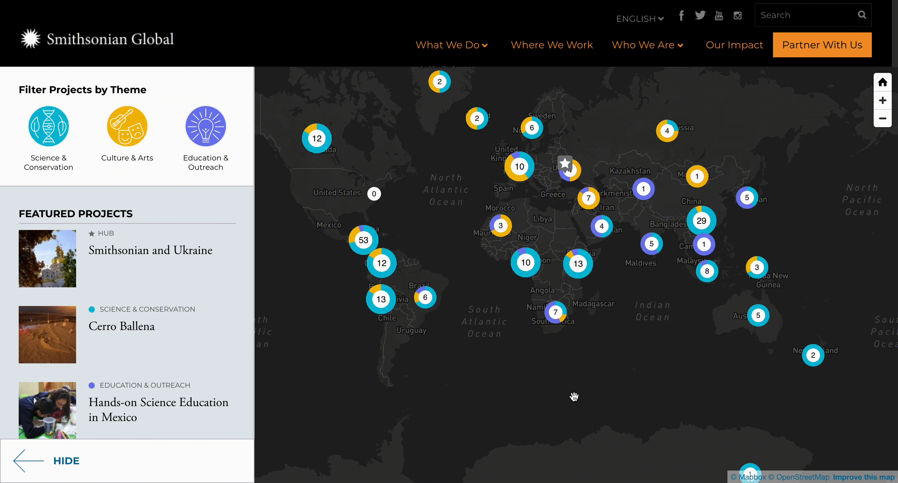
Smithsonian Global
Their map illustrates international project locations, with color-coded pins representing different themes. Users can filter projects by theme, causing the map to adjust dynamically, enhancing thematic exploration.
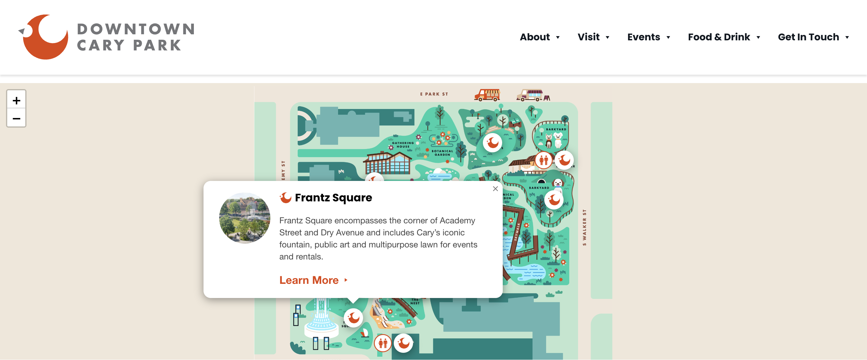
Downtown Cary Park
This map offers a creative view of park amenities, with custom illustrations marking features like playgrounds, sports areas, and rest zones. Users can click pins to learn more about each amenity, making planning and exploration engaging.
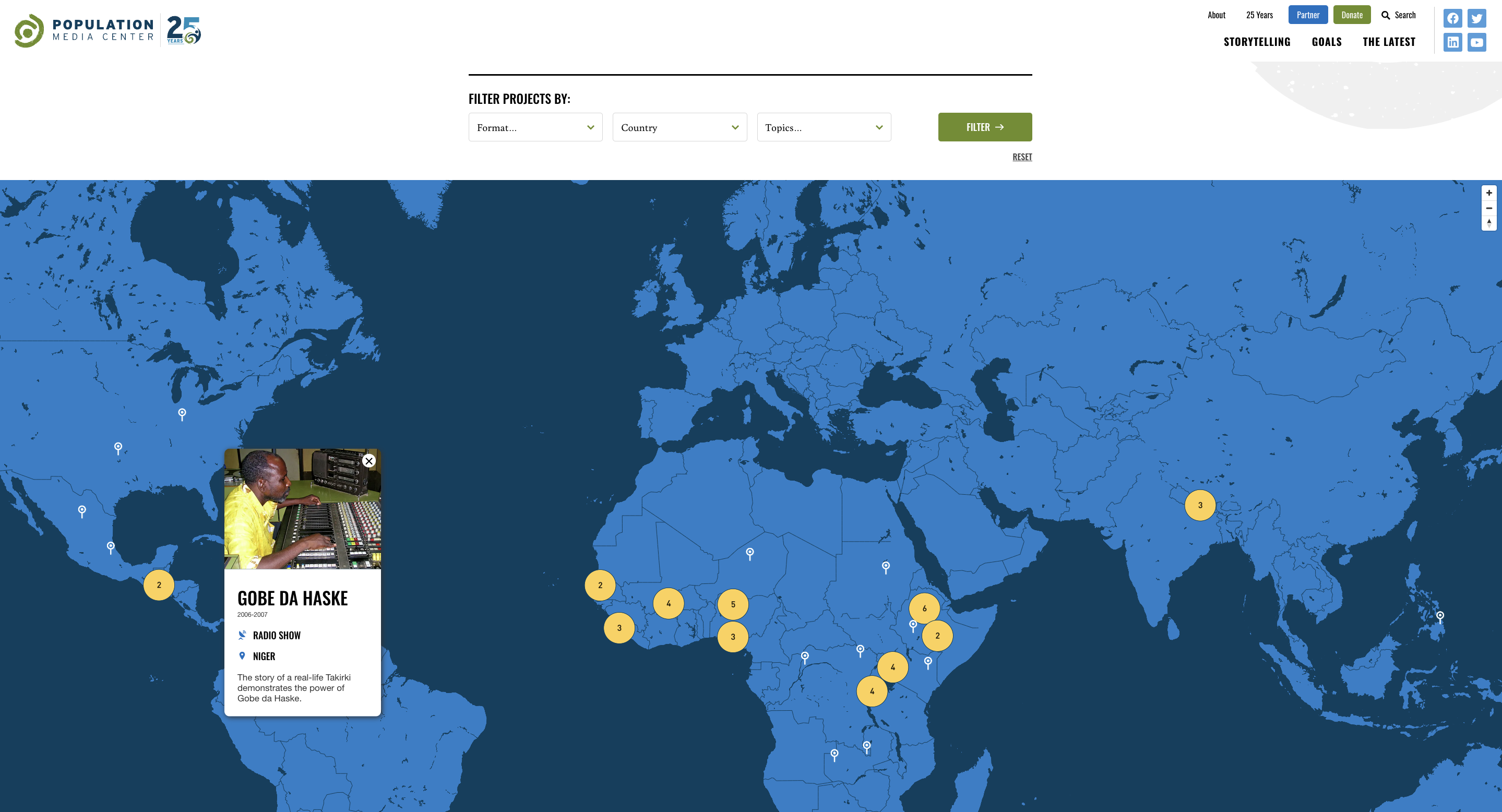
Population Media Center
This project’s map visualizes the locations of global projects, with pins that reveal detailed information about each initiative upon selection. Filters enable users to focus on specific countries, topics, or formats, facilitating targeted research.
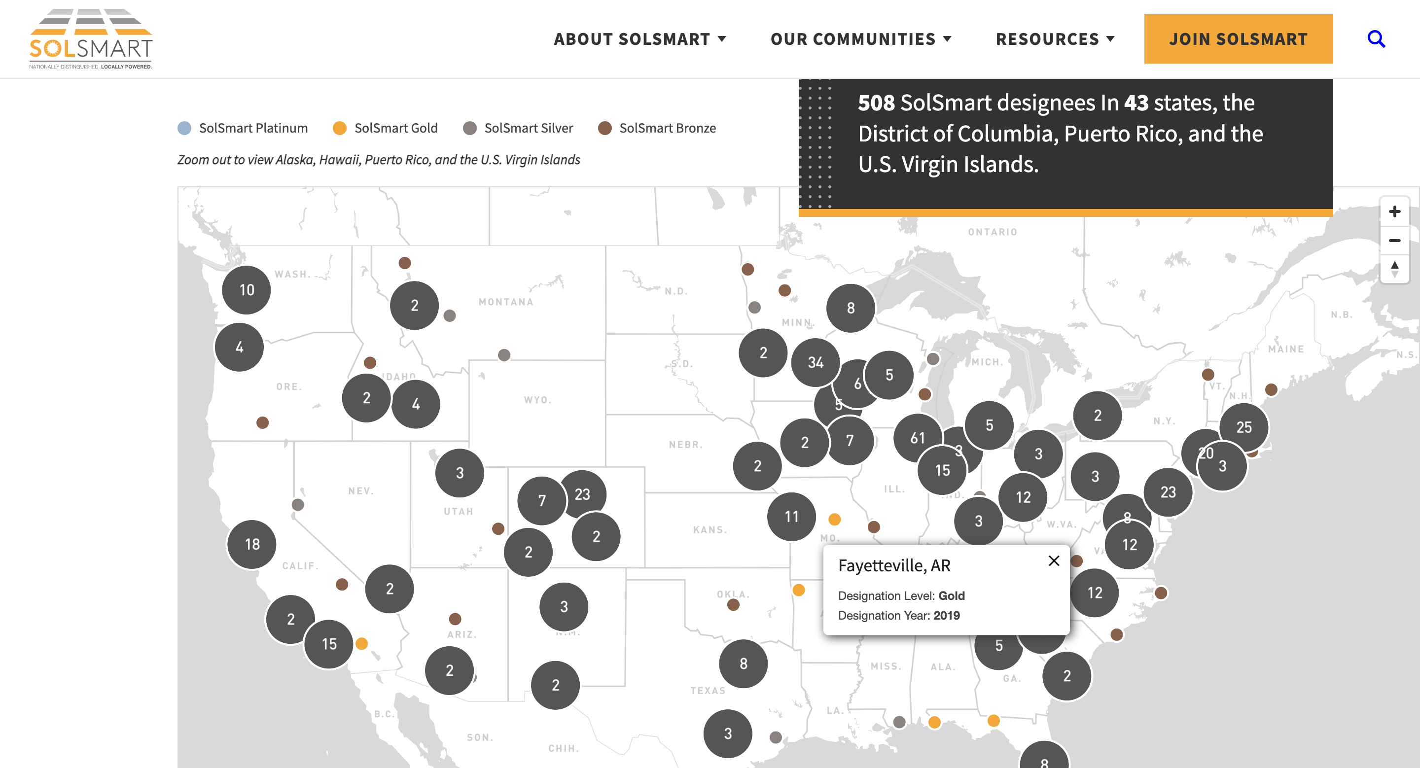
SolSmart
Developed using a Salesforce database, this map shows communities recognized for solar energy initiatives. Clicking pins reveals the designation level and year, with color coding indicating different tiers—an excellent example of data-driven visual storytelling.
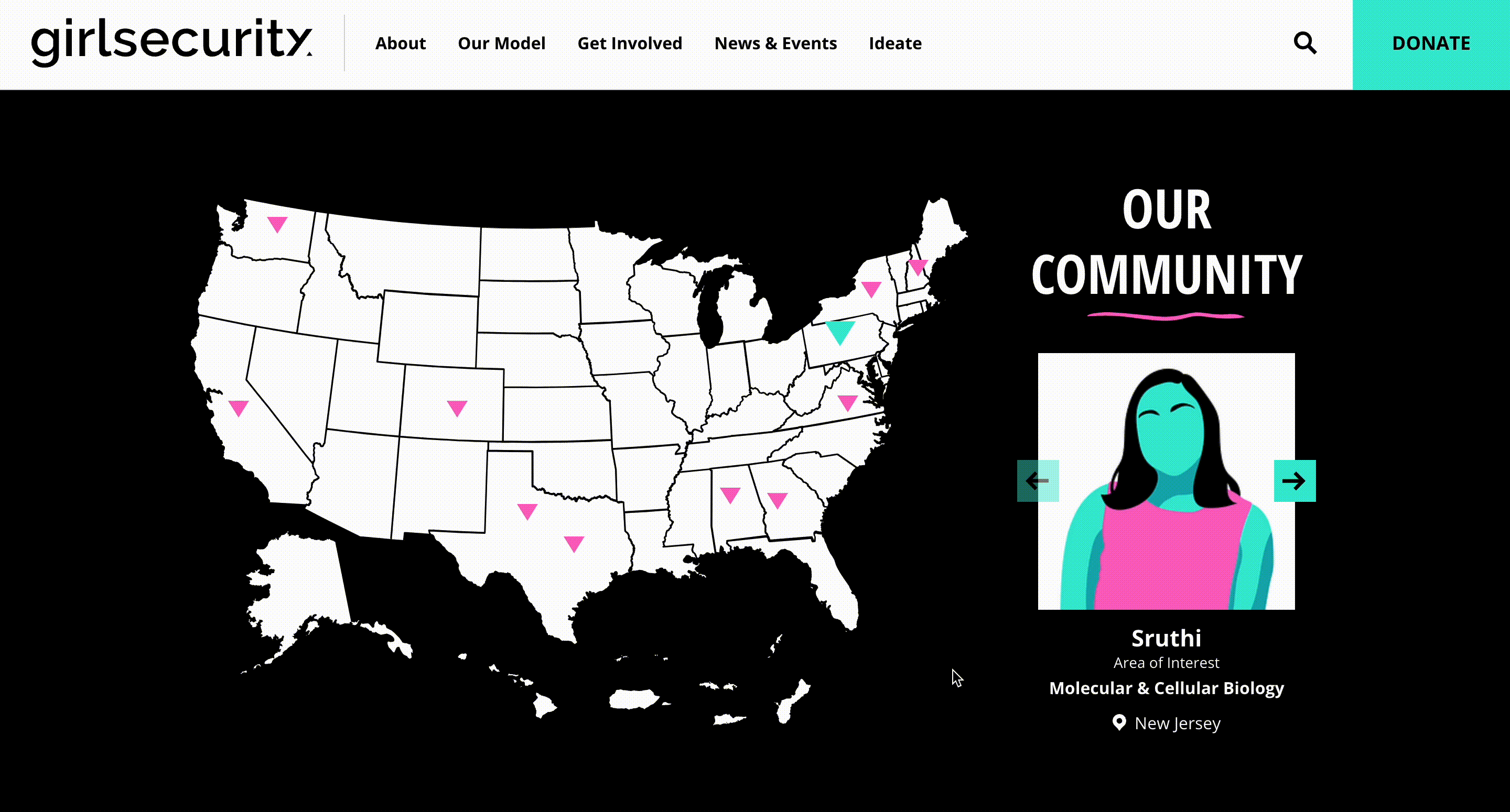
Girl Security
Highlighting their nationwide community, this map uses a slider to display member locations. Each pin is distinct, allowing users to easily visualize the organization’s reach across the country.
Conclusion
The possibilities for integrating interactive maps into your website are virtually limitless. They serve as powerful tools for storytelling, data visualization, and resource navigation across industries. If you’re contemplating adding an interactive map to your site, contact us to brainstorm the best approach tailored to your objectives. From designing user-friendly interfaces to managing complex data feeds, we’re ready to help you leverage maps that make a real impact.
For insights into designing responsive and accessible web elements, consider exploring how to ensure your maps are mobile-friendly and inclusive. Additionally, understanding how web design influences SEO and load times is crucial for optimal performance—find out more at this resource. If you’re interested in the latest AI tools for website design, discover the leading options available. Finally, for those in Perth seeking top-tier web design services, learn which local agency stands out.