Creating a compelling website goes beyond mere aesthetics; it involves a strategic balance of elements that guide users effortlessly through your content. Contrast plays a pivotal role in this process, influencing both the visual hierarchy and the accessibility of your site. When used effectively, contrast ensures that your website is not only attractive but also inclusive and easy to navigate for all visitors, regardless of their visual abilities. Understanding how to harness contrast can significantly elevate your web design, making your website stand out while adhering to best practices and emerging trends. This article explores the fundamentals of contrast in web design and offers practical tips to optimize its application for maximum impact.
What is Contrast in Web Design?
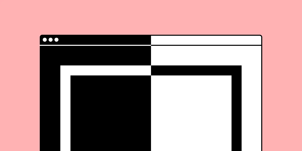
Contrast in web design refers to the deliberate difference between two or more design elements—such as text and background, shapes, or images—that makes them distinguishable from each other. It’s about emphasizing the distinctions rather than the similarities, allowing certain elements to draw attention and improve overall readability. The level of contrast between elements is inversely related to their similarity; the greater the difference, the higher the contrast. High-contrast combinations, like black text on a white background, are highly noticeable and aid in quick comprehension, whereas low-contrast setups tend to blend elements together, which can be useful for subtle background effects or decorative purposes.
The importance of contrast extends beyond aesthetics. It helps create a clear visual hierarchy, guiding users intuitively toward the most important information or actions. Proper contrast enhances usability, making websites more accessible and compliant with standards such as the Web Content Accessibility Guidelines (WCAG). As web design continues to evolve, understanding contrast’s role in both user experience and accessibility will remain fundamental for designers aiming to create effective digital experiences.
Types of Contrast in Web Design
Web designers utilize various contrast types to craft visually engaging and user-friendly websites. Each type plays a specific role in emphasizing content and structuring the visual flow.
Color Contrast: This involves the difference in hue, brightness, and saturation between foreground elements—like text or icons—and their backgrounds. Ensuring sufficient color contrast is vital for readability, especially for users with visual impairments. Tools like the contrast ratio calculator can help verify compliance with accessibility standards.
Size Contrast: Varying the size of elements helps establish a hierarchy, guiding users’ attention toward key areas such as headlines, calls-to-action, or featured images. Larger elements naturally attract more focus and can break the monotony of a uniform layout.
Space or Negative Space Contrast: Also known as whitespace, this refers to the empty areas surrounding design elements. Effective use of negative space can highlight particular components, create visual tension, and improve overall clarity. It also contributes to a clean, uncluttered aesthetic.
Foreground and Background Contrast: This compares the visual relationship between elements placed in the foreground and their backgrounds. Dynamic backgrounds that change based on user interaction can add depth, making contrast a tool for both static and interactive design.
Shape Contrast: Achieved through differences in geometric or organic shapes, this type of contrast adds visual interest and can direct viewers’ focus. Using varied shapes can also convey different moods—sharp, angular shapes suggest order and professionalism, while softer, rounded shapes evoke friendliness.
Element Media Contrast: Incorporating diverse media types—such as photographs, illustrations, or sketches—can create contrast by combining different visual textures and styles that complement or oppose each other, enhancing the overall aesthetic.
Why is Contrast Important in Web Design?
Beyond its visual appeal, contrast serves critical functional and strategic purposes in web design.
Supports Visual Hierarchy: Proper contrast emphasizes the importance of certain elements, making it easier for users to identify primary actions, headings, or key information. This intuitive prioritization improves navigation and user flow.
Enhances Accessibility: Contrast ensures that content is perceivable by individuals with visual disabilities. For example, high-contrast text on a background makes reading easier for those with impaired vision and aligns with international standards like WCAG. Ensuring sufficient contrast is also a legal requirement in many regions, such as under the U.S. Americans with Disabilities Act, which has led to numerous legal actions against non-compliant websites.
Boosts User Engagement: Visually striking contrast can attract attention and encourage interactions, whether it’s clicking a button or exploring different sections of a site. Proper contrast draws users’ eyes naturally to the most relevant parts of your website.
Builds Brand Identity: Consistent use of contrast aligns with your brand’s visual language, reinforcing recognition and trustworthiness.
Incorporating contrast effectively can significantly improve the overall user experience, making your website more intuitive and inclusive. For example, designing with accessibility in mind may involve consulting resources like the Web Content Accessibility Guidelines or analyzing the contrast ratios to meet compliance standards.
Contrast in Web Design – 7 Tips to Maximize Its Effectiveness
Applying contrast thoughtfully enhances your website’s visual hierarchy and accessibility. Here are seven practical tips to make the most of contrast in your designs.
1. Check Your Text Contrast Ratio
Assessing the contrast ratio between text and background is essential for readability. Use reliable contrast ratio tools or built-in features in design software like UXPin, which includes a contrast checker. Strive for a minimum ratio of 4.5:1 for normal text, as recommended by WCAG, but consider higher contrasts for enhanced clarity. For large headings or logos, the contrast requirements can be slightly relaxed, allowing for creative flexibility.
2. Create Large Spacing to Highlight Details
Strategically using generous spacing around key elements—such as call-to-action buttons or featured images—helps draw attention and creates visual separation. This negative space not only emphasizes contrast but also improves navigability and content comprehension. For example, Apple’s product announcements often showcase ample buffer zones around images, guiding viewers’ focus precisely where intended.
3. Use Sufficient Color Contrast
Choosing contrasting colors for text, icons, and interactive elements improves visibility. Avoid low-contrast combinations that can strain the eyes or hinder comprehension, especially for users with color vision deficiencies. Tools like the contrast checker in UXPin can simulate how designs appear to users with different types of color blindness, ensuring your color choices are inclusive and effective.
4. Incorporate Vivid Backgrounds
Background imagery, such as travel destinations for a tourism website, can create a vibrant, engaging atmosphere. Be mindful of how such backgrounds interact with foreground content; high-contrast overlays or filters can enhance readability without sacrificing visual appeal. Keep performance in mind—heavy video backgrounds may impact load times, so optimize media for speed and responsiveness.
5. Make Size Differences Noticeable
Use size contrast to establish a clear hierarchy and direct user attention. Larger headings and buttons stand out against smaller text or less prominent elements, making navigation intuitive. Maintaining proportional size variations ensures your layout remains balanced, avoiding distractions or confusion caused by overly exaggerated differences.
6. Utilize Textures and Patterns
Textures and patterns introduce contrast through surface qualities. Pairing a textured background with smooth text or vice versa adds depth and interest. Experimenting with different textures allows you to craft distinctive visual identities—whether vintage, modern, or natural—while maintaining clarity.
7. Experiment with Shapes: Organic vs. Geometric
Shape contrast—such as combining angular, geometric forms with flowing, organic shapes—can create visual tension that captivates users. Rounded edges convey friendliness, while sharp angles suggest precision. Using contrasting shapes in your design elements, like buttons or icons, can subtly influence user perception and interaction.
Implementing Contrast Effectively
Combining various contrast types enhances both the aesthetic and functional qualities of your website. For instance, pairing bold, large typography with vivid imagery creates a compelling visual hierarchy. To stay ahead of design trends and ensure your website remains relevant, explore emerging innovations at web design trends shaping 2025.
Additionally, incorporating contrast thoughtfully can help you elevate your online presence with expert design techniques. Whether through color, size, or shape, strategic contrast will guide users naturally through your content and foster a seamless browsing experience.
For businesses aiming to create impactful visual cues, understanding how to maximize impact with effective website banners can be crucial. Proper contrast ensures banners are eye-catching and communicate your message effectively (see the ultimate guide to banners).
By integrating these principles, your website not only becomes more attractive but also accessible and user-centric, aligning with modern design standards and user expectations.


