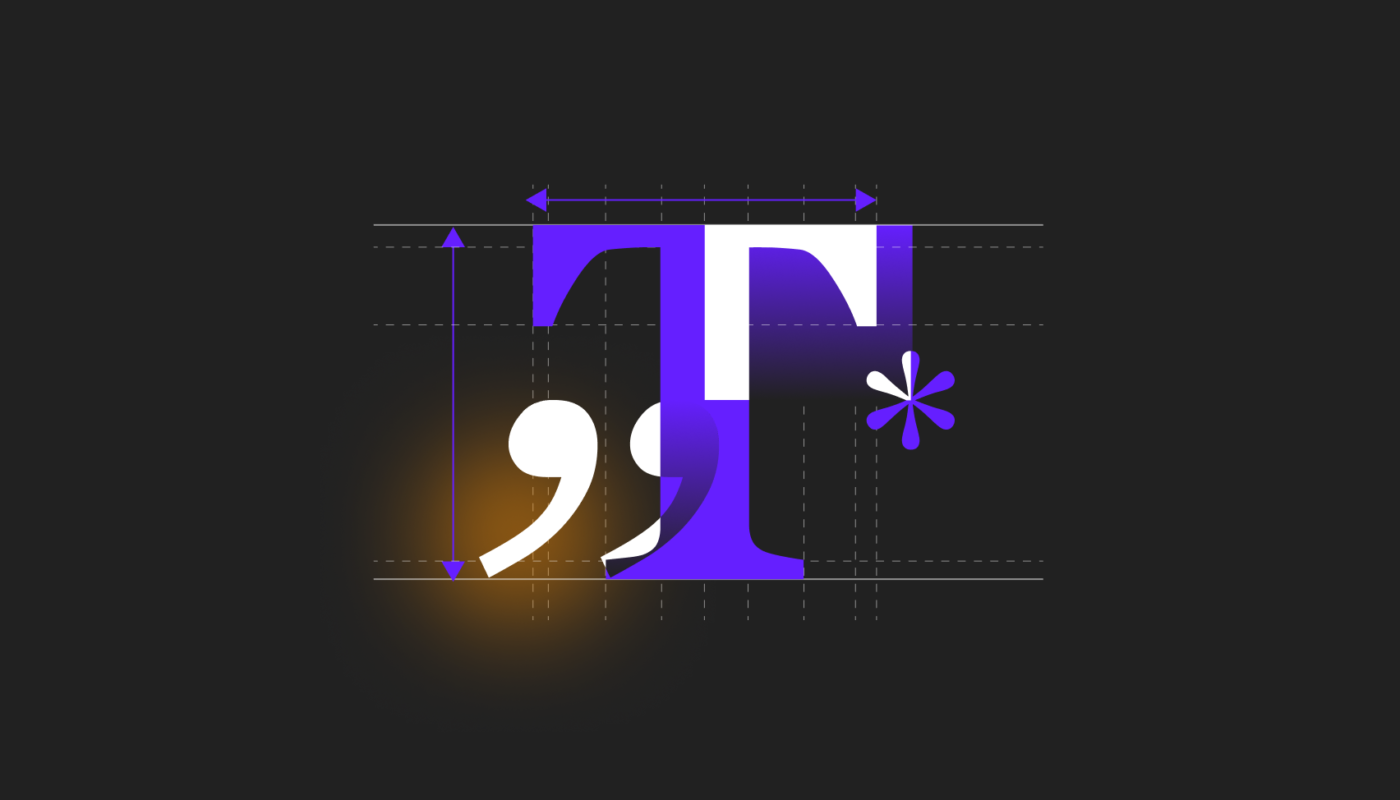
Crafting responsive and visually harmonious web designs hinges on understanding how to effectively utilize font size units. Among these, em and rem are crucial tools that enable designers to create flexible, accessible, and aesthetically consistent typography. Unlike fixed units like pixels, these relative units adapt seamlessly to different screen sizes, user preferences, and design requirements. Mastering their proper application can significantly enhance the quality and maintainability of your projects, whether you’re developing a simple website or a complex web application.
Understanding the fundamental differences between em and rem, and knowing when to use each, empowers designers to build more adaptable and user-friendly interfaces. As you explore these units, consider how they influence hierarchy, scalability, and consistency across your site. For example, adopting a thoughtful approach to font sizing can improve readability and accessibility, making your content more engaging for all visitors.
For those interested in how tailored design choices impact user experience, exploring topics such as custom web design can reveal why personalized solutions often outperform generic templates. To deepen your knowledge, you might find it helpful to review insights on creating unique digital experiences through custom web development, which emphasizes flexibility and user-centric design principles.
Em units
The em unit is a relative measurement based on the font size of the closest parent element. This means that if a parent container has a font size of 16px, then 1em within that container equates to 16px. If a nested element is set to 1.5em, its font size will be 24px (1.5 * 16px). This nesting capability allows for intuitive scaling within specific sections or components of a website, such as buttons inside a card or list items within a menu.
Advantages of em units
Flexible scaling: Em units allow elements to resize dynamically based on their parent’s font size, enabling modular and adaptable components.
Inheritance control: Using ems makes it easier to maintain a clear typographic hierarchy within a section, as sizes adjust relative to their immediate contexts.
Challenges with em units
Complex nesting effects: Deeply nested elements can lead to compounded scaling, making sizes unpredictable if not carefully managed.
Maintenance considerations: Changes in parent font sizes cascade to child elements, requiring meticulous planning to prevent unintended design shifts.
Rem units
Rem, short for “root em,” is based on the font size of the root element. If the root font size is 16px, then 1rem will always be 16px, regardless of nesting. This consistency simplifies the process of designing across an entire site, as rem units provide a uniform scale for typography, spacing, and layout. When you want global control over your design’s scale, rem is typically the preferred choice.
Advantages of rem units
Consistency: Rem units maintain uniform sizing across different components, making global adjustments straightforward.
Ease of maintenance: Since rems are tied to the root element, adjusting the root font size effectively scales all rem-based elements proportionally, simplifying responsive design.
Challenges with rem units
Global impact of root size changes: Altering the root font size affects all rem-based elements, which requires careful planning to avoid unintended layout shifts.
When to choose em vs. rem units
Deciding between em and rem depends on your project’s specific needs:
Use em when:
- Component-specific sizing: You want elements to size relative to their parent, such as buttons within a card that should scale with the section’s text.
- Nested scaling: When your design involves nested components that need to inherit and multiply sizes, em provides intuitive control. For example, list items inside a menu can be scaled together with their container.
- Hierarchical typography: Maintaining clear typographic relationships within a section, like headings and subheadings, can benefit from em’s local scope.
Use rem when:
- Global consistency: Establish base font sizes for body text, headings, and layout spacing that remain uniform across the site.
- Uniform layout elements: For consistent padding, margins, and spacing regardless of nesting, rem units ensure predictable proportions.
- Responsive typography: Adjusting the root font size allows entire layouts to scale smoothly across different devices and screen sizes.
Questions designers should ask themselves
Reflecting on these questions helps ensure thoughtful application of font units:
- Is my goal to scale elements relative to their parent (em) or maintain uniformity across the entire site (rem)?
- How complex is my element hierarchy? Will deep nesting lead to unpredictable sizes?
- Is responsiveness a priority, and can rem units simplify adjustments for various screens?
- Do I need precise control over individual components? Would em facilitate better scaling within specific contexts?
- Is my root font size set correctly to enable effective use of rem units?
- Am I preserving a logical typographic hierarchy with appropriate unit choices?
- Have I avoided over-nesting with em units to prevent compounded scaling?
- Have I tested my design across different devices to ensure accessibility and readability?
Common mistakes to avoid
To ensure smooth implementation, steer clear of these pitfalls:
- Not setting a consistent base font size for the root element, which undermines predictable rem scaling.
- Using em units in deeply nested elements without considering cumulative effects, leading to unexpectedly large or small text.
- Mixing em and rem units haphazardly, causing inconsistency and difficulty in maintaining a cohesive design system.
- Failing to update the root font size for different screen sizes, which can disrupt responsive layouts.
- Assuming that em and rem units behave identically across devices without thorough testing, risking accessibility issues.
Understanding how to effectively leverage em and rem units can dramatically improve your web design process. For a deeper dive into creating responsive and flexible typography, exploring topics such as creating custom web designs or understanding how to craft unique digital experiences can provide valuable insights into scalable and user-centric design strategies.
By mastering these relative units, you ensure your designs are not only visually appealing but also adaptable and accessible across all devices and user preferences.