Modals have become an essential component of contemporary website interfaces, providing a seamless way to deliver critical information or interactive features without navigating away from the current page. Their versatility and user-focused design make them invaluable for enhancing engagement and usability. Understanding how to implement and optimize modals can significantly improve your website’s functionality and user experience.
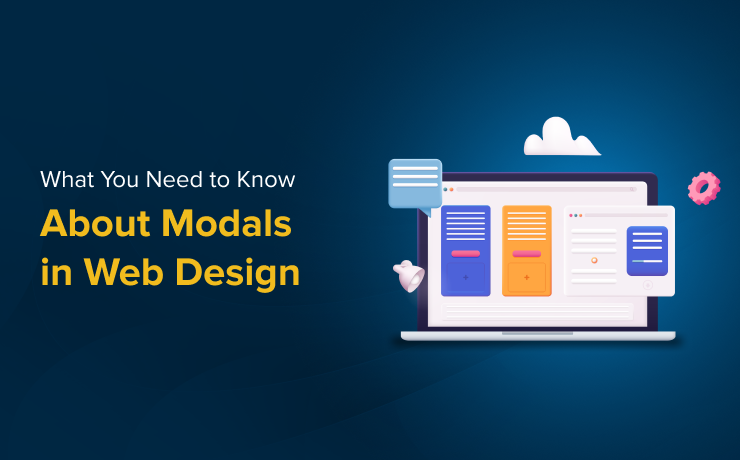
What Are Modals in Web Development?
A modal is a UI overlay that appears on top of the main webpage content, temporarily disabling background interactions to focus the user’s attention on a specific task or message. Unlike traditional browser pop-ups, which open in separate windows, modals are embedded within the page structure, ensuring a consistent and integrated user experience. They are typically triggered by user actions such as clicking a button, link, or icon, and are used to facilitate tasks like form submissions, notifications, or media viewing.
Effective use of modals requires understanding their purpose: they serve as a focused interface element designed to guide users toward particular actions or information, reducing distractions and improving task completion rates.
Common Applications of Modals
Modals are employed across many aspects of web design due to their flexibility. Typical use cases include:
-
User Authentication and Registration: Facilitating sign-ups, logins, or password resets through dedicated modal forms.
-
Notifications and Alerts: Conveying urgent messages, success confirmations, or error warnings in a non-intrusive manner.
-
Media Presentation: Showcasing images, videos, or interactive content without redirecting the user, maintaining engagement.
-
Navigation and Filtering: Offering advanced menu options or filters in e-commerce or content-heavy sites, streamlining browsing.
-
Confirmation Dialogs: Asking users to confirm or cancel critical actions such as data deletion or form submission, preventing accidental operations.
The strategic deployment of modals can significantly improve user flow and interaction quality when integrated thoughtfully.
Benefits of Using Modals Effectively
When designed and implemented properly, modals enhance various aspects of the user experience:
-
Enhanced Usability: Modals present auxiliary information or options clearly without cluttering the main interface.
-
Contextual Engagement: Triggered by specific user actions, they ensure relevance and reduce unnecessary interruptions.
-
Increased Conversion Rates: Well-placed modals can draw attention to calls-to-action, such as subscribing to a newsletter or promotional offers.
-
Efficient Space Utilization: They overlay content, enabling rich interactions without consuming additional screen space or disrupting layout flow.
To achieve these benefits, developers must follow best practices ensuring that modals complement rather than hinder the overall design.
Challenges and Limitations
Despite their advantages, modals can pose certain issues if misused:
-
Disruption of User Flow: Excessive or poorly timed modals can frustrate visitors, leading to higher bounce rates.
-
Accessibility Concerns: Inadequate implementation might block users relying on assistive technologies, creating barriers.
-
Responsiveness on Mobile Devices: Designing modals that function smoothly across various screen sizes requires careful planning to avoid usability pitfalls.
Addressing these challenges involves adhering to accessibility standards and responsive design principles, ensuring modals serve as helpful tools rather than obstacles.
Best Practices for Implementing Modals
Use Modals Judiciously
Limit modal usage to essential interactions. Overusing them can overwhelm users and diminish their effectiveness. Reserve modals for actions that require immediate attention or critical input.
Ensure Clear and Predictable Triggers
The element that opens a modal should clearly indicate its purpose. For example, a button labeled “Subscribe Now” sets user expectations correctly, fostering trust and reducing confusion.
Design for Mobile Compatibility
On smaller screens, modals should adapt seamlessly. Full-screen layouts are often preferable for mobile devices, ensuring touch-friendly controls and easy dismissal. Test across devices to maintain a consistent experience.
Maintain User Context
When a modal closes, users should effortlessly return to their previous position. For instance, after submitting a form within a modal, scrolling back to the original spot maintains continuity and reduces frustration.
Avoid Multiple Overlapping Modals
Stacking multiple modals can confuse users and clutter the interface. If additional information is necessary, consider inline expansions or accordions to keep the interface clean and manageable.
Understanding the nuances of modal design aligns with the principles of creating custom web experiences that stand out. For a deeper dive into crafting unique digital interfaces, explore strategies on creating distinctive online experiences.
Furthermore, selecting the right approach—whether through custom-designed solutions or templates—can influence your site’s effectiveness. Custom web design often outperforms generic templates in delivering tailored user journeys and branding consistency. Learn more about the benefits of personalized design choices at why bespoke web development surpasses template solutions.
Finally, understanding the key differences between custom development and template-based websites is crucial for making informed decisions. Explore this topic further at comparing custom web design and pre-made templates.
Modals, when implemented thoughtfully, are powerful tools that can elevate your website’s usability and engagement. By following established best practices and prioritizing user experience, you can leverage modals to create more dynamic, responsive, and user-friendly digital environments.