Creating an impactful online presence begins with understanding the essential elements that captivate your audience immediately. The hero section is arguably the most critical part of your website’s homepage, as it is the first thing visitors see and interact with. An effectively designed hero area can significantly boost engagement, reinforce your brand message, and drive conversions. Whether you’re a seasoned web designer or a business owner, mastering how to craft compelling hero sections is vital for achieving your digital goals.
Your hero section serves as the digital storefront’s front porch—an eye-catching, strategically crafted area designed to make a memorable impression. It combines powerful visuals, persuasive messaging, and clear calls to action to persuade visitors to explore further or take specific steps. Understanding the anatomy and best practices of hero sections can help you create a seamless, engaging, and conversion-oriented entry point for your website.
What Is a Hero Section?
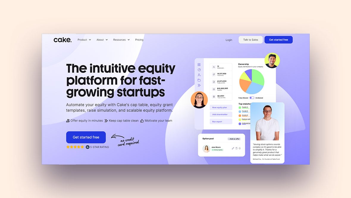
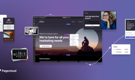
A hero section is the prominently displayed area at the top of a webpage, intended to immediately grab the visitor’s attention. It typically includes a large, visually striking element—such as an image, video, or animation—paired with a headline, subheadline, and one or more calls to action (CTAs). Its primary purpose is to communicate the core value or message of the site in a compelling way, setting the tone for the rest of the user journey.
This section acts as a visual and informational anchor, providing essential context and guiding users toward desired actions, whether it’s exploring products, signing up for a newsletter, or learning more about services offered. The effectiveness of a hero section depends on how well it balances visual appeal with clarity of message and ease of interaction.
Anatomy of a Hero Section
Key Components of the Hero Area
Visual Anchor: Hero Image or Video
The visual element is the centerpiece of the hero section. It could be a high-quality image, an engaging video, or a subtle animation. The goal is to immediately attract attention and evoke the right emotional response. For instance, a dynamic product demo video can powerfully showcase features, while a compelling photo can set the mood.
Choosing between static images and videos depends on your message and audience. Videos can add a layer of storytelling but may impact page load times, so optimization is key. For more insights into the importance of using dynamic elements, explore the role of JavaScript in creating engaging web experiences.
Headline: The Main Message
The headline should be concise, clear, and impactful. It’s the first line users read, so it must quickly convey the value proposition or the primary benefit of your offering. A well-crafted headline addresses the user’s needs or pain points and sparks interest to learn more.
Subheadline: Supporting Details
This brief supporting text elaborates on the headline, providing additional context or emphasizing key benefits. It should be informative yet succinct, encouraging users to continue engaging with your site.
Call-to-Action (CTA) Buttons
CTAs are the pivotal elements guiding users toward desired actions—whether it’s “Get Started,” “Learn More,” or “Shop Now.” These buttons should be visually prominent, with contrasting colors and clear wording, making it obvious what step the user should take next.
Navigation and Branding Elements
The placement of navigation menus and your logo typically resides within or near the hero section to facilitate easy access. Clear navigation helps users explore your website, while a recognizable logo reinforces brand identity.
Visual Elements and Effects
Backgrounds: Images vs. Videos
Select backgrounds that align with your brand story. Static images are reliable and quick to load, while videos can add engagement, especially if they are short and optimized for web use. Balancing aesthetic appeal with performance considerations is essential.
Visual Effects: Parallax and Animations
Adding subtle effects like parallax scrolling or entrance animations can create depth and guide attention. These effects should enhance user interaction without overwhelming the content or causing performance issues. For example, gentle animations can direct focus toward CTAs or key messages.
Color and Typography
Colors should reflect your brand identity and ensure readability through proper contrast. Typography choices—clear fonts with appropriate sizing—also impact user experience. Combining effective color schemes with legible fonts helps direct attention and evoke emotional responses aligned with your brand.
Designing an Impactful Hero Section
Best Practices
- Use High-Quality Visuals: Sharp, relevant images or videos form the foundation of an engaging hero. They immediately communicate your message and set expectations.
- Craft Clear, Impactful Headlines: Your headline should deliver your core message at a glance, emphasizing benefits or solutions.
- Keep Text Minimal: Focus on value propositions. Excessive text can distract or overwhelm visitors.
- Highlight Prominent CTAs: Buttons should stand out and be placed strategically to encourage clicks.
- Maintain Negative Space: An uncluttered design with adequate spacing helps direct focus to key elements and enhances overall readability.
Enhancing Engagement Through Visuals
Choosing visuals that resonate with your brand’s voice and target audience increases relevance and impact. For example, a tech startup might use sleek, modern images, while a handmade craft store could showcase artisanal products in natural settings. Accessibility considerations, such as alt text and color contrast, ensure inclusivity, broadening your reach.
Look at brands like Apple or Tesla for inspiration—they master simplicity and clarity, combining stunning visuals with minimalistic design to maximize impact.
Crafting Effective Messaging
Headline Strategies
Your headline should communicate value and address user needs directly. Focus on benefits, results, or unique selling points. For example, instead of a generic “Welcome to Our Site,” use “Transform Your Business with Innovative Solutions.” Addressing pain points helps establish relevance and encourages deeper engagement.
Supporting Text and Subheadlines
Use subheadlines to expand on your main message, providing clarity without overwhelming. Keep supporting text brief but informative, incorporating microcopy elements like tooltips or labels that guide users smoothly through their journey.
CTA Optimization
Differentiate between primary and secondary CTAs based on their importance. The primary CTA should be bold and compelling, prompting immediate action. Placement and design—such as contrasting colors and strategic positioning—maximize click-through rates. Phrases like “Start Your Free Trial” or “Discover More” create urgency and clarity.
Enhancing User Experience
Responsive Design
Your hero section must adapt seamlessly across devices. Use responsive images and flexible layouts to ensure quick load times and optimal display on desktops, tablets, and smartphones. Techniques like lazy loading and modern image formats (e.g., WebP) help improve performance, which directly influences user satisfaction.
Navigation and User Guidance
Clear, accessible navigation within or near the hero area helps users find what they need effortlessly. Visual cues like arrows or scroll prompts subtly guide visitors deeper into your site, making their journey intuitive.
Different Types of Hero Sections
Product-Focused
Highlight specific products with high-resolution visuals and direct CTAs like “Buy Now” or “See Details.” For example, Samsung’s hero sections often feature vibrant images of their latest devices paired with clear action buttons.
Brand-Focused
Use branding elements—logos, slogans, brand colors—to establish identity immediately. Companies like SoundCloud craft hero sections that encapsulate their ethos in a single glance, reinforcing brand recognition.
Service-Focused
Showcase services with testimonials, trust badges, and success stories to build credibility. Including reviews or case studies right within the hero can boost trust and prompt conversions.
Optimizing for Conversion
Testing and Iteration
Implement A/B testing to compare different headlines, visuals, or CTA placements. Use analytics to track performance metrics such as click-through and bounce rates, and refine your design accordingly. Continuous testing helps tailor your hero section to what resonates best with your audience.
Customization for Different Audiences
Adapt your messaging, visuals, and offers based on target demographics or regional preferences. Localization and personalization strategies can significantly improve engagement and conversion rates.
Frequently Asked Questions
Why is a hero section important?
A well-designed hero creates a strong first impression, immediately communicates your core message, and can significantly influence user engagement and overall site performance. It often serves as the gateway to higher conversion rates.
What elements are essential in a hero section?
Key elements include a captivating visual (image or video), a compelling headline, supporting subtext, and prominently placed CTA buttons. Additional features like navigation menus and branding reinforce usability and recognition.
How do visuals influence a hero’s effectiveness?
Choosing relevant, high-quality visuals that reflect your brand identity enhances credibility and emotional connection. Proper contrast and accessibility considerations ensure your message reaches everyone.
What makes a headline impactful?
Clear, benefit-oriented headlines that address user needs and highlight unique value propositions grab attention instantly. They should avoid jargon and be easy to understand.
How critical is the CTA?
The CTA directs user actions. Its design, placement, and wording determine whether visitors convert. Effective CTAs are visually distinct, action-oriented, and aligned with user intent.
How can I optimize my hero section for mobile?
Use responsive layouts, optimize images and videos for speed, and ensure touch-friendly buttons. Testing across devices guarantees a smooth experience, reducing bounce rates.
Why does typography matter?
Clear, legible fonts reinforce your message and brand personality. Proper font size, line spacing, and contrast improve readability, especially on smaller screens.
How do I evaluate my hero section’s success?
Monitor key metrics like click-through rates, bounce rates, and conversions. Conduct A/B tests to compare different versions and gather user feedback for continuous improvement.
Can a strong hero section significantly improve conversions?
Absolutely. An effectively crafted hero captures attention, clearly communicates value, and guides visitors to take action, ultimately boosting your website’s success.
Conclusion
Understanding the fundamental role of a hero section is crucial for designing websites that engage and convert visitors. By combining compelling visuals, persuasive messaging, and strategic CTAs, you can create a powerful first impression that encourages users to explore and act. Remember to optimize for responsiveness, test different variations, and tailor your approach to your specific audience. With thoughtful design and continuous refinement, your hero section can become a vital driver of your website’s performance, brand recognition, and overall success.


