Effective design hinges on the careful arrangement of visual elements, creating harmony, clarity, and a professional appearance. Understanding and applying the core principles of alignment is fundamental for designers aiming to craft organized and aesthetically pleasing work. Whether you’re designing for print, digital media, or branding, mastering alignment can significantly elevate your projects by establishing structure and guiding the viewer’s eye seamlessly through your composition.
Alignment is not merely about positioning; it is a strategic tool to arrange elements so they relate cohesively, producing a balanced and unified visual experience. Proper alignment fosters a sense of order and confidence, making your designs appear more polished and trustworthy. Conversely, misaligned components can distract viewers, diminish the perceived quality, and weaken the overall message. Therefore, deliberate use of alignment principles is a hallmark of professional design.
In this article, we explore the fundamental concepts of alignment, including the different types, techniques, and their impact on visual communication. We will also examine how grids and software tools facilitate precise alignment, ensuring consistency across your projects. Additionally, understanding the subtleties of mixed and abstract alignments allows for creative expression within structured frameworks.
Designers must consider alignment as an integral part of their toolkit, consciously applying it to enhance readability, aesthetic appeal, and functional clarity. To deepen your understanding, it is beneficial to learn about the various roles that scripting languages like JavaScript play in web design, which can influence layout behavior and interactive elements. For insights on this, visit this resource.
Furthermore, staying informed about current web development practices, such as growth-driven design strategies, can help you create adaptable and user-centric websites. Exploring growth-driven design offers valuable perspectives on building flexible layouts that evolve with user needs. Also, consider the importance of certifications and formal education in the IT, web design, and development sectors, which can significantly impact your professional growth. More on this can be found at this link.
Types of Alignment
Edge Alignment
Edge alignment involves positioning elements along the outer edges—left, right, top, or bottom. This technique ensures that items line up flush against a defined boundary, creating a clean, organized appearance. Edge alignment is especially useful for structuring textual content and images, providing clear visual anchors.
Center Alignment
Center alignment organizes elements around a central axis—either vertically or horizontally. This approach is commonly used in titles, logos, and symmetrical layouts. Proper use of center alignment can produce a balanced and harmonious composition, emphasizing the importance or focal point of the centered element.
Good and Bad Alignment
Achieving good alignment results in a seamless, effortless flow where visual elements appear intentionally placed. Such alignment appears invisible, subtly guiding the viewer’s eye without drawing attention to itself. On the other hand, poor alignment—whether accidental or deliberate—can make a design look chaotic and unprofessional. It can distract or confuse viewers, undermining the message’s clarity.
Mixed Alignment
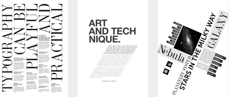
Sometimes, designers deliberately employ mixed alignment to create visual interest or to convey a particular mood. This technique involves combining different alignment styles within a layout, resulting in a more dynamic and expressive composition. When used intentionally, mixed alignment can evoke a sense of movement, freedom, or playfulness.
Using Grids for Precise Alignment
A grid system provides an invisible framework that guides the placement of visual elements, ensuring consistency and balance. Modern design software often includes grid tools that make aligning components straightforward and accurate. Grids support complex compositions, enabling designers to maintain harmony across multiple pages or sections.
Various examples demonstrate the versatility of grid-based alignment, from simple three-column layouts to intricate, asymmetrical arrangements. By experimenting with different grid configurations—vertical, horizontal, or modular—designers can achieve a wide range of visual effects.
Practical Examples
One layout might feature a structured three-column grid, with titles and images aligning neatly within specific sections, promoting clarity and order. Another might explore vertical and horizontal alignment, creating a dynamic and engaging flow that guides the viewer’s eye naturally. Abstract arrangements, achieved through contrast in size, weight, and alignment, push the boundaries of conventional design, fostering innovation and creativity.
When analyzing a design, consider how alignment choices influence the overall impression. Is there a clear grid or structure? How do these choices support the communication goals? Recognizing these patterns enhances your ability to create compelling and cohesive work.
To expand your skills further, explore how scripting languages like JavaScript influence layout and interactivity, which can impact alignment in web design. Additional insights are available at this resource.
In conclusion, mastering alignment involves understanding both the technical and aesthetic aspects. Whether through strict grid systems or more abstract arrangements, deliberate alignment enhances visual clarity and emotional impact. As you develop your design practice, keep experimenting with different alignment techniques and consider how they support your overall message and user experience.