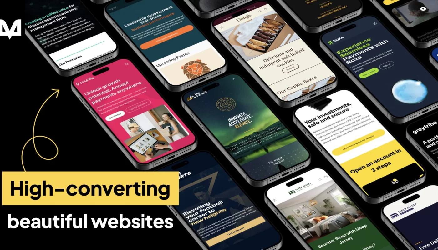
Typography is a fundamental element in web design that shapes the way visitors perceive and interact with your website. It sets the tone, influences readability, and reflects your brand’s personality. A well-crafted typographic hierarchy guides users seamlessly through your content, ensuring they engage more deeply with your message. Choosing the right fonts isn’t just about aesthetics; it’s about creating an intuitive, accessible, and visually appealing experience. Whether you’re aiming for a modern, minimalist look or something more expressive, understanding the art and science behind typography will significantly enhance your website’s effectiveness.
In this guide, we’ll explore key principles for selecting and implementing fonts that make a lasting impact. From sourcing high-quality typefaces to ensuring accessibility, these insights will help you craft a visually cohesive and user-friendly digital space. If you’re interested in how to make your website even more compelling, consider exploring strategies for building effective serverless web applications at this resource. Additionally, when seeking the perfect design partner, you can find reputable professionals by browsing top web designers in Perth WA.
1. Understanding the Power of Typography
Typography extends beyond mere font selection. It’s a powerful tool capable of evoking emotions, establishing your brand identity, and enhancing user experience. Effective typography guides visitors through your content, helps prioritize information, and reinforces your visual message. Thoughtful choices in font style, size, and weight can influence how users perceive your site, making it more memorable and engaging. For instance, highlighting critical calls to action with contrasting fonts or styles can significantly increase user interaction. To maximize your website’s visual impact, consider experimenting with different typefaces while maintaining consistency to avoid visual clutter.
2. Finding the Right Source
Selecting quality fonts from reputable sources ensures compatibility and consistency across various devices and browsers. Platforms like Google Fonts and Adobe Fonts offer extensive libraries of web-optimized typefaces, making it easier to find styles that align with your brand. These platforms provide access to a broad spectrum of fonts, from classic serifs to modern sans-serifs, giving you the flexibility to craft distinctive designs. While you can upload custom fonts or use third-party providers, it’s crucial to verify that these fonts display correctly on all user devices, avoiding potential display issues. For professional and reliable typefaces, these sources are often the best starting point.
3. Establishing Consistency
Consistency in typography creates a cohesive visual identity and enhances user experience. Select a limited set of fonts that match your website’s theme and stick with them throughout your design. This approach helps reinforce your brand personality and prevents a cluttered appearance. A good rule of thumb is to use no more than two or three font families—one for headings, another for body text, and possibly an accent font for emphasis. Combining fonts that complement each other, such as pairing a serif with a sans-serif, can add visual interest without sacrificing harmony. Maintaining uniform styles across different pages strengthens your site’s professionalism and readability.
4. Consider Readability and Legibility
Prioritizing clarity ensures visitors can easily consume your content. Readability relates to how comfortably your text can be read, while legibility pertains to how easily individual characters can be distinguished. Fonts with clear letterforms, appropriate spacing, and suitable sizes are essential. Sans-serif fonts are often favored for digital screens due to their clean appearance, but the choice depends on your brand style and audience. Avoid overly decorative fonts for lengthy content, as they can hinder comprehension. Remember, a beautiful font that’s hard to read defeats its purpose. Testing font sizes and line spacing across devices helps optimize the user experience.
5. Creating Visual Hierarchy
Establishing a clear visual hierarchy guides users through your content smoothly. Use different font sizes, weights, and styles to differentiate between headings, subheadings, and body text. Larger, bolder fonts draw attention to important sections, while smaller or lighter fonts serve as supporting content. This hierarchy not only improves readability but also helps users scan your website efficiently. Incorporating contrast between headlines and body text ensures key messages stand out. Visual cues like color, spacing, and typography work together to structure information logically, making your site more user-friendly. For more insights on structuring your content visually, explore strategies for crafting engaging “How It Works” sections.

6. Highlighting Emphasis
Strategic use of font styles can draw attention to crucial elements like buttons, quotes, or important phrases. Techniques such as italics, all-caps, underlining, or color variations can make specific content pop. However, moderation is key—overusing these techniques can create visual chaos and diminish their impact. Use emphasis sparingly to guide user focus and reinforce your messaging. For example, applying bold or contrasting fonts for call-to-action buttons encourages clicks and conversions. Thoughtful emphasis enhances your site’s visual storytelling without overwhelming visitors.
7. Considering Accessibility
Inclusivity is vital in modern web design, and typography plays a significant role in accessibility. Choose fonts that offer high contrast with background colors to ensure readability for users with visual impairments. Use tools like Stark to evaluate color contrast ratios and comply with WCAG guidelines, making your website usable for everyone. Additionally, selecting fonts with clear, simple letterforms helps reduce cognitive load for users with dyslexia or other reading difficulties. Implementing accessible typography practices not only broadens your audience but also demonstrates your commitment to inclusivity.
8. Testing and Feedback
Once your fonts are selected, thorough testing across devices and browsers is essential. Conduct usability tests and gather feedback to understand how your typography impacts user experience. Pay attention to load times, as complex or custom fonts can slow down your site. Adjust and refine your choices based on real-world usage to achieve optimal readability and aesthetic appeal. Mobile testing is particularly crucial, as typographic sizes and spacing may appear differently on smaller screens. Remember, good typography is an ongoing process—regular reviews ensure your website remains visually appealing and user-friendly.
Typography is a nuanced art that can elevate your web design when approached thoughtfully. Simplicity, consistency, and accessibility should always be your guiding principles. If you need help refining your website’s typography or overall design, consider consulting professional designers like those found through web design services in Perth WA. For further inspiration on visual elements that boost engagement, explore techniques such as website banners, or learn how to craft compelling sections like “How It Works”. Mastering typography is a continuous journey, but the results will significantly enhance your site’s effectiveness and aesthetic appeal.


