Creating visually appealing and user-friendly websites hinges heavily on a fundamental design principle: alignment. Proper alignment ensures that all elements on a web page are organized harmoniously, guiding visitors effortlessly through your content. It not only enhances the aesthetic appeal but also boosts usability by establishing a clear visual hierarchy and structure. Without a solid understanding of alignment, even the most innovative ideas can fall flat, leaving users confused or disengaged. Developing expertise in alignment techniques is essential for web designers aiming to craft professional, balanced, and accessible interfaces. This comprehensive guide explores the core concepts, importance, types, and best practices of alignment in web design, supplemented with real-world examples and tools to perfect your craft.
What is Alignment in Web Design?
Alignment in web design refers to the strategic arrangement of visual elements—such as text blocks, images, buttons, menus, and shapes—on a webpage. It creates an invisible connection among various components, establishing order and coherence. Thoughtful alignment supports the creation of a logical flow, which helps visitors understand and navigate your site with ease. When elements are aligned correctly, they form a unified visual narrative that directs attention to key areas, emphasizes important content, and facilitates a seamless user experience.
Effective alignment fosters a sense of trust and professionalism, making your website appear more polished and credible. It also plays a crucial role in establishing a clear hierarchy, allowing users to quickly identify the most relevant information. For those interested in exploring the technical aspects of structuring a website, examining how to efficiently plan and execute alignment can be invaluable. For instance, when starting a web project, understanding the fundamentals of layout planning and structure—such as creating detailed wireframes—can significantly improve the final design. To streamline this process, tools like Elementor and HappyAddons offer intuitive drag-and-drop interfaces that simplify precise element positioning and alignment.
Importance of Alignment in Web Design
Proper alignment is vital for elevating the overall quality of your website’s user experience. It affects numerous aspects of design, from visual appeal to functionality, and influences how visitors interact with your content.
a. Enhances Aesthetic Appeal
Websites with well-aligned elements look clean, organized, and professional. For example, eCommerce platforms, online magazines, and news portals often feature dense content. Consistent alignment ensures that this abundance of information appears uncluttered and visually appealing, making it easier for users to digest.
b. Improves Readability
A neatly aligned layout guides the reader’s eye naturally across the page, making text easier to scan and comprehend. Clear alignment helps highlight important headings, subheadings, and call-to-action buttons, reducing cognitive load and increasing engagement.
c. Boosts Usability
Visitors are more likely to complete desired actions—such as submitting forms, clicking buttons, or navigating menus—when interface elements are intuitively positioned. Proper alignment contributes to a user-friendly environment that encourages interaction and reduces frustration.
d. Increases Engagement
A well-structured design with strategic alignment draws attention to key sections, encouraging visitors to explore more. This can lead to longer sessions, lower bounce rates, and higher conversions. Distraction-free layouts with aligned content keep users focused on your intended message.
e. Facilitates Responsiveness
With over half of web traffic originating from mobile devices, responsive design is crucial. Alignment techniques help ensure that elements adapt smoothly across various screen sizes, maintaining visual consistency and functionality. Adjusting element positioning for different devices guarantees accessibility and a positive user experience on smartphones and tablets.
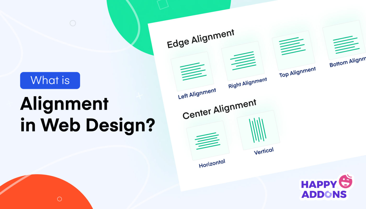
Types of Alignment in Web Design
Understanding the different types of alignment allows designers to choose the appropriate strategy for each element and section of their website.
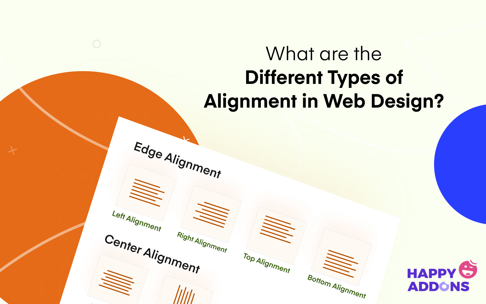
Left Alignment
In left alignment, all elements are aligned along the left edge of the container. This is the most common alignment for text, especially on Western languages that read from left to right. It creates a clean, organized appearance, commonly used in news sites, blogs, and professional portfolios. When adding new content, elements naturally stack from the left, maintaining consistency.
Right Alignment
Elements are aligned along the right edge of the container. This style is often used for sidebars, date stamps, or supplementary information like tags and categories. It can also be employed in design for languages that read from right to left, such as Arabic or Hebrew, ensuring cultural relevance and readability.
Center Alignment
Content is positioned centrally within the container. Center alignment is ideal for headings, titles, and highlight sections like featured images or quotations. It draws focus and creates a symmetrical, balanced look that emphasizes the importance of the content in the middle of the page.
Justified Alignment
This type stretches the text to align evenly along both the left and right edges, creating a clean block of text. It is often used in print media but less common online due to readability concerns. Web designers typically avoid justified alignment for titles or headings but may use it for lengthy passages, ensuring the full use of available space.
Horizontal Alignment
Horizontal alignment involves positioning elements along a straight line from left to right, often used in headers and footers. Maintaining elements on an invisible line enhances visual order and guides user attention across the page.
Vertical Alignment
Vertical alignment arranges elements along an invisible line from top to bottom. It is essential when designing full-page layouts or sections with multiple columns, ensuring consistent spacing and positioning to create a cohesive visual flow.
Principles of Alignment in Web Design
Adhering to core alignment principles ensures your website maintains an appealing and functional layout. These best practices serve as a blueprint for creating balanced and professional designs.
1. Prioritize Geometric Shapes
In UI and web design, focus on square and rectangular shapes. These forms are easier to align, predictable, and naturally evoke feelings of stability, security, and familiarity. When designing interfaces, using these shapes helps to create a cohesive and approachable look. For example, buttons, cards, and images predominantly feature rectangular forms because they facilitate consistent alignment and grid implementation.
2. Implement a Grid System
A grid structure is a network of intersecting horizontal and vertical lines that organize content into consistent blocks. Using a grid simplifies alignment, ensuring that elements are evenly spaced and proportioned. It acts as an invisible skeleton that guides the placement of text, images, and other components, making the design process more efficient. For detailed guidance on structuring your grid, refer to resources on grid systems in web design.
3. Follow the Reading Patterns
Understanding typical eye movement patterns can improve content presentation. The most common scanning patterns are the F-shape and Z-shape, which indicate how users naturally read and browse websites. Designing your layout to align with these patterns—placing key messages and calls to action along the lines—can enhance engagement and clarity.
4. Develop Wireframes
Creating wireframes provides a visual blueprint of your website’s structure, focusing on layout and element placement without distractions like colors or graphics. Wireframes help identify alignment issues early and establish a clear framework for the final design. Using wireframing tools simplifies this process and ensures consistency across your pages.
5. Choose Appropriate Tools
Modern web design benefits from numerous no-code or low-code tools that facilitate precise alignment. Platforms like Elementor and HappyAddons empower even beginners to craft professional layouts easily. Their drag-and-drop interfaces allow you to move elements freely and align them accurately, streamlining the design workflow. For more complex grid arrangements, explore plugins offering advanced features, such as the grid layout capabilities of these tools.
Use Elementor and HappyAddons for Flawless Alignment
These tools are game-changers in the web design arena. Elementor, combined with its addon HappyAddons, offers a versatile drag-and-drop environment where you can position every element with pixel-perfect precision. Their extensive widget libraries and responsive design options make it straightforward to create aligned, professional-looking websites without coding.
Grid Layout Features
One standout feature is the Grid Layout, which allows you to customize the number of columns and their widths, making it ideal for long pages or complex layouts. Adjusting grid parameters helps maintain perfect alignment across different devices, ensuring your site looks great everywhere. Check out this guide to learn how to leverage such tools effectively.
Bonus: Examples of Good and Bad Alignment
Evaluating real websites reveals how alignment influences overall design quality. An example of a well-aligned site is wedevs.com, which demonstrates impeccable consistency in color, typography, and element placement, leading to an intuitive user experience. Conversely, sites like blueskycapitaladvisors.com often suffer from chaotic layouts with misaligned elements, confusing users and diminishing credibility.
Remember, aesthetic appeal depends not only on alignment but also on complementary factors like color schemes, typography, and loading speed. For comprehensive web design principles, visit this resource.
FAQ on Alignment in Web Design
Q: How does alignment influence web design?
Alignment arranges website elements systematically, creating visual harmony and guiding user attention effectively. Proper alignment fosters an organized environment that enhances overall aesthetics and usability.
Q: What are the main types of alignment?
The six key types are: left, right, center, justified, horizontal, and vertical alignment. Each serves specific purposes depending on the content and layout goals.
Q: How is alignment different from balance?
Balance pertains to the distribution of visual weight across the design, while alignment focuses on the precise positioning of elements to create a cohesive structure.
Q: What are some fundamental principles of web design?
They include maintaining visual hierarchy, optimizing for speed, using legible typography, and following user scanning patterns—all supported by proper alignment.
Q: Which alignment works best for web text?
Left alignment is most common for paragraphs and detailed content. Center alignment suits titles and highlights, while right alignment is suitable for languages with right-to-left scripts.
Final Remarks
Achieving perfect alignment is essential for creating websites that are both beautiful and functional. Well-aligned elements facilitate navigation, improve readability, and elevate your site’s professionalism. Whether you’re designing from scratch or refining an existing layout, understanding and applying these principles will significantly enhance your web development skills. For those looking to streamline their process, modern tools like Elementor and HappyAddons are invaluable assets. Remember, even minor alignment improvements can have a substantial impact on user experience and overall site success. Keep practicing, and your designs will stand out with clarity and elegance.
To learn more about building successful websites, explore guides on starting a WordPress web design business, and ensure your project specifications are clear with well-crafted RFPs.