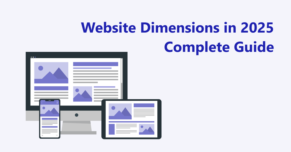
Every pixel plays a crucial role in modern web design. As we approach 2025, understanding the ideal website sizes that maximize user experience, responsiveness, and overall performance becomes imperative. Designers and developers need to stay ahead of evolving device standards, ensuring their sites look flawless across a broad spectrum of screens—from smartphones to large monitors. This comprehensive guide explores current and upcoming web dimension standards, best practices for creating adaptable layouts, and key insights to optimize your site for the future.
Web dimensions influence how users perceive and interact with your website. Choosing appropriate widths and heights not only enhances visual appeal but also impacts your site’s usability and SEO rankings. With the proliferation of mobile devices, especially under the mobile-first indexing policies of search engines like Google, prioritizing responsive design has never been more critical. Incorporating flexible layouts, understanding device-specific breakpoints, and utilizing the right units of measurement are essential strategies for building websites that perform seamlessly on any device.
What Are Website Dimensions and Why Do They Matter?
Website dimensions refer to the height and width of web pages, which directly influence layout, content readability, and functionality across different devices. These measurements determine how content adapts to various screen sizes, affecting usability and aesthetic consistency.
In the realm of modern design, understanding what constitutes optimal website dimensions involves considering common screen resolutions and the principles of responsive design. The goal is to create a site that renders correctly whether viewed on a compact smartphone or a large desktop monitor, providing a consistent experience without requiring separate versions.
Fixed Versus Responsive Dimensions
There are two primary approaches to defining website sizes:
Fixed dimensions—these involve specifying exact pixel widths (e.g., 1200px). While straightforward for desktop displays, fixed widths can cause issues on smaller screens, leading to horizontal scrolling or content overflow. They are increasingly outdated as devices vary widely in size.
Responsive dimensions—these enable the layout to adapt dynamically to the viewer’s screen size. Using techniques like fluid grids and flexible images, responsive design ensures a website maintains its usability and aesthetic integrity across all devices, which is essential in 2025 and beyond.
The shift from fixed to fluid widths reflects current best practices. Responsive design relies heavily on relative units such as percentages, em, rem, and viewport units (vh, vw) to create flexible layouts that scale naturally.
Impact of Website Width and Height on User Experience and SEO
Selecting appropriate dimensions is vital for delivering a positive user experience. A site that isn’t mobile-friendly can frustrate visitors through inconvenient zooming, horizontal scrolling, or slow load times, increasing bounce rates. Conversely, a well-optimized responsive site keeps users engaged, regardless of the device.
From an SEO perspective, search engines favor mobile-optimized websites. Properly calibrated dimensions improve page load speeds and readability, both of which are ranking factors. Ensuring your site adapts well to various screen sizes helps maximize visibility and accessibility.
Typical Website Dimensions for 2025
As device diversity continues to grow, selecting the right dimensions becomes more nuanced. Future-proofing your website involves understanding the standard sizes for desktops, mobiles, tablets, and hybrid devices.
Desktop Screen Sizes and Resolutions
For desktop users, common resolutions form the basis for designing flexible layouts. Typical widths include:
- 1280px, 1440px, 1920px (Full HD), 2560px (2K), 3840px (4K UHD).
For optimal content presentation, especially on Full HD monitors, a container width between 1140px and 1280px is recommended. High-resolution displays like Retina screens (MacBook Pro, iMac) benefit from high-res images scaled at 2x or 3x to maintain sharpness.
Fixed pixel widths are gradually being phased out in favor of percentage-based, responsive containers, such as those implemented with CSS frameworks like Bootstrap or CSS Grid.
Mobile Screen Sizes and Breakpoints
Mobile traffic continues to dominate, making mobile-first design crucial. Typical smartphone dimensions in 2025 include:
- 360px, 375px, 414px, 430px (covering popular models like iPhones and Android devices).
Responsive breakpoints often set at:
-
≤ 480px for mobile phones,
-
768px for tablets in portrait,
-
1024px for landscape tablets and small laptops,
-
1280px+ for desktops.
Implementing a mobile-first approach ensures Google’s Mobile-First Indexing works in your favor, as Google predominantly ranks sites based on their mobile version.
Tablets and Hybrid Devices
Tablets bridge the gap between smartphones and laptops. Typical sizes:
-
768×1024px (portrait iPads),
-
820×1180px (newer Android tablets),
-
1280×800px (widescreen tablets, hybrids).
Designing with these dimensions in mind guarantees a smooth user experience, especially considering touch interactions and keyboard inputs.
How to Verify Website Dimensions
Testing your website across multiple devices and screen sizes is essential. Effective methods include:
Using Chrome DevTools for Responsive Testing
Google Chrome’s DevTools offers a quick way to simulate various device viewports:
-
Open your site in Chrome.
-
Press F12 or Ctrl + Shift + I (Windows) / Cmd + Option + I (Mac).
-
Navigate to the “Elements” tab and hover over elements to see their pixel dimensions.
This allows you to evaluate responsiveness without leaving your desktop environment.
Browser Extensions for Quick Dimension Checks
Extensions streamline the process:
-
Window Resizer: Switch between preset screen sizes with a single click.
-
Page Ruler Redux: Measure element dimensions directly on the page.
-
Responsive Web Design Tester: Preview your site on multiple device emulations simultaneously.
-
WhatFont: Identify font types and sizes used on your site.
These tools are invaluable for designers and developers aiming for pixel-perfect responsiveness.
Testing Without Code
For quick assessments:
-
Manually resize your browser window to observe how layout adapts.
-
Use online services like Responsinator or Screenfly to view your website on various device simulators.
-
Test on actual devices whenever possible to gauge real-world performance and usability.
Monitoring Dimensions in Google Analytics
Google Analytics 4 (GA4) provides insights into user device types, screen resolutions, and viewport sizes. Tracking these metrics helps identify whether your site is optimized for the most common user screens, enabling targeted improvements.
Modern Web Page Size and Pixel Dimensions
Designing for 2025 involves balancing fixed pixel values and relative units. While pixels offer precision, they lack flexibility across diverse screens. Relative units such as percentages (%), em, rem, vh, vw, and CSS Grid fractions (fr) facilitate adaptable layouts.
Pixels Versus Relative Units
-
Pixels (
px) provide exact control but can cause layout issues on smaller screens. -
Relative units enable scalability and responsiveness. For example, setting a container to
width: 100%or usingmax-width: 1200pxwithwidth: 100%combines fixed and fluid approaches.
Common Pitfalls in Setting Dimensions
-
Declaring fixed widths like
width: 1200pxwithout fallback or flexibility can hinder mobile responsiveness. -
Omitting media queries leads to poor adaptation on different devices.
-
Using
pxfor font sizes reduces scalability; preferremorem. -
Ignoring viewport height (
vh) can truncate content on mobile screens.
Recommended Wireframe Sizes for 2025
Creating wireframes based on standard sizes ensures your design is adaptable:
Desktop Prototypes
-
1440px × 900px: ideal for widescreens.
-
1280px × 800px: suitable for laptops.
-
1920px × 1080px (Full HD): common for high-resolution displays.
Main content containers are typically limited to 1140px–1200px to maintain balance.
Mobile Wireframes
-
360px × 640px: popular for Android phones.
-
375px × 812px: standard for iPhones.
-
414px × 896px: larger iPhones and similar devices.
Testing across these sizes ensures consistent UX.
Building Effective Wireframes
Use flexible grid systems, such as 12-column layouts for desktops and 4-column grids for mobiles. Incorporate ample white space and tap-friendly targets (minimum 48px) to improve usability. Always verify your wireframes on multiple device sizes to prevent layout issues before development.
WordPress Dimensions and Custom Layouts
WordPress remains a versatile platform, offering various layout options:
Fixed, Responsive, and Fluid Layouts
-
Fixed layouts: fixed pixel widths (e.g., 960px–1200px). Suitable for controlled designs but less adaptable.
-
Responsive layouts: adapt to screen size using relative units, ensuring compatibility across devices.
-
Fluid layouts: expand to 100% of the viewport width, maximizing space utilization.
Layout Width Options
-
Fixed widths: precise control but potential responsiveness issues.
-
Percentage-based: flexible, adjusting smoothly across screens.
-
Fluid layouts: occupy full width, ideal for mobile.
-
Sidebar configurations: main content typically ranges from 900px to 1100px, balancing content and side elements.
Our Approach to WordPress Web Design
Our team specializes in creating custom, fully responsive WordPress themes. We employ modern CSS techniques, including media queries and flexible grids, to ensure your website looks great on any device. Additionally, our SEO-optimized layouts enhance visibility while maintaining fast load times, aligning with Google’s best practices.
Final Thoughts
Choosing the right website dimensions extends beyond aesthetics—it’s fundamental to effective user engagement and search engine performance. As device ecosystems continue to evolve, designing with flexible units and responsive principles becomes essential. Incorporating these guidelines will help you build websites that are visually appealing, highly functional, and ready for the demands of 2025 and beyond.
Looking to develop a modern, adaptable WordPress website? Contact our agency and let us craft a solution that impresses across all screens!