Creating visually appealing and user-friendly digital interfaces hinges on a fundamental principle: alignment. When elements are thoughtfully arranged relative to one another or a shared baseline, they foster a sense of order, coherence, and aesthetic appeal. Skilled designers leverage various types of alignment—such as typography, grid systems, and visual components—to guide users seamlessly through content, improve readability, and establish a clear hierarchy. Mastering alignment is essential for producing interfaces that are not only attractive but also intuitive and efficient to navigate.
By understanding and applying alignment effectively, designers can craft cohesive layouts that elevate the overall user experience. This involves strategic positioning of text, images, and interface elements, whether through grid systems or consistent spacing. Proper alignment reduces visual clutter, promotes clarity, and enhances the aesthetic flow of a design, making it more engaging and accessible.
What is Alignment in Design?
Alignment in design refers to the deliberate arrangement of visual elements—such as text, images, and icons—relative to each other or a common baseline. This technique creates a sense of order, harmony, and visual stability within a layout. Whether aligning elements along a horizontal or vertical axis, or along common edges, alignment ensures that every component feels intentionally placed, contributing to a cohesive overall appearance.
Effective alignment involves carefully positioning design components within a layout to achieve clarity and ease of navigation. It helps to establish visual relationships, guide the viewer’s eye naturally, and reinforce the hierarchy of information. When executed properly, alignment transforms a chaotic collection of elements into a polished, professional interface that communicates its message effectively.
The importance of alignment for user experience
Achieving mastery in alignment is vital for designing digital experiences that are both visually pleasing and highly functional. When elements are aligned consistently, users can quickly grasp the structure of the interface, reducing cognitive effort and streamlining their interactions. Proper alignment fosters familiarity, as users recognize patterns and predictable arrangements, which enhances their confidence and satisfaction.
Consistent alignment across pages or sections builds a sense of rhythm and predictability, making navigation smoother and content easier to scan. This consistency not only improves engagement but also aids in retention and usability, especially for complex applications or websites. As a core UX principle, proper alignment contributes significantly to creating intuitive, accessible, and aesthetically compelling digital products.
Different Types of Alignment
Effective interface design benefits from applying various alignment techniques, each serving a specific purpose in organizing content and visual elements.
Horizontal Alignment
Horizontal alignment involves positioning elements along the left, center, or right edges of a layout. This technique establishes balance and guides the user’s eye across the screen.
- Left alignment: Elements are aligned along the left edge, providing a clean starting point for reading and a consistent flow. It’s ideal for body text and primary content.
- Center alignment: Elements are centered horizontally, often used for headings or focal points, creating symmetry and emphasis.
- Right alignment: Elements align along the right edge, suitable for secondary information or interfaces with right-to-left language scripts.


Vertical Alignment
Vertical alignment arranges elements along the top, middle, or bottom of a layout, shaping the flow from top to bottom.
- Top alignment: Positions elements at the top, establishing a uniform starting point that directs attention downward.
- Middle alignment: Centers elements vertically, suitable for balanced designs or focal points.
- Bottom alignment: Aligns elements at the bottom, often used in footers or secondary content areas.

Edge Alignment
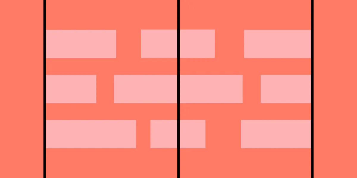
Edge alignment involves aligning elements along a shared horizontal or vertical edge, creating clear visual boundaries and a structured hierarchy. This technique enhances layout clarity and visual cohesion, especially when organizing groups of components or text blocks.
Alignment in Typography
Typography is a key aspect of visual communication, and proper text alignment plays a vital role in readability and hierarchy. While layout alignment pertains to the whole design, text alignment focuses on how content is positioned within its container.
Aligning Headings and Body Text
Aligning text elements consistently helps establish a relationship between headings and content, guiding the user naturally through information.
- Left-aligned text: The most common choice, offering a clean, predictable reading experience.
- Center-aligned text: Used for headings or short emphasis lines, adding symmetry.
- Right-aligned text: Suitable for secondary content or languages that read from right to left.
- Justified text: Aligns both edges, creating a clean block but can introduce uneven spacing if not carefully managed.

Consistent text alignment
Maintaining uniform alignment across all textual content reduces confusion, enhances readability, and supports a cohesive visual hierarchy. When the entire interface adheres to a consistent alignment pattern, users find it easier to scan and understand information.
Alignment for different languages and scripts
Designing for diverse languages requires attention to script-specific alignment needs. For instance, right-to-left languages like Arabic or Hebrew demand right-aligned text, while vertical scripts such as traditional Chinese or Japanese may require top-to-bottom alignment, influencing overall layout choices.
Alignment in Grid Systems and Layouts
Understanding grid systems
Grid systems serve as the backbone of organized design, providing a framework for aligning elements systematically. Whether fluid, modular, or hierarchical, grids help maintain consistency, balance, and proportion across interfaces, enabling designers to create layouts that are visually harmonious and easy to navigate.
Creating balanced layouts using grid alignment
Aligning elements along gridlines ensures balanced and structured compositions. Proper grid use reduces visual clutter, guides user attention, and creates a sense of order that enhances usability. For example, aligning images with related text within a grid clarifies relationships between content and visuals.
Responsiveness and grid alignment
Responsive design requires that layouts adapt seamlessly across devices. Maintaining alignment during these adjustments ensures a cohesive experience, whether by stacking elements vertically on mobile or maintaining horizontal alignments on larger screens. Understanding how to reflow grid-based layouts is essential for modern web design.
Aligning Visual Elements
Aligning Images and Graphics
Positioning visual assets thoughtfully within a grid or relative to other components reinforces the visual hierarchy. For instance, aligning images with relevant text improves comprehension and aesthetic flow, making interfaces more intuitive and engaging.
Using alignment in UI components and design patterns
Consistency in aligning UI elements—such as buttons, forms, and navigation menus—creates predictable interactions. Vertically aligning form fields or horizontally arranging navigation links enhances usability and maintains a clean, professional look.
Consistency in alignment across different design elements
A uniform approach to alignment across headings, images, and interactive components reinforces the overall hierarchy and helps users navigate content effortlessly. This consistency fosters familiarity, trust, and satisfaction.
Common Alignment Mistakes and How to Avoid Them
Mismatched alignments
Aligning related elements inconsistently causes visual confusion. To prevent this, ensure that similar components follow the same alignment rules, such as left-aligning all headings and body text or aligning images along the same edge.
Inconsistent alignment across design elements
Disparities in alignment across different pages or sections diminish cohesion. Applying a unified grid or style guide helps maintain visual harmony and makes the interface more predictable.
Overemphasis on alignment
While alignment is important, overdoing it can make a design feel rigid or monotonous. Balance alignment with other principles like contrast, whitespace, and proximity to create dynamic, lively interfaces.
Best Practices and Examples of Alignment
- Maintain consistent alignment strategies across all pages.
- Use grids to organize components systematically.
- Use alignment to emphasize hierarchy—center primary calls to action, left-align content for readability.
- Balance alignment with sufficient white space and contrast.
- Tailor alignment techniques to different devices by stacking or shifting elements responsively.
Simplify Alignment With UXPin
UXPin’s user-friendly interface streamlines the alignment process, allowing designers to easily position and distribute elements through intuitive controls or keyboard shortcuts. Its Auto Layout feature leverages flexbox principles, enabling flexible, responsive arrangements that adapt across devices. This shared language between design and development teams accelerates project workflows and ensures pixel-perfect results. To explore how these features can enhance your design process, consider signing up for a free trial and start building your interactive prototypes today, with confidence in your layout precision.