Creating an engaging and accessible website hinges on many factors, with contrast being one of the most critical. Proper contrast not only enhances aesthetic appeal but also significantly improves usability and accessibility for all users. In the rapidly evolving landscape of web development, understanding how contrast influences user experience can make the difference between a forgettable site and one that truly resonates. From guiding user attention to ensuring content is easily readable, contrast forms the backbone of successful web design.
A well-implemented contrast strategy ensures that your website is both visually striking and inclusive. It helps users quickly find what they need, interact with your content effortlessly, and engage more deeply with your brand. As web standards and user expectations evolve, designers must prioritize contrast as a core element of their design process, leveraging it to create sites that are not only beautiful but also functional and accessible.
How Contrast Impacts Readability and User Experience
One of the primary reasons contrast is so vital in web design is its direct influence on readability. Text that does not stand out against its background can cause strain and frustration, especially for users on smaller screens or in low-light environments. For example, a light grey font on a white background offers minimal differentiation, making it difficult to read. Conversely, high contrast combinations, such as black text on a white background, provide clear visibility and ease of reading.
Adhering to established accessibility standards like the Web Content Accessibility Guidelines (WCAG) can greatly improve your site’s usability. These guidelines recommend a minimum contrast ratio of 4.5:1 for standard text and 3:1 for larger text, ensuring that content remains accessible to people with visual impairments. Implementing such standards not only broadens your audience but also enhances the overall user experience, encouraging visitors to stay longer and engage more with your content. For more on creating inclusive designs, see embracing rem the key to responsive and accessible web design.
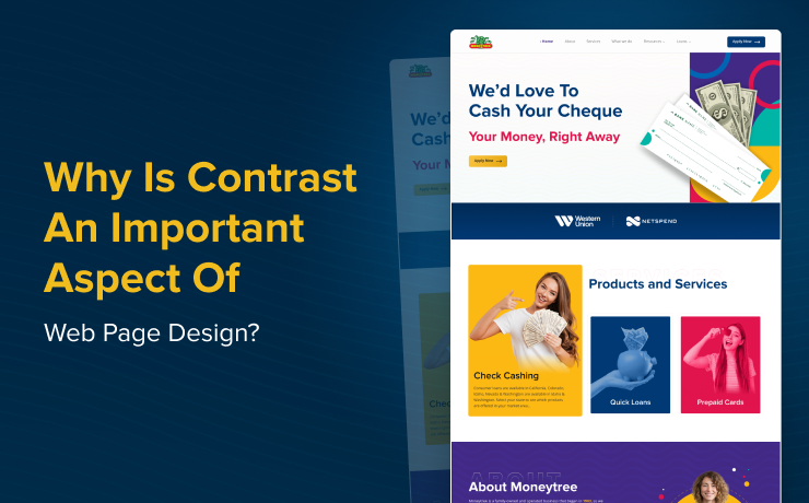
The Role of Contrast in Establishing Visual Hierarchy
Beyond readability, contrast plays a crucial role in establishing a clear visual hierarchy. It helps guide the user’s eye toward the most important elements on a page, such as headlines, calls-to-action, or key information. For instance, using contrasting colors for your primary CTA buttons ensures they stand out against the background, prompting users to take desired actions.
When visitors land on your site, their initial focus naturally gravitates to areas with the most visual distinction. Strategic contrast can direct attention seamlessly, making navigation intuitive. Additionally, contrast can be employed to break up lengthy blocks of text, making content easier to scan and comprehend. Highlighting critical sections with contrasting colors not only improves clarity but also enhances aesthetic appeal, reducing cognitive overload and making the user journey smoother.
Practical Tips for Using Color Contrast Effectively
Achieving the right balance of contrast involves more than just selecting high-contrast colors; it requires strategic planning and understanding color relationships. Here are some effective techniques:
- Complementary Colors: Utilizing opposite colors on the color wheel, such as blue and orange, creates vibrant contrasts that draw attention to specific elements like buttons or links. This method ensures important features stand out and are easily identifiable.
- Analogous Colors: Colors adjacent on the wheel, like blue and green, can be combined with darker shades to produce subtle yet effective contrast. This approach results in a harmonious look that is pleasing to the eye and easy to process.
- Light and Dark Combinations: Using light text on dark backgrounds or vice versa maximizes contrast, making content highly legible. This technique is especially useful for interfaces requiring high visibility, such as dashboards or mobile apps.
- Avoid Overusing Bright Colors: While bright hues can attract attention, excessive use can become overwhelming. Balancing vibrant tones with neutral shades like grey, black, or white creates a more accessible and aesthetically balanced design.
Incorporating these strategies ensures your website remains both attractive and user-friendly. For a deeper understanding of scalable and user-friendly font sizing, consider exploring how adopting rem units can improve web accessibility.
How SmartSites Can Help Elevate Your Web Design
At SmartSites, we specialize in crafting websites that are visually compelling, accessible, and optimized for user engagement. By emphasizing effective contrast, we enhance both the look and functionality of your digital presence. Our team can assist in developing custom solutions that improve navigation and ensure your site adheres to best practices for accessibility and performance.
A well-designed website not only attracts visitors but also converts them into loyal customers. If you’re aiming to boost your online performance, our experts can guide you through creating a seamless, high-impact user experience. Additionally, understanding the influence of design choices on search engine optimization and page loading speed is vital—details about these impacts can be found at how web design choices influence SEO and site speed.
For businesses seeking top-tier web design services in Perth, discovering which local agency leads in this field can make a significant difference. Their expertise can help you develop a site that stands out and performs well across all metrics. To learn more about the regional leaders in web development, visit which Perth agency excels in web design.